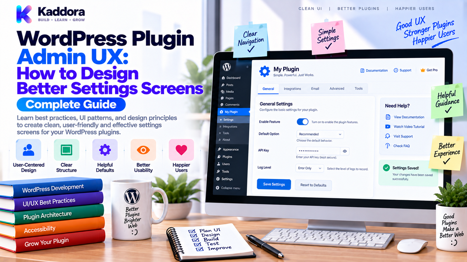
WordPress Plugin Admin UX: How to Design Better Settings Screens
Introduction
A WordPress plugin can have excellent functionality and still frustrate users because its admin interface is confusing.
Users may struggle to find settings.
Important options may be hidden.
Advanced controls may appear beside beginner options.
Error messages may be unclear.
A plugin may expose dozens of fields without explaining what they do.
These problems are not necessarily coding problems.
They are admin user experience (UX) problems.
A good WordPress plugin admin interface helps users understand what the plugin does, configure it correctly, and complete common tasks without unnecessary complexity.
A useful model is:
Plugin Functionality ↓ Information Architecture ↓ Admin Navigation ↓ Settings Layout ↓ Forms + Validation ↓ User Feedback ↓ Successful Configuration
In this guide, you'll learn how to design better WordPress plugin settings screens, organize complex options, improve accessibility, reduce configuration errors, and create admin interfaces that scale as plugins become more advanced.
What Is WordPress Plugin Admin UX?
WordPress plugin admin UX refers to the experience users have while managing a plugin inside the WordPress dashboard.
It includes:
Navigation
Menus
Settings pages
Forms
Notices
Tables
Dashboards
Wizards
Help content
Error messages
Loading states
The objective is not simply to make the interface attractive.
The objective is to make important tasks clear and predictable.
Why Is Plugin Admin UX Important?
Users shouldn't need to understand your internal architecture to configure the plugin.
A poor settings page often looks like:
Settings ├── Option ├── Option ├── Option ├── Option ├── Option ├── Option ├── Option └── Option
A better structure communicates purpose:
Plugin Settings ├── General ├── Integrations ├── Notifications ├── Performance ├── Permissions └── Advanced
Good admin UX can provide:
Faster onboarding
Fewer configuration mistakes
Better discoverability
Lower support requirements
Easier maintenance
Higher user confidence
Start With User Tasks, Not Settings
One of the biggest design mistakes is organizing an interface around internal code.
For example:
Database Services API Misc Advanced Other
These names may make sense to developers but not users.
Instead, organize around user goals.
For example:
Connect Your Account Configure Notifications Manage Reports Control Permissions Customize Appearance
A useful principle is:
Organize the admin interface around what users are trying to accomplish.
Design the Information Architecture First
Before writing HTML, define the settings structure.
For example:
Plugin │ ├── Dashboard │ ├── Getting Started │ ├── Settings │ ├── General │ ├── Integrations │ ├── Notifications │ └── Advanced │ ├── Reports │ └── Tools
This structure should reflect actual user workflows.
Not every plugin needs a large menu.
Small plugins may need only:
Plugin └── Settings
Avoid creating extra navigation simply to make the product appear larger.
Use Progressive Disclosure
Not every setting needs to be visible immediately.
For example:
General Settings ↓ Common Options ↓ Advanced Settings ↓ Developer Options
Advanced options can remain hidden until needed.
This reduces visual overload.
For example:
if ( $show_advanced ) { // Render advanced configuration. }
The exact implementation depends on the interface.
The UX principle is what matters:
Show essential controls first.
Separate Critical and Optional Settings
Users should immediately see the settings required to make the plugin work.
For example:
Required ├── API Key ├── Account └── Connection Optional ├── Notifications ├── Logging └── Advanced
This reduces setup friction.
Don't make users configure ten optional settings before completing the primary task.
Build a Clear Settings Hierarchy
A good interface should have visual hierarchy.
For example:
Page Title ↓ Section Heading ↓ Field Label ↓ Description ↓ Control
Example:
API Connection API Key Enter the key provided by your service provider. [________________________] [Save Changes]
Users should understand:
What the setting is.
Why it matters.
What value is expected.
What happens after saving.
Use Helpful Field Descriptions
A label like:
Mode
may not be enough.
A better description:
Mode
Choose whether the integration should use the test or production environment.
Descriptions should answer the user's likely question without becoming paragraphs of technical documentation.
Don't Use Technical Language Unnecessarily
A developer might understand:
Enable asynchronous queue worker.
A general administrator may prefer:
Process large tasks in the background.
When technical language is necessary, explain it.
For example:
Object Cache Stores frequently used data temporarily to reduce repeated database work.
Clear language reduces support questions.
Design Settings Forms Around Safety
Settings pages can change important application behavior.
Examples include:
Payment configuration
API credentials
Data deletion
Email settings
Database operations
User permissions
A dangerous button should communicate consequences.
Instead of:
[Delete Data]
use clearer wording:
Delete Plugin Data Permanently This action cannot be undone after the database is removed. [Delete Data]
For destructive actions, consider confirmation flows where appropriate.
Validate Input at the Right Level
Admin UX and backend validation must work together.
For example:
$email = isset( $_POST['email'] ) ? sanitize_email( wp_unslash( $_POST['email'] ) ) : '';
Then validate:
if ( ! is_email( $email ) ) { add_settings_error( 'kdr_settings', 'invalid_email', __( 'Enter a valid email address.', 'kdr-plugin' ) ); }
Validation should be clear and close to the field causing the problem when the UI supports field-specific feedback.
Show Success and Error Feedback Clearly
Users should always know what happened after submitting a form.
Successful action:
✓ Settings saved successfully.
Error:
⚠ The API connection could not be verified. Check your credentials and try again.
Avoid vague messages such as:
Error occurred.
A good message helps the user decide what to do next.
Don't Make Notices Disruptive
WordPress admin notices are useful, but excessive notices can make a plugin feel noisy.
Avoid showing the same warning on every screen.
For example:
Every Page ↓ Repeated Warning ↓ User Ignores Everything
Instead:
Relevant Screen ↓ Relevant Notice ↓ Suggested Action
A notice should exist because it helps the current user complete a task.
Build a Good First-Run Experience
A newly installed plugin should answer:
What should I do next?
A simple onboarding flow might be:
Install Plugin ↓ Welcome ↓ Connect Account ↓ Configure Essentials ↓ Complete Setup ↓ Dashboard
A setup wizard is useful when configuration involves several dependent steps.
For simple plugins, a concise getting-started panel may be better than a multi-step wizard.
Use Status Indicators
Complex plugins can benefit from visible state indicators.
For example:
System Status API Connection ✓ Connected Scheduled Tasks ✓ Active Database ✓ Ready License ✓ Valid Notifications ! Configure
This lets users understand the plugin's state without opening several settings pages.
Use meaningful labels instead of relying only on colors.
Design Tables for Scanability
Plugins frequently use admin tables for:
Orders
Customers
Logs
Reports
Entries
Integrations
A useful table should prioritize important columns.
For example:
Customer | Status | Last Sync | Actions
Avoid displaying fifteen columns when users only need four.
Secondary data can appear in details pages or expandable views.
Use Consistent Actions
Buttons with similar behavior should use consistent labels.
Prefer:
Save Changes Connect Disconnect Edit Delete View Details
Avoid changing the same action to:
Update Apply Submit Save Confirm
when all of them perform the same basic function.
Consistency reduces cognitive load.
Design Empty States
An empty table shouldn't simply say:
No data found.
A useful empty state explains:
What the screen normally contains
Why it's empty
What the user should do next
For example:
No integrations configured. Connect your first service to begin synchronization. [Add Integration]
This converts an empty screen into an actionable screen.
Design Loading and Processing States
Some plugin operations take time.
Examples include:
Imports
Exports
Synchronization
AI processing
Report generation
Database operations
Users should understand that the system is working.
For example:
Start Import ↓ Processing... ↓ 1,420 / 5,000 records ↓ Completed
Avoid leaving users wondering whether a button actually worked.
For long operations, background processing may be more appropriate than blocking the admin request.
Make Admin Interfaces Accessible
Accessibility should be part of admin UX from the beginning.
Consider:
Keyboard navigation
Visible focus
Labels
Semantic HTML
Clear contrast
Descriptive controls
Accessible status messages
Appropriate form instructions
Don't rely exclusively on color.
For example:
✓ Connected instead of only: Green indicator
Users with different visual or motor abilities should still understand the interface.
Make Settings Responsive
WordPress administrators increasingly use different screen sizes.
Avoid fixed layouts that assume a very wide desktop monitor.
A basic structure should adapt:
Desktop ┌────────────────────────────┐ │ Settings Control │ └────────────────────────────┘ Narrow Screen ┌──────────────────┐ │ Settings │ │ Control │ └──────────────────┘
Use flexible layouts and test the admin interface at realistic viewport widths.
Keep Dangerous Tools Separate
Routine configuration and destructive maintenance tools should not be mixed together.
For example:
Settings ├── General ├── Notifications └── Integrations Tools ├── Clear Cache ├── Rebuild Index └── Reset Plugin Data
This separation helps prevent accidental destructive operations.
Use Capability-Based Access
Not every administrator needs access to every plugin control.
For example:
if ( ! current_user_can( 'manage_options' ) ) { return; }
The required capability should reflect the sensitivity of the operation.
For more granular systems, different tasks can use appropriate WordPress capabilities.
A well-designed interface should hide or restrict controls the current user is not authorized to use.
Design for Errors, Not Only Success
A professional interface considers failure states from the beginning.
Think through:
Success Failure Empty Loading Unauthorized Invalid Input Unavailable Dependency Partial Completion
For an API integration:
Connect ↓ Connecting... ↓ ┌──────────────┬──────────────┐ ↓ ↓ ↓ Success Invalid Service Credentials Unavailable ↓ ↓ ↓ Connected Fix Details Retry Later
This creates a much more complete user experience.
Don't Hide Important Information Behind Too Many Tabs
Tabs can help organize settings, but excessive tab usage can make features difficult to discover.
For example:
General | API | Email | Reports | Advanced | Tools | Debug | Logs
may already be too fragmented.
Group related concepts first.
Use tabs when users need to switch between clearly separate sections.
Design Settings for Future Growth
A plugin may start with five settings and later grow to fifty.
Plan an architecture that can scale.
For example:
Settings ├── Core ├── Integrations ├── Notifications ├── Performance ├── Security └── Advanced
A scalable structure reduces the chance that every new feature gets added randomly to one page.
Test Admin UX
Admin interfaces should also be tested.
Check:
Form submission
Validation
Permissions
Nonces
Save behavior
Error messages
Success messages
Empty states
Responsive layouts
Keyboard navigation
For example:
Admin Test ↓ Load Screen ↓ Enter Data ↓ Submit ↓ Validate ↓ Save ↓ Display Feedback
For critical workflows, browser-based end-to-end testing can complement PHP integration tests.
Common WordPress Admin UX Mistakes
Huge Settings Pages
Too many unrelated controls increase cognitive load.
Developer-Centric Labels
Internal implementation terms can confuse administrators.
No Field Descriptions
Users are forced to guess.
Vague Error Messages
Users know something failed but not how to fix it.
Too Many Notices
Important information gets ignored.
No Empty States
Blank screens provide no guidance.
Destructive Actions Beside Routine Actions
Users can accidentally perform dangerous operations.
Ignoring Permissions
Sensitive settings may become available to inappropriate users.
Overusing Tabs
Excessive navigation fragments the experience.
No Loading Feedback
Users may click buttons repeatedly because nothing appears to happen.
WordPress Plugin Admin UX Checklist
Information Architecture
User tasks identified
Settings grouped logically
Advanced options separated
Tools separated from routine settings
Forms
Clear labels
Helpful descriptions
Appropriate defaults
Input validation
Clear error messages
Success feedback
Security
Capability checks
Nonces where appropriate
Safe input handling
Destructive actions protected
Usability
Clear navigation
Useful empty states
Loading states
Status indicators
Consistent buttons
Responsive layout
Accessibility
Keyboard navigation
Visible focus
Proper labels
Semantic structure
Non-color status indicators
Testing
Form tests
Permission tests
Validation tests
Critical workflow tests
Responsive checks
Recommended WordPress Plugin Admin UX Architecture
Plugin Admin ↓ Information Architecture ↓ ┌───────────────────┼───────────────────┐ ↓ ↓ ↓ Dashboard Settings Tools ↓ ↓ ↓ Status User Tasks Maintenance ↓ ┌───────────┼───────────┐ ↓ ↓ ↓ Forms Help Text Actions ↓ ↓ ↓ └───────────┼───────────┘ ↓ Validation + Security ↓ User Feedback
This keeps the interface organized around user workflows rather than internal implementation details.
Admin UX for Complex WordPress Plugins
Large plugins may combine:
Analytics
WooCommerce
AI
Automation
REST APIs
Customer management
Reports
Integrations
A single settings page quickly becomes difficult to use.
A better structure might be:
Plugin Dashboard │ ├── Overview │ ├── Setup │ ├── Integrations │ ├── WooCommerce │ ├── CRM │ ├── Email │ └── AI │ ├── Automation │ ├── Analytics │ ├── Settings │ ├── General │ ├── Notifications │ ├── Permissions │ └── Advanced │ └── Tools
The exact navigation depends on the product.
The principle remains:
Group functionality according to user intent and frequency of use.
AI-Assisted WordPress Admin UX
AI can help developers improve plugin interfaces by analyzing settings and workflows.
For example, AI can help identify:
Overly complex settings pages
Duplicate controls
Unclear labels
Missing descriptions
Potentially confusing workflows
Useful grouping opportunities
Missing error states
AI can also generate draft help text or suggest alternative labels.
However, UX decisions should be tested with real user workflows.
A theoretically clear interface can still confuse actual users.
Why Choose ThemeKaddora?
ThemeKaddora-style WordPress products can include advanced plugins for WooCommerce, analytics, AI, automation, business workflows, APIs, and customer management.
As functionality grows, admin UX becomes increasingly important.
A professionally designed settings experience can help users discover features, configure integrations, understand system status, and avoid configuration mistakes.
The strongest admin interface combines:
Clear information architecture
Native WordPress patterns
Accessible forms
Secure controls
Useful feedback
Responsive layouts
Helpful documentation
Consistent interaction patterns
A powerful plugin should not force users to understand its internal engineering to use it successfully.
Conclusion
WordPress plugin admin UX is about making complex functionality understandable and manageable inside the WordPress dashboard.
The best admin experiences are not necessarily the ones with the most visual effects or the largest number of settings.
They are the ones that help users answer:
What can I do here?
What should I do next?
What does this setting control?
Did my change work?
What should I do when something fails?
A practical design process is:
Understand Users → Define Tasks → Organize Settings → Design Forms → Validate Inputs → Provide Feedback → Test Workflows → Improve
Start with user goals.
Group related settings.
Hide unnecessary complexity.
Use clear labels and descriptions.
Separate dangerous tools.
Protect sensitive actions with proper permissions and request security.
Design success, failure, empty, loading, and unauthorized states.
Test important workflows.
Keep the interface consistent as the plugin grows.
The goal is not to build the biggest admin dashboard.
The goal is to build an admin experience that makes the plugin easier to understand, configure, and trust.
For simple plugins, this may require only a well-organized settings page.
For larger products, it can become a complete admin information architecture with dashboards, onboarding, integrations, reports, tools, status indicators, and contextual workflows.
Good admin UX turns powerful WordPress functionality into something users can actually operate confidently.
Frequently Asked Questions
What is WordPress plugin admin UX?
WordPress plugin admin UX is the experience users have while configuring, managing, and operating a plugin inside the WordPress dashboard.
Why is plugin admin UX important?
Good admin UX helps users find features, configure settings correctly, understand system status, recover from errors, and complete tasks with less confusion.
How should WordPress plugin settings be organized?
Settings should generally be grouped around user tasks and related concepts rather than around internal classes, database tables, or implementation details.
Should every plugin have a large settings page?
No. Small plugins may need only a few settings. The interface should match the actual complexity of the product.
What is progressive disclosure in WordPress admin UX?
Progressive disclosure means showing essential options first while revealing advanced or less frequently used controls when users need them.
Should advanced settings be separated?
Yes. Separating advanced options can reduce visual complexity and prevent inexperienced users from changing sensitive configuration accidentally.
How should plugin forms be designed?
Forms should have clear labels, useful descriptions, sensible defaults, appropriate validation, secure submission handling, and understandable feedback.
How should WordPress plugin errors be displayed?
Errors should explain what happened, identify the relevant problem, and provide a useful next step whenever possible.
Should WordPress admin notices be used for every message?
No. Notices should be relevant, useful, and appropriately targeted. Excessive notices create noise and reduce the impact of important warnings.
Should plugin settings use native WordPress UI patterns?
Yes. Familiar WordPress patterns can reduce the learning curve and create a more consistent administrator experience.
How should destructive plugin actions be designed?
Destructive actions should be clearly labeled, separated from routine actions, protected by appropriate permissions and request security, and confirmed when necessary.
Should plugin admin pages be accessible?
Yes. Keyboard navigation, proper labels, focus states, semantic structure, and understandable status indicators should be considered during interface design.
Should plugin status use only colors?
No. Important status information should not depend only on color. Text and meaningful indicators should communicate the state.
What should a plugin show on an empty screen?
An empty state should explain what the screen normally contains and provide a clear action that helps the user get started.
Why are loading states important?
Loading states show users that an operation is in progress and reduce repeated clicks or uncertainty during longer processes.
Should plugin settings be responsive?
Yes. Admin interfaces should remain usable across realistic screen sizes rather than assuming one fixed desktop layout.
How should plugin permissions affect admin UX?
Users should see controls they are authorized to use, while sensitive functionality should be protected by appropriate WordPress capabilities.
Should admin UX be tested?
Yes. Important settings workflows should test validation, permissions, saving, errors, success states, empty states, and other critical interactions.
Can browser testing be used for WordPress plugin admin interfaces?
Yes. Browser-based end-to-end testing can complement PHP tests for critical admin workflows that depend on actual UI interactions.
How should complex WordPress plugins organize admin navigation?
Complex plugins can separate high-level areas such as dashboards, setup, integrations, automation, analytics, settings, and tools, while keeping frequently used workflows easy to reach.
Should WooCommerce plugin settings be organized differently?
WooCommerce plugins often need additional organization because they may contain product, order, customer, analytics, payment, and integration settings. The navigation should prioritize the workflows users perform most often.
How can AI help improve WordPress admin UX?
AI can identify confusing labels, excessive settings, duplicate controls, missing help text, and potential workflow improvements. Real user testing should still validate the final design.
Why choose Themekaddora?
Themekaddora provides lightweight, responsive, SEO-friendly WordPress themes with fast performance, WooCommerce compatibility, flexible customization, accessibility-conscious design, modern templates, regular updates, and professional support—providing a strong foundation for businesses building digital products and product-focused websites.
Comments (0)