
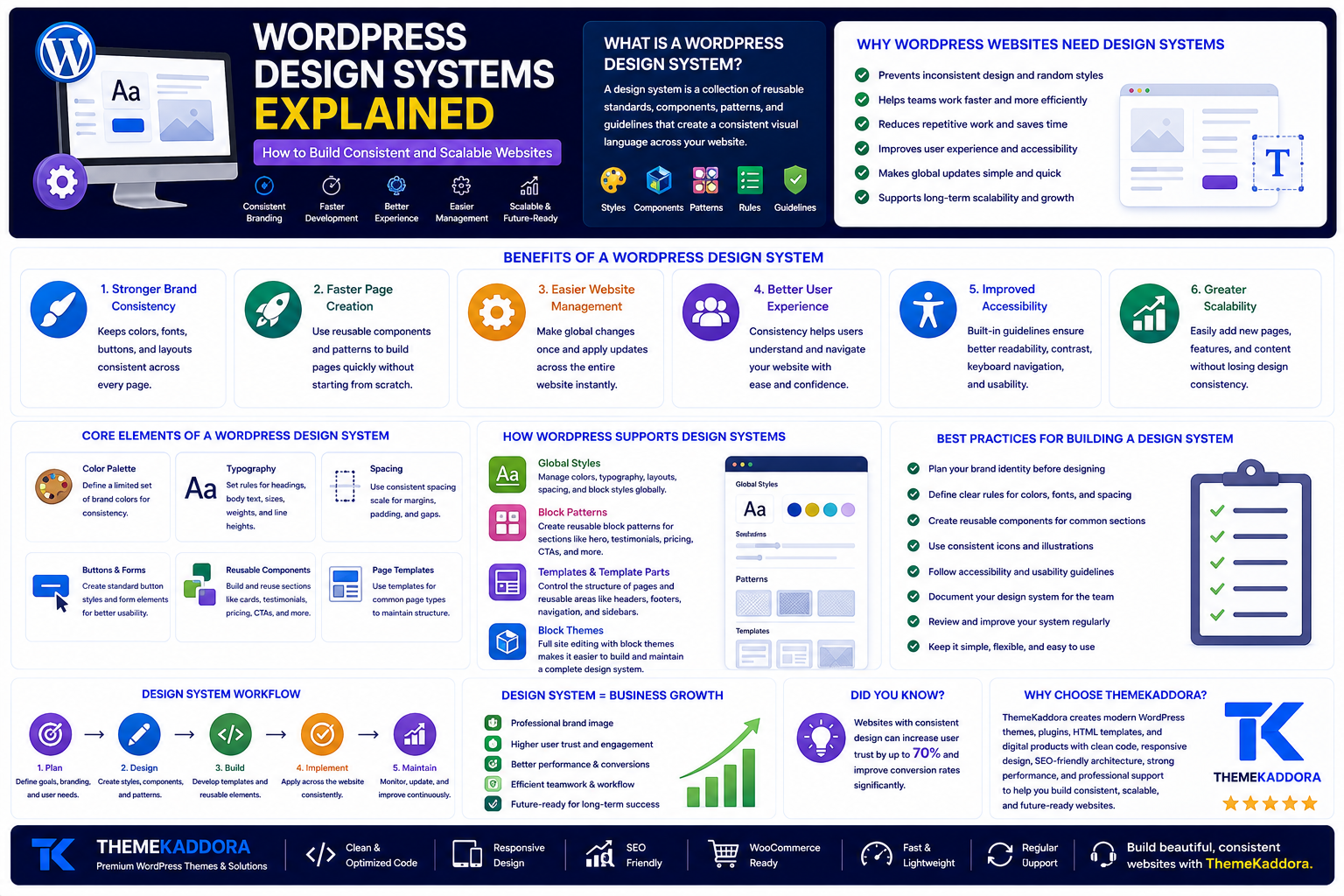
WordPress Design Systems Explained: How to Build Consistent and Scalable Websites
Introduction
As a WordPress website grows, maintaining design consistency becomes more difficult.
One page may use a different button style, another may have inconsistent spacing, and headings may vary in size or color. Over time, these small differences can make a website feel unprofessional and harder to manage.
A WordPress design system solves this problem by creating a shared set of styles, components, patterns, and rules for the entire website.
Instead of designing every page from scratch, teams can reuse approved layouts and visual elements. This creates a website that is more consistent, scalable, accessible, and easier to update.
What Is a WordPress Design System?
A design system is a collection of reusable website standards and components.
It may include:
Brand colors
Typography
Spacing rules
Buttons
Forms
Cards
Icons
Page sections
Navigation patterns
Templates
Accessibility guidelines
Together, these elements create a consistent visual language across the website.
A design system is more than a traditional brand style guide.
A style guide may explain which colors and fonts to use. A design system turns those rules into practical, reusable website components.
For example, instead of simply defining how a button should look, the system provides an approved button style with consistent colors, spacing, typography, hover effects, and accessibility states.
Why WordPress Websites Need Design Systems
WordPress gives users considerable flexibility when creating pages.
However, too much freedom can lead to inconsistency, especially when several people manage the same website.
Without clear standards, editors may:
Use random font sizes
Add unnecessary colors
Create different button styles
Apply inconsistent spacing
Rebuild the same sections repeatedly
A design system creates controlled flexibility. Editors can still create unique pages, but they work within established visual and functional guidelines.
Benefits of a WordPress Design System
1. Stronger Brand Consistency
Visitors should experience the same brand across every page.
Consistent colors, typography, buttons, layouts, and interactions make a business appear more professional and trustworthy.
2. Faster Page Creation
Teams do not need to design every section from the beginning.
They can reuse approved components for:
Testimonials
Service sections
Pricing tables
Feature cards
Calls to action
Frequently asked questions
This reduces design time and speeds up content publishing.
3. Easier Website Management
Global changes become much simpler.
For example, if a brand color or heading style changes, a properly configured system can apply that update across the entire website instead of requiring manual edits on every page.
4. Better User Experience
Consistency helps visitors understand how the website works.
When buttons, forms, menus, and links behave predictably, users can navigate the website more easily.
5. Improved Accessibility
Design systems can include standards for:
Color contrast
Font sizes
Keyboard navigation
Focus states
Form labels
Button sizes
Heading structure
When accessibility is built into reusable components, it becomes easier to maintain across all pages.
6. Greater Scalability
Businesses often add new products, services, locations, landing pages, and content over time.
A design system makes expansion easier because teams can create new pages without introducing visual inconsistency.
Core Elements of a WordPress Design System
Color Palette
Define a limited set of approved colors, including:
Primary color
Secondary color
Accent color
Background colors
Text colors
Success, warning, and error colors
Limiting color choices creates a stronger and more recognizable brand.
Typography
Set clear rules for:
Headings
Body text
Captions
Buttons
Labels
Quotes
Typography should remain readable across desktop, tablet, and mobile devices.
Spacing
Consistent spacing improves readability and visual balance.
Create standards for:
Margins
Padding
Section gaps
Content width
Grid spacing
Random spacing can make even a well-designed page feel unfinished.
Buttons and Forms
Create a small number of approved button styles, such as:
Primary button
Secondary button
Text link
Forms should also use consistent input fields, labels, validation messages, and submit buttons.
This improves usability and prevents confusion.
Reusable Components
Common content components may include:
Feature cards
Testimonials
Pricing sections
Team profiles
Statistics
Comparison tables
Calls to action
Reusable components help teams publish faster while preserving design quality.
Page Templates
Templates provide a consistent structure for common page types.
Examples include:
Service pages
Product pages
Blog posts
Landing pages
Case studies
Contact pages
Templates reduce repetitive work and make content easier to manage.
How WordPress Supports Design Systems
Modern WordPress includes several features that make design systems easier to create.
Global Styles
Global Styles allow users to manage website-wide settings such as:
Colors
Typography
Layouts
Spacing
Block appearance
Changes can be applied across the entire website from one central interface.
Block Patterns
Block patterns are reusable groups of WordPress blocks.
They can be created for:
Hero sections
Testimonials
Pricing tables
Feature grids
Contact sections
Calls to action
Patterns allow editors to insert complete, professionally designed sections without rebuilding them.
Templates and Template Parts
Templates control the structure of pages such as blog posts, archives, search results, and product pages.
Template parts manage reusable areas such as:
Headers
Footers
Navigation
Sidebars
Updating one template part can apply the same change across multiple pages.
Synced Patterns
Synced patterns are useful for content that appears in several places.
Examples include:
Promotional banners
Contact information
Legal notices
Newsletter forms
Calls to action
When the original pattern is updated, all synchronized versions can update automatically.
Design Tokens and theme.json
Design tokens are named values that represent design decisions.
Examples include:
Primary Color
Heading Large
Standard Spacing
Content Width
Button Radius
Instead of entering random values, editors select approved design options.
Modern WordPress themes can define these settings through the theme.json file.
This file may control:
Color palettes
Font sizes
Spacing options
Layout widths
Block styles
Editor settings
A well-configured theme creates greater consistency between the WordPress editor and the published website.
Controlled Flexibility Is Better Than Unlimited Customization
Unlimited customization may sound useful, but it often creates poor results.
When users can change every color, font, layout, and spacing value, websites may develop:
Conflicting styles
Inconsistent branding
Accessibility problems
Poor mobile layouts
Difficult maintenance
A good design system does not remove creativity.
It provides enough flexibility to create different pages while protecting the most important brand and usability standards.
How to Create a WordPress Design System
Step 1: Audit Your Existing Website
Review your current website and identify inconsistencies.
Look for:
Duplicate button styles
Different font sizes
Random spacing
Repeated layouts
Inconsistent forms
Step 2: Define Brand Foundations
Document your approved:
Colors
Fonts
Logo usage
Image style
Tone of voice
These decisions should guide the rest of the system.
Step 3: Identify Common Components
List the sections used repeatedly across your website.
Prioritize components such as testimonials, service cards, calls to action, pricing sections, and contact forms.
Step 4: Build Patterns and Templates
Turn approved layouts into reusable block patterns and page templates.
This allows editors to create content faster without compromising design consistency.
Step 5: Document Usage Rules
Explain:
When to use each component
Which variations are available
How content should be structured
How images should be selected
Clear documentation helps everyone use the system correctly.
Step 6: Review the System Regularly
A design system should evolve as your business changes.
Review it when:
Your brand is updated
New products are launched
Accessibility requirements change
New content types are introduced
User feedback reveals problems
Common Design System Mistakes
Avoid:
Creating too many component variations
Allowing unrestricted colors
Ignoring mobile responsiveness
Forgetting accessibility
Failing to document the system
Making components too complex
Treating the system as a one-time project
A design system should simplify website management, not make it more complicated.
Do Small Businesses Need Design Systems?
Design systems are not only for large companies.
A small business system may include:
Five approved colors
Four font sizes
Two button styles
Six reusable sections
Three page templates
Even a simple system can significantly improve consistency and publishing speed.
How a WordPress Theme Supports Your Design System
Your theme provides the foundation for the entire website.
A strong theme should offer:
Consistent typography
Global color controls
Reusable patterns
Flexible templates
Responsive layouts
Accessible components
Editor consistency
A poorly structured theme can make design standards difficult to maintain.
Why Choose Themekaddora?
Themekaddora WordPress themes are designed to help businesses create professional, consistent, and scalable websites.
Our themes provide:
Lightweight architecture
Responsive layouts
SEO-friendly code
Global design controls
Flexible page templates
Reusable content sections
WooCommerce compatibility
Cross-browser support
Regular updates
Professional support
Instead of redesigning every page independently, businesses can use Themekaddora themes as a structured foundation for faster content creation and long-term website growth.
WordPress Design System Checklist
✅ Define approved brand colors
✅ Standardize typography
✅ Create spacing rules
✅ Limit button variations
✅ Standardize forms
✅ Build reusable components
✅ Create block patterns
✅ Develop page templates
✅ Include accessibility standards
✅ Test mobile responsiveness
✅ Document usage guidelines
✅ Review the system regularly
Conclusion
A WordPress design system turns disconnected design decisions into a consistent website experience.
By standardizing colors, typography, spacing, components, patterns, and templates, businesses can create websites that are easier to manage, more accessible, and more scalable.
The result is not only a better-looking website.
It is a more efficient publishing system that helps teams work faster while protecting brand consistency.
With a flexible and performance-focused WordPress theme from Themekaddora, businesses can build a reliable design foundation that supports both current requirements and future growth.
Frequently Asked Questions
What is a WordPress design system?
A WordPress design system is a collection of reusable styles, components, patterns, templates, and rules that help maintain consistency across a website.
Is a design system the same as a WordPress theme?
No. A theme provides the technical and visual foundation, while a design system defines how styles and components should be used consistently.
What are WordPress Global Styles?
Global Styles allow users to control colors, typography, layouts, spacing, and block appearance across the website from a central interface.
Do small businesses need a design system?
Yes. Even a simple design system can improve consistency, accessibility, page creation speed, and website management.
Why choose Themekaddora WordPress themes?
Themekaddora themes provide lightweight performance, responsive layouts, reusable sections, global design controls, SEO-friendly architecture, WooCommerce compatibility, and flexible templates for scalable business websites.
Comments (0)