
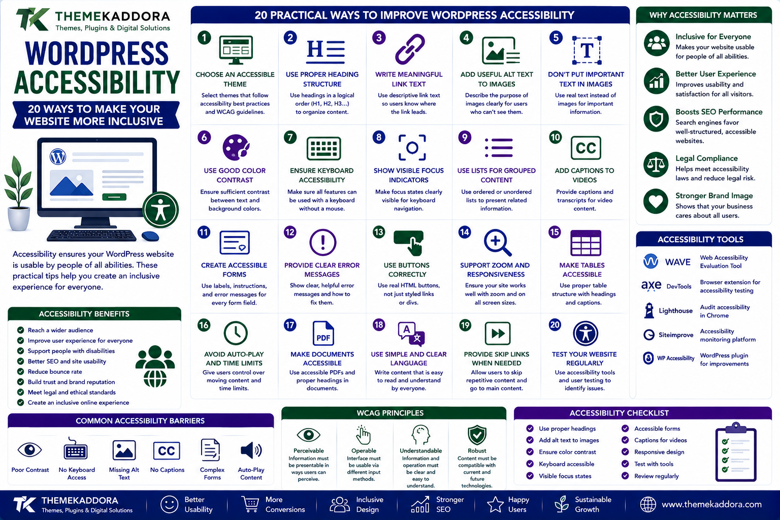
WordPress Accessibility: 20 Ways to Make Your Website More Inclusive
Introduction
A website should be usable by as many people as reasonably possible.
However, visitors don't all interact with websites in the same way.
Some people navigate with a keyboard rather than a mouse.
Some use screen readers.
Some have limited vision.
Others may have difficulty distinguishing certain colors, hearing audio, controlling precise mouse movements, or processing complicated interfaces.
Website accessibility focuses on reducing unnecessary barriers so people can access and use digital content.
For WordPress website owners, accessibility isn't simply a technical feature.
It is part of creating a better user experience.
An accessible website can also benefit mobile users, older visitors, people using temporary assistive solutions, and anyone browsing under challenging conditions.
In this guide, we'll explore 20 practical ways to make a WordPress website more accessible and inclusive.
What Is WordPress Accessibility?
WordPress accessibility means designing and configuring a WordPress website so people with different abilities can navigate, understand, interact with, and use its content.
Accessibility can involve:
Navigation
Keyboard interaction
Images
Color
Typography
Forms
Videos
Audio
Links
Headings
Buttons
Multimedia
Website structure
Accessibility is broader than simply adding an accessibility plugin.
The underlying content, theme, components, and user interface all matter.
Why Website Accessibility Matters
An inaccessible website can create unnecessary barriers.
For example:
A keyboard user may be unable to open a menu.
A screen-reader user may not understand an unlabeled form field.
A visitor with low vision may struggle with low-contrast text.
A user may not understand an image without alternative text.
Someone watching without sound may miss information contained only in audio.
Making these experiences more accessible improves the website for a wider audience.
1. Choose an Accessibility-Aware WordPress Theme
Your theme controls a large part of the website's interface.
When selecting a theme, review whether it considers accessibility in areas such as:
Navigation
Focus states
Headings
Forms
Buttons
Color contrast
Keyboard interaction
Don't assume that a theme is accessible simply because it advertises itself as "modern" or "responsive."
Review its actual behavior.
2. Use Proper Heading Structure
Headings create a hierarchy.
A typical structure might look like:
H1 — Main Page Topic
H2 — Major Section
H3 — Subsection
This helps visitors understand how information is organized.
It can be particularly useful for people using screen readers, who may navigate through headings.
Don't choose heading levels simply because a particular heading size looks attractive.
3. Write Meaningful Link Text
Avoid vague link text such as:
Click here
or:
Read more
when the context isn't clear.
Instead, use descriptive text such as:
Read our WordPress accessibility guide
A visitor should have a reasonable idea of where a link leads.
4. Add Useful Alternative Text to Images
Alternative text helps communicate the purpose or meaning of an image when the image cannot be perceived.
For meaningful images, describe what is relevant to the content.
For example:
"WordPress dashboard displaying website analytics"
is more informative than:
"image123.jpg"
However, not every image needs descriptive alternative text.
Decorative images may be appropriately treated as decorative.
The goal is to communicate useful information, not describe every visual detail unnecessarily.
5. Don't Put Important Text Only Inside Images
Text embedded inside an image can create accessibility problems.
For example, don't place an important instruction exclusively inside a banner graphic.
Whenever possible, provide important information as actual text.
This also improves:
Searchability
Mobile usability
Translation
Content reuse
6. Provide Sufficient Color Contrast
Text should be distinguishable from its background.
Low-contrast combinations can be difficult for many users to read.
Review:
Body text
Headings
Buttons
Form labels
Navigation
Links
Placeholder text
Don't choose colors only because they look attractive.
They also need to remain readable.
7. Don't Use Color as the Only Information Signal
Imagine a form saying:
"Fields marked in red are required."
Someone who cannot distinguish the color may miss the information.
Instead, combine color with:
Text
Icons
Labels
Symbols
Other clear indicators
Important information should not depend on color alone.
8. Make Your Website Keyboard Accessible
Users should be able to navigate important functionality without requiring a mouse.
Test common interactions such as:
Menus
Buttons
Links
Forms
Dialogs
Search
Sliders
Use the keyboard to move through the website and identify areas where interaction becomes impossible.
9. Make Focus States Visible
When navigating with a keyboard, users need to know which element currently has focus.
A visible focus indicator can show:
"This is the button or link currently selected."
Don't remove focus outlines without providing an equally visible alternative.
A visually attractive design shouldn't come at the expense of keyboard usability.
10. Make Forms Accessible
Forms are essential for many WordPress websites.
They may be used for:
Contact
Login
Registration
Checkout
Newsletter subscriptions
Search
Support requests
Make sure fields have clear labels and users can understand:
What information is required
What format is expected
What went wrong
How to correct an error
Error messages should be understandable and connected to the relevant fields.
11. Don't Rely Only on Placeholder Text
Placeholder text can disappear when users start typing.
It can also have poor contrast or be mistaken for actual input.
Use proper field labels.
A placeholder can provide an example, but it shouldn't replace essential instructions or labeling.
12. Use Descriptive Button Labels
Buttons should clearly communicate their action.
Instead of:
Submit
consider more specific wording when appropriate:
Send Message
Create Account
Continue to Checkout
Download Guide
The user should understand what will happen when they activate the button.
13. Make Video Content Accessible
If your website contains video, consider accessibility features such as:
Captions
Transcripts
Clear controls
Accessible media players
Captions can help people who cannot hear the audio and people watching in environments where sound isn't practical.
14. Provide Alternatives for Audio Content
If important information is provided through audio, consider providing a text alternative.
For example:
Podcast
↓
Transcript
This makes the information accessible to visitors who cannot or do not want to listen to the recording.
Transcripts can also make content easier to search and reference.
15. Avoid Automatically Playing Audio
Unexpected audio can be disruptive.
It can also create problems for people using screen readers or browsing in shared environments.
Give users control over multimedia playback.
Avoid forcing visitors to listen to audio before they can interact with the website.
16. Make Content Easy to Read
Accessibility isn't only about technical compliance.
Readable content matters too.
Use:
Clear language
Short paragraphs
Descriptive headings
Lists
Logical organization
Adequate spacing
Avoid unnecessarily complicated sentences when a simpler explanation communicates the same idea.
17. Avoid Excessive Animations
Animations can improve visual design, but excessive movement can make interfaces difficult to use.
Be careful with:
Flashing elements
Rapid transitions
Constant movement
Auto-rotating sliders
Parallax effects
Give users control where appropriate.
Also consider providing reduced-motion behavior when your interface uses significant animation.
18. Make Navigation Predictable
Visitors should be able to understand how the website works.
Keep important navigation patterns consistent.
For example:
Main navigation stays in a familiar location.
Buttons behave consistently.
Links look like links.
Forms use predictable layouts.
Important actions remain easy to find.
Consistency reduces cognitive effort.
19. Test With Real Users and Assistive Technologies
Automated tools can identify certain accessibility issues.
But automated testing cannot detect everything.
Combine:
Automated testing
Keyboard testing
Manual review
Assistive technology testing
User feedback
When possible, involve people with different accessibility needs in testing.
Real users can reveal problems that automated tools miss.
20. Keep Accessibility in Your Maintenance Process
Accessibility shouldn't be treated as a one-time redesign.
New content can introduce problems.
For example:
A new image may lack alternative text.
A new form may have unclear labels.
A new popup may not work with a keyboard.
A new video may lack captions.
Include accessibility checks in your regular publishing and development workflow.
Accessibility and WordPress Plugins
Plugins can add useful functionality, but they can also introduce accessibility problems.
Before installing a plugin, consider how it affects:
Keyboard navigation
Focus management
Forms
Buttons
Modals
Menus
Color contrast
Screen-reader announcements
Don't assume that installing an accessibility plugin automatically makes every part of a website accessible.
Accessibility needs to be considered across the complete website.
Accessibility and Page Builders
Page builders can make website creation easier, but they may also introduce complex markup or interactive components.
When using a page builder, pay attention to:
Heading hierarchy
Button semantics
Keyboard navigation
Focus states
Image alternative text
Contrast
Responsive behavior
Visual controls should not replace semantic structure.
Accessibility and SEO
Accessibility and SEO are not the same thing.
However, they can overlap in useful ways.
For example:
Descriptive headings
help both users and search engines understand content structure.
Alternative text
can improve image understanding while making images more accessible.
Clear links
help visitors understand navigation.
Readable content
improves usability.
Accessibility should not be implemented merely as an SEO tactic.
The primary objective is to make the website more usable and inclusive.
Accessibility and Mobile Experience
Accessibility improvements often benefit mobile users too.
For example:
Larger touch targets
Clear labels
Simple navigation
Readable text
Good contrast
Predictable interactions
can help almost everyone.
A website doesn't have to be difficult to use simply because it has a lot of features.
Common WordPress Accessibility Mistakes
Removing Focus Indicators
This can make keyboard navigation difficult.
Using Tiny Text
Small text can be difficult to read.
Low-Contrast Colors
Beautiful color combinations aren't useful if visitors can't read the content.
Missing Image Alternatives
Meaningful images may communicate information that some users cannot access.
Unlabeled Forms
Users may not understand what information is required.
Autoplaying Multimedia
Unexpected movement or sound can create unnecessary barriers.
Inaccessible Popups
Dialogs that cannot be opened, closed, or navigated with a keyboard can create serious usability problems.
Using Color Alone
Important information should have another clear indicator.
A Practical WordPress Accessibility Checklist
Content
Clear headings
Descriptive links
Useful alternative text
Readable content
Logical structure
Navigation
Keyboard navigation works
Focus states are visible
Menus are predictable
Buttons have clear labels
Forms
Fields have labels
Required fields are clear
Errors are understandable
Keyboard interaction works
Visual Design
Text has sufficient contrast
Color isn't the only information signal
Text is readable
Animations are controlled appropriately
Multimedia
Videos have captions where appropriate
Audio has text alternatives where appropriate
Media controls are accessible
Autoplay is avoided where unnecessary
Testing
Keyboard testing completed
Automated testing completed
Manual testing completed
Assistive technology testing considered
Accessibility reviewed after major updates
How to Audit WordPress Accessibility
You don't need to redesign the entire website immediately.
Start with an audit.
Step 1 — Test Keyboard Navigation
Navigate the website without using a mouse.
Step 2 — Review Headings
Check whether the page structure makes sense.
Step 3 — Check Images
Review alternative text and decorative images.
Step 4 — Test Forms
Try completing forms using only the keyboard.
Step 5 — Review Contrast
Check important text and interface elements.
Step 6 — Test Mobile
Check readability, navigation, and touch interactions.
Step 7 — Test Interactive Components
Review menus, popups, sliders, tabs, and dialogs.
Step 8 — Use Automated Tools
Use accessibility testing tools to identify additional issues.
Step 9 — Manually Verify Findings
Automated results need human interpretation.
Step 10 — Fix the Highest-Impact Problems First
Prioritize barriers that prevent people from accessing or completing important tasks.
What Is WCAG?
The Web Content Accessibility Guidelines, commonly known as WCAG, provide internationally recognized guidance for making web content more accessible.
WCAG organizes accessibility principles around four broad concepts:
Perceivable
Information should be presented in ways users can perceive.
Operable
Users should be able to interact with the interface.
Understandable
Content and interactions should be understandable.
Robust
Content should work reliably across different user agents and assistive technologies.
WCAG includes specific success criteria and conformance levels.
If accessibility is important for your organization, review the requirements that apply to your website, users, industry, and jurisdiction rather than treating a single checklist as universal legal advice.
Accessibility Is More Than Compliance
Accessibility is sometimes treated as a legal or technical requirement.
But the bigger idea is simple:
People should be able to use your website.
A website can technically pass an automated scan and still provide a frustrating experience.
Likewise, a small accessibility improvement can make an important difference to a real visitor.
Think beyond compliance.
Think about usability.
Why choose ThemeKaddora?
ThemeKaddora provides WordPress plugins and digital products designed for website owners, developers, agencies, and businesses.
Its product categories include solutions for:
WooCommerce
AI
Analytics
Marketing
Automation
Productivity
Business growth
ThemeKaddora focuses on practical functionality, modern WordPress development, performance, compatibility, and professional website requirements.
When searching for a WordPress plugin alternative, businesses should evaluate the actual problem first and then choose a solution that provides long-term value.
Final Thoughts
WordPress accessibility is about removing unnecessary barriers.
Start with the fundamentals:
Clear content
Logical structure
Keyboard access
Visible focus
Readable text
Sufficient contrast
Descriptive links
Useful image alternatives
Accessible forms
Captions and transcripts
Predictable navigation
Continuous testing
You don't need to transform everything overnight.
Start by identifying the most important user journeys.
Make those experiences easier to navigate and understand.
Then continue improving as your website evolves.
An accessible website isn't just better for people with disabilities.
It can be better for everyone.
The goal isn't to make your website more complicated.
It's to make it easier for more people to use.
Frequently Asked Questions
What is WordPress accessibility?
WordPress accessibility is the practice of making WordPress websites easier for people with different abilities to navigate, understand, and interact with.
Why is accessibility important for websites?
Accessibility helps reduce barriers for people who use keyboards, screen readers, magnification, captions, alternative input methods, or other assistive technologies.
Is WordPress accessibility the same as SEO?
No. Accessibility and SEO have different objectives, although some practices can benefit both.
Can an accessibility plugin make WordPress fully accessible?
No. Plugins can provide useful functionality, but accessibility depends on the entire website, including the theme, content, plugins, custom code, and interactive components.
What is WCAG?
WCAG stands for Web Content Accessibility Guidelines. It provides internationally recognized guidance for improving web accessibility.
How can I test WordPress accessibility?
Use a combination of automated accessibility tools, keyboard testing, manual review, assistive technology testing, and, where possible, testing with people who have different accessibility needs.
Do WordPress images need alt text?
Meaningful images generally need appropriate alternative text that communicates their relevant purpose or information. Decorative images may not need descriptive alternative text.
How can I make WordPress forms accessible?
Use clear labels, understandable instructions, keyboard-accessible controls, identifiable errors, and appropriate feedback for successful or unsuccessful submissions.
Why is keyboard accessibility important?
Some visitors cannot use a mouse or prefer keyboard navigation. Important website functionality should remain usable without requiring mouse interaction.
Does accessibility help mobile users?
Many accessibility improvements also improve mobile usability, including clear navigation, readable text, understandable forms, and easy-to-use controls.
Is an accessible WordPress website automatically legally compliant?
Not necessarily. Accessibility requirements can vary depending on the organization, location, industry, audience, and applicable laws. Seek appropriate professional advice for legal compliance questions.
Why choose Themekaddora?
Themekaddora provides lightweight, responsive, SEO-friendly WordPress themes with fast performance, WooCommerce compatibility, flexible customization, accessibility-conscious design, modern templates, regular updates, and professional support—providing a strong foundation for businesses building digital products and product-focused websites.
Comments (0)