
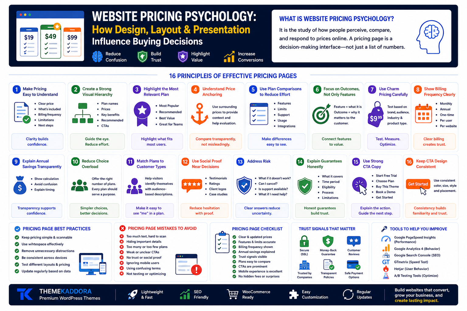
Website Pricing Psychology: How Design, Layout, and Presentation Influence Buying Decisions
Introduction
Price is not experienced in isolation.
Two businesses can offer similar products at similar prices, yet customers may perceive one offer as clearer, safer, more valuable, or easier to choose.
Why?
Because the way pricing is presented influences how people understand and evaluate an offer.
Website visitors don't simply look at a number. They also process:
What is included
What is excluded
Which option is recommended
How plans compare
Whether the business feels trustworthy
Whether the decision feels risky
Whether the next step is clear
This is where website pricing psychology becomes important.
Pricing psychology is not about manipulating customers. Used responsibly, it is about reducing confusion, presenting value clearly, organizing choices effectively, and helping visitors make informed decisions.
In this guide, you'll learn how pricing page design, visual hierarchy, plan structure, trust signals, and presentation can influence buying decisions—and how to apply these ideas to WordPress websites.
What Is Website Pricing Psychology?
Website pricing psychology is the study and practical application of how people perceive, compare, and respond to prices presented online.
It considers factors such as:
Context
Visual hierarchy
Comparison
Perceived value
Choice architecture
Risk
Trust
Cognitive effort
A pricing page is therefore more than a list of numbers.
It is a decision-making interface.
Why Pricing Page Design Matters
A visitor may already like your product but still hesitate if the pricing page is confusing.
Poor pricing presentation can create questions such as:
Which plan is right for me?
Why is one plan more expensive?
Are there hidden fees?
Can I cancel?
What happens after purchase?
Is support included?
What does this feature mean?
A strong pricing page reduces unnecessary uncertainty.
1. Make Pricing Easy to Understand
Clarity should come before cleverness.
Visitors should quickly understand:
How much it costs
What they receive
Billing frequency
Important limitations
Next steps
Avoid unnecessarily complex pricing language.
2. Create a Strong Visual Hierarchy
Not every element should compete equally for attention.
Use visual hierarchy to distinguish:
Plan names
Prices
Key benefits
Recommended options
CTAs
A well-organized page helps visitors scan efficiently.
3. Highlight the Most Relevant Plan Carefully
Many pricing pages visually emphasize one option.
Common labels include:
Most Popular
Recommended
Best Value
Great for Growing Teams
Only use these labels when they are accurate and meaningful.
The highlighted option should genuinely fit a broad or clearly defined audience segment.
4. Understand Price Anchoring
People often evaluate prices relative to other prices they see.
For example, if plans are displayed as:
Starter: $19
Professional: $49
Business: $99
the surrounding options provide context for evaluating each plan.
The goal should be transparent comparison—not misleading framing.
5. Use Plan Comparisons to Reduce Cognitive Load
Visitors should not need to open multiple tabs or memorize feature lists.
A comparison table can clarify:
Features
Limits
Support
Usage
Integrations
Licensing
Make meaningful differences easy to identify.
6. Focus on Outcomes, Not Only Features
A feature tells visitors what is included.
An outcome explains why it matters.
Example:
Feature: Advanced analytics
Outcome: Understand which campaigns generate the most qualified leads.
Connect technical capabilities to practical value.
7. Use Charm Pricing Carefully
Prices ending in values such as:
$9.99
$49
$99
are common across many markets.
However, not every brand should use the same approach.
Premium services may benefit from simpler presentation.
Test based on:
Brand positioning
Audience
Industry
Product category
8. Show Billing Frequency Clearly
If a price is:
Monthly
Annual
One-time
Per user
Per website
state it clearly.
Ambiguous billing creates distrust.
9. Explain Annual Savings Transparently
Annual plans may offer lower effective monthly costs.
If you display savings:
Show the calculation clearly
Avoid confusing comparisons
Explain billing timing
Transparency supports confidence.
10. Reduce Choice Overload
Too many plans can make decisions harder.
A business might offer:
Starter
Professional
Business
instead of presenting ten slightly different options.
The right number depends on the product, but every option should serve a clear purpose.
11. Match Plans to Customer Types
Help visitors identify themselves.
Examples:
Starter
Best for individuals and new websites.
Professional
Best for growing businesses.
Agency
Best for teams managing multiple client websites.
Audience-based descriptions simplify comparison.
12. Use Social Proof Near Pricing Decisions
Visitors may hesitate immediately before purchasing.
Relevant proof can include:
Customer testimonials
Ratings
Client logos
Case studies
Verified reviews
Place proof where it supports the decision naturally.
13. Address Risk
Customers often think about what could go wrong.
Questions include:
What if it doesn't work for me?
Can I cancel?
Is support available?
What if I need help?
Clear policies reduce uncertainty.
14. Explain Guarantees Honestly
If you offer a guarantee, explain:
What it covers
Time period
Eligibility
Process
Limitations
Avoid hiding important conditions.
15. Use Strong CTA Copy
Generic buttons such as:
Submit
provide little context.
More specific CTAs include:
Start Free Trial
Choose Professional
Buy This Theme
Book a Consultation
Get Started
The CTA should explain the action.
16. Keep CTA Design Consistent
Buttons should use:
Clear labels
Consistent styles
Strong contrast
Appropriate spacing
Avoid making every button compete equally.
17. Add FAQs Near the Pricing Section
Common questions may include:
Can I change plans later?
Is support included?
Are updates included?
What payment methods are accepted?
Can I cancel?
FAQs help resolve objections without requiring a support conversation.
18. Explain What Happens After Purchase
Visitors feel more confident when the next step is predictable.
Explain:
Complete purchase
Receive access
Download or activate
Follow setup instructions
Contact support if needed
Clear onboarding reduces uncertainty.
19. Optimize Pricing Pages for Mobile
Pricing tables often become difficult to use on smaller screens.
Test:
Card stacking
Feature readability
CTA visibility
Horizontal scrolling
Font size
Spacing
Mobile visitors should be able to compare plans comfortably.
20. Improve Pricing Page Speed
Pricing pages are often close to conversion.
Avoid slowing them down with:
Heavy animations
Oversized images
Unnecessary scripts
Complex sliders
Excessive third-party widgets
Fast performance reduces friction.
21. Use White Space Strategically
White space helps separate:
Plans
Features
Prices
CTAs
Trust elements
Crowded pricing pages increase cognitive effort.
22. Avoid Hidden Fees
Unexpected costs can damage trust.
Clearly communicate relevant:
Taxes
Setup fees
Transaction fees
Renewal pricing
Add-on costs
Transparency supports long-term customer relationships.
23. Explain Renewal Pricing
If introductory and renewal prices differ, communicate this clearly.
Customers should understand:
Initial cost
Renewal cost
Billing schedule
Avoid surprises.
24. Use Scarcity Responsibly
Scarcity can be appropriate when it is genuine.
Examples:
Registration closes Friday
Limited workshop capacity
Seasonal offer ends on a specific date
Avoid fake countdown timers or artificial claims.
25. Test Pricing Presentation
Consider testing:
Plan order
CTA wording
Comparison layout
Benefit descriptions
Billing toggle presentation
FAQ placement
Test one meaningful hypothesis at a time.
Pricing Psychology for Different Website Types
SaaS Websites
Focus on:
Plan comparison
Usage limits
Feature differences
Free trial information
eCommerce Websites
Focus on:
Product value
Shipping clarity
Bundles
Reviews
Agency Websites
Focus on:
Scope
Deliverables
Process
Consultation CTAs
WordPress Theme Websites
Focus on:
License details
Included features
Updates
Support
Compatibility
Pricing Page SEO Opportunities
Pricing pages may support organic visibility when they provide useful information.
Optimize:
Page title
Meta description
Headings
Internal links
FAQs
Product details
Page speed
Mobile experience
Avoid thin pages containing only a price table.
Common Pricing Page Mistakes
Avoid:
Too many plans
Hidden fees
Unclear billing periods
Weak CTAs
Poor mobile layouts
Missing FAQs
Feature overload
Fake urgency
Confusing discounts
Slow loading pages
Unclear plan differences
Missing trust signals
A simpler page often performs better than an overloaded one.
Website Pricing Psychology Checklist
Before publishing, confirm:
✅ Pricing is easy to understand
✅ Billing period is visible
✅ Plans have clear differences
✅ Recommended option is honest
✅ Benefits are explained
✅ CTA labels are specific
✅ Mobile layout is tested
✅ FAQs answer objections
✅ Policies are accessible
✅ Renewal pricing is clear
✅ Trust signals are relevant
✅ Page speed is optimized
Why Your WordPress Theme Matters
Pricing presentation depends heavily on design flexibility.
A quality theme should support:
Responsive pricing tables
Flexible content sections
Clear typography
Strong visual hierarchy
Fast performance
WooCommerce compatibility
Easy customization
A rigid theme can make pricing experiences difficult to optimize.
Why Choose Themekaddora for Conversion-Focused Websites?
Themekaddora WordPress themes provide a modern foundation for business, agency, eCommerce, and service websites.
Key benefits include:
Lightweight architecture
Responsive layouts
SEO-friendly code
WooCommerce compatibility
Fast loading performance
Flexible customization
Clean HTML5 and CSS3 standards
Cross-browser compatibility
Regular updates
Professional support
These features help businesses create pricing experiences that are clear, professional, and easier to optimize.
Conclusion
Pricing pages are not simply places to display numbers.
They are decision-making environments.
The way you organize plans, explain value, present comparisons, address risk, and design calls to action can influence how easily visitors understand their options.
Effective pricing psychology is not about tricking customers. It is about reducing confusion, communicating value clearly, and helping people make informed choices.
For WordPress websites, a flexible and performance-focused theme provides the foundation needed to create responsive pricing pages, comparison sections, trust elements, and conversion-focused layouts.
Themekaddora themes combine lightweight architecture, responsive design, SEO-friendly code, WooCommerce compatibility, and flexible customization to help businesses create professional websites that support clearer customer decisions.
Better pricing presentation creates better understanding.
Better understanding creates more confident decisions.
Frequently Asked Questions (FAQs)
What is website pricing psychology?
Website pricing psychology explores how price presentation, context, comparison, design, and perceived value influence customer decision-making.
Does pricing page design affect conversions?
Yes. Clear layouts, understandable plan differences, strong CTAs, relevant trust signals, and transparent information can reduce friction and support better decisions.
Should I highlight one pricing plan?
You can highlight a plan when it genuinely represents a recommended or popular option for a clearly defined audience.
How many pricing plans should a website have?
There is no universal number. Each plan should serve a distinct audience or need without creating unnecessary complexity.
Are pricing tables good for SEO?
Pricing pages can support SEO when they include useful, original information beyond the table itself, such as FAQs, feature explanations, and clear product details.
Why choose Themekaddora WordPress themes?
Themekaddora themes provide responsive layouts, lightweight architecture, SEO-friendly code, WooCommerce compatibility, fast performance, and flexible customization, helping businesses build professional conversion-focused WordPress websites.
Comments (0)