
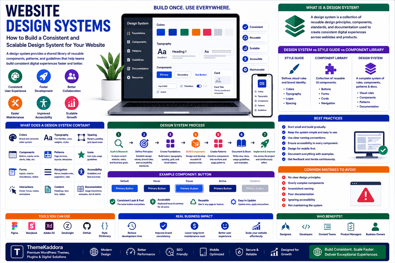
Website Design Systems: How to Build a Consistent and Scalable Design System for Your Website
Introduction
As websites become more sophisticated, maintaining a consistent visual experience across hundreds of pages can become increasingly difficult.
A button may look different on one page than another. Form fields may use different spacing. Headings may have inconsistent sizes. Colors may vary between sections. Developers may repeatedly rebuild the same interface elements instead of reusing existing components.
These problems become even more noticeable when multiple designers and developers work on the same website.
This is where a website design system becomes valuable.
A design system provides a structured collection of reusable design principles, components, styles, patterns, and documentation that help teams build consistent digital experiences.
Instead of designing every page independently, teams can work with a shared visual and technical language.
A design system can include:
- Colors
- Typography
- Spacing
- Buttons
- Forms
- Cards
- Navigation
- Modals
- Alerts
- Icons
- Layouts
- Accessibility guidelines
- Component documentation
The goal is not simply to make a website look consistent.
A well-designed system can also improve development speed, collaboration, accessibility, maintainability, and scalability.
In this guide, you'll learn what a website design system is, what it contains, how to build one, common mistakes, and how design systems can help businesses create better digital experiences.
1. What Is a Website Design System?
A website design system is a collection of reusable design standards and interface components used to create consistent digital experiences.
It establishes common rules for how a website should look and behave.
For example, instead of creating a new button design for every page, a design system can define:
Primary Button
Background
Text color
Font
Border radius
Padding
Hover state
Focus state
Disabled state
Developers and designers can then reuse the same component throughout the website.
This creates consistency while reducing unnecessary duplication.
2. Design System vs Style Guide vs Component Library
These terms are sometimes used interchangeably, but they are not exactly the same.
Style Guide
A style guide generally documents visual rules such as:
Colors
Typography
Logos
Spacing
Branding
Component Library
A component library contains reusable interface components such as:
Buttons
Inputs
Cards
Navigation
Modals
Design System
A design system combines visual principles, reusable components, interaction patterns, documentation, and often development resources.
It provides a broader framework for creating and maintaining digital products.
A useful way to think about it is:
Style Guide → Visual Rules
Component Library → Reusable UI
Design System → Rules + Components + Patterns + Documentation
3. Why Do Businesses Need a Design System?
Without a shared system, websites can become inconsistent as they grow.
Common problems include:
Different button styles
Inconsistent spacing
Repeated CSS
Duplicate components
Slow design revisions
Confusing developer handoffs
Accessibility inconsistencies
Difficult maintenance
A design system helps create a common language between designers, developers, content teams, and product managers.
This can improve both the development process and the final user experience.
4. Benefits of a Website Design System
Consistent User Experience
Users should experience the same interface language across different pages and sections.
Consistent components make websites easier to understand.
Faster Development
Developers can reuse existing components instead of rebuilding common interfaces.
For example, once a button component has been created and tested, it can be reused across dozens of pages.
Better Collaboration
Designers and developers can work from shared specifications.
Instead of discussing what a button "should look like," teams can reference the approved button component.
Easier Maintenance
Updating a centralized component can potentially improve multiple parts of the website simultaneously.
Improved Accessibility
Accessibility requirements can be incorporated directly into reusable components.
For example, a standard button component can include:
Keyboard interaction
Focus states
Appropriate contrast
Accessible labels
This reduces the chance that accessibility requirements are forgotten during individual page development.
Easier Scaling
A design system becomes increasingly valuable as websites and products grow.
New pages can be created using established patterns instead of starting from scratch.
5. What Does a Design System Contain?
A complete design system can contain several layers.
Design Tokens
Design tokens store reusable values such as:
Colors
Font sizes
Spacing
Border radius
Shadows
Breakpoints
For example:
primary-color: #00C853 spacing-md: 16px border-radius-md: 8px
Instead of manually entering values throughout the project, teams can reference standardized tokens.
6. Color System
A design system should define how colors are used.
Instead of simply listing dozens of colors, define their purpose.
For example:
Primary
Used for important actions and brand elements.
Secondary
Used for supporting interface elements.
Success
Used for successful operations.
Warning
Used for cautionary messages.
Error
Used for errors and destructive actions.
Neutral
Used for backgrounds, borders, and text.
The system should also define appropriate contrast relationships.
7. Typography System
Typography affects readability, hierarchy, and brand identity.
A design system can define:
Font families
Font weights
Heading sizes
Body text
Line heights
Letter spacing
Small text
Captions
For example:
H1 → 48px
H2 → 36px
H3 → 28px
Body → 16px
The exact values depend on the product.
The important point is consistency.
8. Spacing and Layout System
Inconsistent spacing can make a website feel poorly designed.
A design system can establish a spacing scale.
For example:
4px 8px 12px 16px 24px 32px 48px 64px
Designers and developers can use these values consistently across components and layouts.
The system can also define:
Container widths
Grid structures
Columns
Gutters
Breakpoints
Section spacing
9. Build Reusable UI Components
Components are the practical building blocks of a design system.
Common components include:
Buttons
Primary
Secondary
Tertiary
Destructive
Disabled
Forms
Text fields
Select boxes
Checkboxes
Radio buttons
Toggles
Search fields
Navigation
Header
Sidebar
Breadcrumbs
Tabs
Pagination
Feedback
Alerts
Notifications
Toasts
Error messages
Loading states
Reusable components reduce duplication and improve consistency.
10. Define Component States
A component is not complete when only its default appearance has been designed.
Interactive components may require multiple states.
For example, a button can have:
Default
Hover
Focus
Active
Disabled
Loading
A form field may have:
Default
Focus
Filled
Error
Success
Disabled
Defining these states prevents inconsistent behavior across the website.
11. Responsive Design System
A design system should work across different screen sizes.
Define how components behave on:
Desktop
Tablet
Mobile
For example, a desktop navigation bar might become a mobile menu.
A multi-column card layout might become a single-column layout.
Responsive behavior should be documented instead of left entirely to individual developers.
12. Accessibility in Design Systems
Accessibility should be built into the system rather than added later.
Components should consider:
Keyboard navigation
Focus visibility
Color contrast
Screen readers
Semantic HTML
Form labels
Error messaging
Touch targets
When accessibility is included in reusable components, every page built from those components can benefit from the same standards.
13. Design System Documentation
Documentation is one of the most important parts of a successful design system.
Documentation should explain:
What the component does
When to use it
When not to use it
Available variants
Component states
Accessibility requirements
Responsive behavior
Code examples
For example:
Primary Button
Use when:
The user needs to perform the primary action on a page.
Avoid when:
Multiple equally important actions compete for attention.
Good documentation helps teams use components consistently.
14. Design Tokens and CSS Variables
Modern websites can use CSS variables to implement design tokens.
For example:
:root { --color-primary: #00C853; --spacing-md: 16px; --radius-md: 8px; }
Components can then reference these variables.
.button { background: var(--color-primary); padding: var(--spacing-md); border-radius: var(--radius-md); }
This makes global design changes easier to manage.
15. Design System Workflow
A practical workflow might look like:
Research
↓
Define Brand Principles
↓
Create Design Tokens
↓
Build Core Components
↓
Define Component States
↓
Create Patterns
↓
Document Components
↓
Build Pages
↓
Test
↓
Improve
This approach helps prevent teams from designing hundreds of pages before establishing reusable foundations.
16. Design System Tools
Different teams use different tools to create and manage design systems.
Common categories include:
Design tools
Component libraries
Documentation platforms
Version control
Storybook-style component environments
CSS frameworks
Design token tools
The exact toolset matters less than establishing a reliable process.
A sophisticated tool cannot fix an unclear design system.
17. Common Design System Mistakes
Creating Too Many Components
Not everything needs to become a reusable component.
Overengineering can make the system difficult to understand.
Designing Without Developers
A design system should work in real code, not only in design files.
Ignoring Documentation
Undocumented components are often used inconsistently.
Ignoring Accessibility
Accessibility should be part of component standards.
Never Updating the System
Design systems evolve as products evolve.
Making the System Too Rigid
A design system should provide consistency without preventing legitimate product innovation.
18. How to Build a Design System From an Existing Website
You do not need to start from zero.
If your website already exists:
Step 1: Audit Existing Pages
Identify repeated patterns.
Step 2: Group Similar Components
Find variations of the same UI element.
Step 3: Remove Unnecessary Variations
Decide which version should become the standard.
Step 4: Create Design Tokens
Standardize colors, typography, spacing, and other values.
Step 5: Build Reusable Components
Convert common patterns into reusable components.
Step 6: Document Them
Explain usage and states.
Step 7: Gradually Migrate Pages
Update existing pages over time.
This approach allows businesses to improve consistency without rebuilding the entire website at once.
19. Measuring Design System Success
A design system should create measurable improvements.
Useful metrics include:
Development time
Design revision time
Component reuse
UI inconsistencies
Accessibility issues
Bug frequency
New-page creation time
For example, if a new landing page previously required two days but can now be assembled using existing components in several hours, the design system is providing measurable value.
Why Choose ThemeKaddora?
ThemeKaddora is a digital marketplace focused on practical digital products and solutions for website owners, developers, freelancers, agencies, entrepreneurs, and online businesses.
Its ecosystem can include:
WordPress themes
WordPress plugins
WooCommerce solutions
SaaS products
AI-powered tools
Business automation solutions
Website templates
Digital products
When selecting themes, plugins, templates, or digital tools, businesses should consider usability, performance, accessibility, security, compatibility, documentation, updates, and long-term maintainability.
Conclusion
A website design system can transform the way businesses design, develop, and maintain digital experiences.
Instead of treating every page as an isolated design project, teams can work with reusable components, shared design tokens, documented patterns, and consistent accessibility standards.
The result can be:
Faster development
More consistent interfaces
Easier maintenance
Better collaboration
Improved accessibility
Greater scalability
However, a design system should not become a collection of unnecessary rules.
The best systems provide enough structure to create consistency while remaining flexible enough to support innovation.
A strong design system is not simply a collection of colors and buttons. It is a shared language that helps teams build better digital experiences together.
Frequently Asked Questions
1. What is a website design system?
A website design system is a collection of reusable design standards, components, patterns, tokens, and documentation used to create consistent digital experiences.
2. Is a design system the same as a UI kit?
No. A UI kit generally provides reusable visual components, while a design system can include components, principles, behavior, accessibility standards, documentation, and development resources.
3. What are design tokens?
Design tokens are reusable values for things such as colors, spacing, typography, borders, shadows, and other design properties.
4. Why are design systems important?
They improve consistency, collaboration, development speed, accessibility, maintainability, and scalability.
5. Can small businesses use design systems?
Yes. Even a small website can benefit from a simple design system when multiple pages or developers need to maintain consistent interfaces.
6. Does a design system improve website accessibility?
It can. Accessibility requirements can be built directly into reusable components and documented as part of the system.
7. How long does it take to create a design system?
The timeline depends on the size and complexity of the product. A small system may be created relatively quickly, while large organizations may continuously develop their systems over time.
8. Can I create a design system for an existing website?
Yes. Existing interfaces can be audited, standardized, converted into reusable components, and gradually migrated to the new system.
9. What tools are used to build design systems?
Teams may use design tools, component libraries, documentation platforms, version control, CSS frameworks, and component-development environments.
10. Why choose ThemeKaddora?
ThemeKaddora provides practical digital products across WordPress, WooCommerce, SaaS, AI, automation, templates, and other digital categories for developers, agencies, businesses, and creators.
Comments (0)