
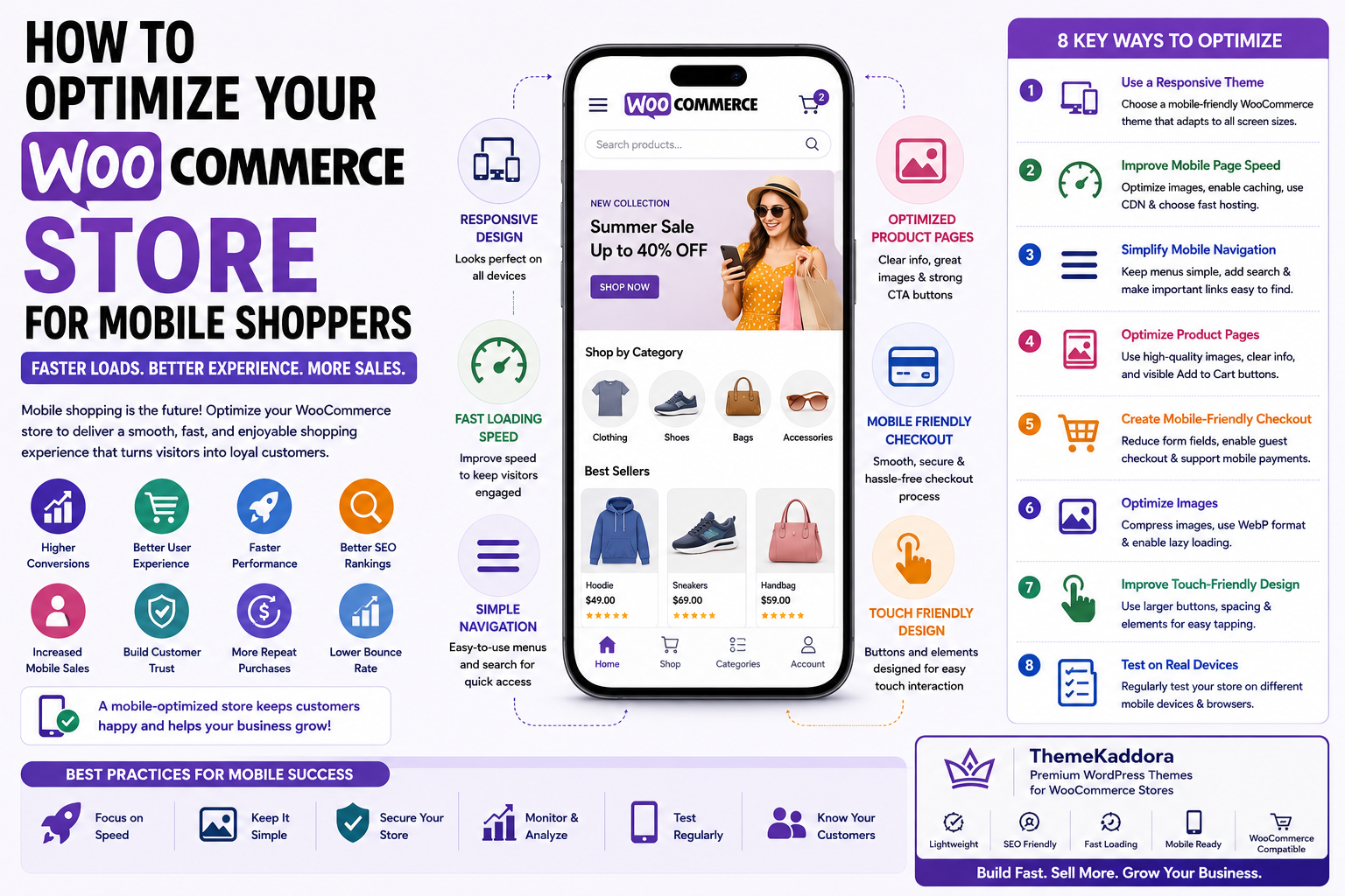
How to Optimize Your WooCommerce Store for Mobile Shoppers
Introduction
Mobile shopping has transformed the eCommerce industry. Today, a large percentage of online purchases begin on smartphones, making mobile optimization a critical factor in the success of any WooCommerce store. Customers expect websites to load quickly, display correctly on every screen size, and provide a smooth shopping experience from product discovery to checkout.
A poorly optimized mobile website can lead to slow loading times, difficult navigation, abandoned carts, and lost revenue. On the other hand, a fast and user-friendly mobile experience encourages visitors to stay longer, explore more products, and complete their purchases with confidence.
WooCommerce offers a flexible foundation for building mobile-friendly online stores, but achieving excellent mobile performance requires more than simply using a responsive theme. Store owners must also optimize navigation, images, checkout, page speed, and user interactions.
In this guide, you'll learn practical strategies to optimize your WooCommerce store for mobile shoppers and create an engaging shopping experience that improves conversions and customer satisfaction.
1. Why Mobile Optimization Matters
Mobile commerce continues to grow every year, and many customers now browse, compare products, and complete purchases using smartphones or tablets.
A mobile-optimized WooCommerce store helps you:
Improve user experience
Increase conversion rates
Reduce bounce rates
Boost customer satisfaction
Improve search engine rankings
Increase mobile sales
Build customer trust
Support repeat purchases
Since search engines prioritize mobile-friendly websites, mobile optimization also contributes to better organic visibility.
2. Use a Responsive WooCommerce Theme
A responsive theme automatically adjusts your website's layout to fit different screen sizes and devices.
A quality WooCommerce theme should provide:
Responsive layouts
Flexible product grids
Mobile-friendly typography
Optimized images
Adaptive navigation
Touch-friendly buttons
Fast performance
Responsive design ensures customers enjoy a consistent shopping experience whether they visit from a smartphone, tablet, or desktop computer.
3. Improve Mobile Page Speed
Page speed has a direct impact on user satisfaction and conversions. Mobile users are particularly sensitive to slow-loading websites and often leave if pages take too long to load.
Improve speed by:
Compressing images
Using modern image formats
Enabling browser caching
Minifying CSS and JavaScript
Removing unnecessary plugins
Choosing high-performance hosting
Loading scripts efficiently
A faster website keeps visitors engaged and encourages them to continue shopping.
4. Simplify Mobile Navigation
Mobile screens provide limited space, making clear navigation essential.
Best practices include:
Keep menus simple
Use clear category names
Add a prominent search bar
Limit menu depth
Display important links first
Use sticky navigation when appropriate
Easy navigation helps customers find products quickly without frustration.
5. Optimize Product Pages for Mobile
Product pages play a major role in purchasing decisions.
To improve mobile usability:
Use high-quality but optimized images
Write concise product descriptions
Highlight key product information first
Display pricing clearly
Make the Add to Cart button highly visible
Keep product options easy to select
A clean, well-structured product page improves readability and encourages purchases.
6. Create a Mobile-Friendly Checkout
Checkout is one of the most critical stages of the customer journey. Even small usability issues can lead to cart abandonment.
Optimize mobile checkout by:
Reducing the number of form fields
Supporting guest checkout
Offering multiple payment methods
Using mobile-friendly input fields
Displaying progress indicators
Auto-filling customer information where appropriate
A streamlined checkout experience reduces friction and helps more shoppers complete their purchases.
7. Optimize Images for Mobile Devices
Images are one of the largest contributors to page size, making image optimization essential for mobile performance. High-quality visuals are important for showcasing products, but oversized images can slow your website and frustrate shoppers.
Best practices for mobile image optimization include:
Compress images before uploading.
Use modern image formats such as WebP when supported.
Upload images at appropriate dimensions.
Enable lazy loading for below-the-fold images.
Use responsive images that adapt to different screen sizes.
Remove unnecessary decorative images.
Optimized images improve loading speed while maintaining visual quality, helping customers browse products more comfortably on mobile devices.
8. Improve Touch-Friendly Design
Unlike desktop users, mobile shoppers rely on touch gestures to navigate your store. Designing with touch interactions in mind improves usability and reduces accidental clicks.
Consider these improvements:
Use large, easy-to-tap buttons.
Provide sufficient spacing between clickable elements.
Make form fields large enough for comfortable typing.
Avoid tiny text links placed too close together.
Ensure dropdown menus are easy to interact with.
Keep important actions within easy thumb reach.
A touch-friendly interface creates a smoother shopping experience and encourages users to complete purchases without frustration.
9. Test Across Multiple Devices
A WooCommerce store may look perfect on one smartphone but behave differently on another device or browser. Regular testing helps identify layout issues, performance problems, and usability concerns before they affect customers.
During testing, review:
Homepage layout
Product pages
Category pages
Search functionality
Shopping cart
Checkout process
Payment methods
Contact forms
Also test your store using different screen sizes, operating systems, and mobile browsers to ensure a consistent experience for every visitor.
10. Common Mobile Optimization Mistakes
Many WooCommerce stores lose potential sales because of avoidable mobile usability issues.
Avoid these common mistakes:
Slow-loading pages caused by unoptimized media.
Using desktop-only layouts on mobile devices.
Small fonts that are difficult to read.
Tiny buttons or closely spaced links.
Complicated navigation menus.
Long checkout forms.
Pop-ups that cover important content.
Ignoring mobile performance testing.
Regularly reviewing your mobile experience helps prevent these issues and keeps your store competitive.
Why Choose ThemeKaddora?
At ThemeKaddora, we develop modern WordPress themes and WooCommerce solutions that prioritize speed, usability, and mobile performance from the ground up.
Our products include:
Mobile-first responsive design
Lightweight, optimized code
Fast loading performance
SEO-friendly architecture
WooCommerce compatibility
Secure coding standards
Easy customization
AI-ready development
Conversion-focused layouts
Whether you're launching a new online store or optimizing an existing one, ThemeKaddora helps you deliver a seamless shopping experience across all devices.
Conclusion
Mobile optimization is no longer optional for WooCommerce stores. As more customers browse and purchase products using smartphones, delivering a fast, responsive, and user-friendly mobile experience is essential for increasing conversions and building long-term customer loyalty.
By choosing a responsive theme, improving page speed, simplifying navigation, optimizing product pages, streamlining checkout, and testing across multiple devices, you can create a shopping experience that keeps customers engaged from their first visit to the final purchase.
Combined with ThemeKaddora's performance-focused WooCommerce themes and WordPress solutions, these mobile optimization strategies provide a strong foundation for growing your online business and meeting the expectations of today's mobile-first shoppers.
Frequently Asked Questions
1. What is WooCommerce mobile optimization?
WooCommerce mobile optimization is the process of improving your online store so it performs efficiently and provides an excellent shopping experience on smartphones and tablets.
2. Why is mobile optimization important?
Most online shoppers use mobile devices to browse products and make purchases. A mobile-friendly store improves usability, customer satisfaction, and conversion rates.
3. Does mobile optimization affect SEO?
Yes. Search engines use mobile-first indexing, so a mobile-friendly website can improve search visibility and support better rankings.
4. What makes a WooCommerce theme mobile-friendly?
A mobile-friendly theme includes responsive layouts, optimized images, touch-friendly navigation, fast loading speeds, and a checkout experience designed for smaller screens.
5. How can I improve mobile page speed?
Compress images, minimize CSS and JavaScript, enable browser caching, remove unnecessary plugins, and choose reliable hosting.
6. Should I simplify the checkout process?
Yes. A shorter, easier checkout reduces friction and can significantly decrease cart abandonment.
7. How often should I test my mobile store?
Test after major updates, new plugin installations, design changes, and periodically across different devices and browsers.
8. Do responsive themes automatically optimize performance?
Responsive design improves layout adaptability, but you still need to optimize images, scripts, hosting, and overall website performance.
9. Can better mobile UX increase sales?
Yes. Faster navigation, improved usability, and streamlined checkout help more visitors complete purchases and return in the future.
10. Why choose ThemeKaddora?
ThemeKaddora develops fast, secure, SEO-friendly, and mobile-first WordPress themes and WooCommerce solutions designed to help businesses improve user experience, increase conversions, and grow with confidence.
Comments (0)