
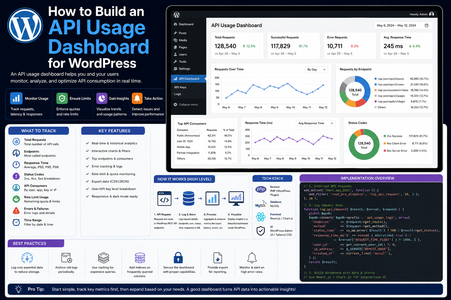
How to Build an API Usage Dashboard for WordPress: Complete Guide
Introduction
Modern WordPress plugins often depend on external APIs for:
CRM
Payments
AI
Analytics
Shipping
Marketing
SaaS
Business automation
As an integration grows, simply knowing that the API connection is working is no longer enough.
Developers and administrators may need to know:
How many requests are being made? Which provider receives the most traffic? How many requests are failing? How many 429 responses occurred? What is the average and P95 latency? How many retries happened? How much quota remains? Which connection is generating the most traffic? Is synchronization falling behind? Are API costs increasing?
Without a centralized dashboard, this information may be scattered across logs, database records, provider dashboards, and queue systems.
An API usage dashboard brings the important information together.
A typical architecture is:
WordPress Integration │ ┌────┼────┐ ▼ ▼ ▼ Metrics Logs Traces │ ▼ Usage Aggregator │ ▼ API Usage Dashboard │ ┌─┴──────────────┐ ▼ ▼ Charts Alerts
The key principle is:
An API usage dashboard should show not only request volume, but the relationship between API consumption, performance, failures, quotas, synchronization, and business impact.
What Is an API Usage Dashboard?
An API usage dashboard is an administrative interface that summarizes how a WordPress integration communicates with external services.
It may display:
Requests Success Rate Errors Latency Retries 429 Responses Quota Queue Sync Status
A useful dashboard should allow an administrator to understand the health and usage of an integration without reading raw logs.
Why Build an API Usage Dashboard?
A dashboard can help identify:
Unexpected request growth
API rate-limit problems
Retry storms
Slow providers
Broken credentials
Queue buildup
Synchronization delays
Excessive polling
Cost increases
Tenant-specific issues
It also helps developers validate whether an optimization actually reduced API usage.
Dashboard vs Provider Dashboard
Many API providers already offer their own dashboards.
So why build one in WordPress?
A provider dashboard may show:
Provider Usage
but the WordPress application knows:
Which plugin feature made the request Which tenant triggered it Which queue job caused it Which local operation failed
A WordPress dashboard can connect external API usage with application behavior.
What Should the Dashboard Show?
A useful overview might contain:
API Requests 12,450 Success Rate 98.7% P95 Latency 640 ms 429 Responses 82 5xx Responses 34 Retries 210 Pending Jobs 340 Sync Lag 7 min
The exact metrics depend on the integration.
1. Track Total Requests
The first metric is request volume.
For example:
Today: 12,450 requests
Track requests over useful time periods:
Last hour
Today
Last 7 days
Custom period
2. Track Requests Over Time
A chart can show:
Requests │ │ ╭──╮ │ ╭───╯ ╰──╮ │───╯ ╰── └───────────────── Time
This helps identify traffic spikes.
An unexpected increase may indicate:
Retry loops
Duplicate jobs
Polling bugs
New features
Increased customer activity
3. Track Requests by Provider
For a plugin supporting multiple integrations:
CRM A 6,200 CRM B 3,400 Payment 1,800 AI 1,050
This makes high-volume providers immediately visible.
4. Track Requests by Operation
Provider totals may not explain the real problem.
Break requests down by operations such as:
customer_sync order_sync product_sync health_check webhook_fetch report_export
For example:
Customer Sync 5,500 Health Checks 3,000 Order Sync 2,700
A large health-check count may indicate inefficient monitoring.
5. Track Success Rate
A dashboard can show:
Successful: 12,180 Failed: 270 Success Rate: 97.8%
Success rate should be calculated over a clearly defined time window.
6. Track Errors by Status Code
Useful categories include:
401 403 404 409 422 429 500 502 503 504
For example:
429 → 82 503 → 25 401 → 12
Different errors require different recovery strategies.
7. Track Error Categories
In addition to HTTP statuses, use normalized categories:
authentication authorization validation rate_limit timeout provider network unknown
This allows the dashboard to group provider-specific errors consistently.
8. Track API Latency
Display:
P50 P95 P99
For example:
P50: 220 ms P95: 670 ms P99: 1.8 sec
This is more useful than average latency alone.
9. Track Latency by Operation
For example:
Customer Lookup 180 ms Order Sync 420 ms Report Export 2.4 sec
A dashboard can quickly identify which operation is responsible for slow API performance.
10. Track Timeouts
Show:
Timeouts: 42 Timeout Rate: 0.34%
A rising timeout rate may indicate provider degradation or network problems.
11. Track Retries
Display:
Retries: 210 Retry Rate: 1.7%
A sudden increase can indicate:
5xx failures
Timeouts
Rate limits
Network instability
12. Track Retry Attempts Per Operation
A useful dashboard can show:
Average Attempts: 1.08 Maximum Attempts: 5
An unusually high number can reveal an integration reliability problem.
13. Track 429 Responses
Display:
429: 82 Rate: 0.66%
This tells administrators whether API traffic is approaching provider limits.
14. Track Rate-Limit Information
When available, display safely:
Quota Limit Remaining Quota Reset Time Retry-After
Do not assume every provider exposes the same headers.
15. Track API Costs When Available
Some providers expose usage-based billing.
A dashboard may show:
Requests: 12,400 Tokens: 2.4M Estimated Usage: ...
Cost calculations should use provider-specific pricing data rather than generic assumptions.
16. AI API Usage
For AI integrations, usage may include:
Requests Input Tokens Output Tokens Total Tokens Model Failed Requests
Tracking this can help identify unexpected usage.
17. Payment API Usage
For payment integrations, request volume can include:
Authorization Capture Refund Customer Lookup Webhook Verification
Do not use API volume as a substitute for financial reconciliation.
The dashboard should complement payment records, not replace them.
18. Track Webhook Activity
Show:
Received: 1,240 Verified: 1,238 Rejected: 2 Processed: 1,220 Pending: 18
This can reveal webhook processing problems quickly.
19. Track Queue Status
For asynchronous integrations:
Pending: 340 Processing: 12 Failed: 8 Dead Letter: 3
This gives users visibility into background work.
20. Track Oldest Queue Job
One of the most useful metrics is:
Oldest Pending Job: 22 minutes
A growing age indicates that processing is falling behind.
21. Track Sync Lag
For synchronization systems:
Last Successful Sync: 10:35 Current Time: 10:43 Sync Lag: 8 minutes
This is often more meaningful than raw API uptime.
22. Track Records Processed
For synchronization:
Fetched: 10,000 Processed: 9,980 Failed: 20
This can reveal partial failures.
23. Track Checkpoint Progress
Show:
Last Checkpoint: 2026-08-19 10:30 Checkpoint: cursor_abc
Avoid exposing sensitive provider data.
24. Track Connection Health
For multiple connections:
Healthy: 180 Degraded: 8 Reauthorization: 4 Disconnected: 3
This gives administrators an immediate overview.
25. Track Connections by Environment
Keep:
Production Sandbox Staging Development
clearly separated.
A sandbox failure should not be confused with a production incident.
26. Track Usage by Tenant
For SaaS products:
Tenant A: 4,200 requests Tenant B: 1,800 requests Tenant C: 300 requests
Tenant-level visibility helps identify heavy API consumers.
27. Be Careful With Tenant Data
Only users authorized to view tenant information should see it.
Use strict access control and avoid exposing sensitive tenant details unnecessarily.
28. Avoid High-Cardinality Metrics
Do not make every:
customer_id order_id email request_id
a dashboard metric dimension.
Use logs for individual identifiers and aggregated metrics for dashboards.
29. Show Top API Consumers
A useful dashboard section:
Top Operations Customer Sync 44% Order Sync 31% Health Checks 14% Reports 7% Other 4%
This can highlight optimization opportunities.
30. Detect Unnecessary Polling
If:
Health Check: 10,000 requests/day
while:
Business Requests: 2,000/day
the integration may be polling too aggressively.
The dashboard can expose this imbalance.
31. Track Requests Per Business Operation
A powerful efficiency metric is:
API Requests / Order API Requests / Customer API Requests / Sync Job
If an optimization reduces:
10 requests/order → 3 requests/order
the improvement is immediately visible.
32. Track Duplicate Requests
Repeated identical API calls may indicate:
Duplicate queue jobs
Missing caching
Retry bugs
Concurrent processing
Record safe operation identifiers rather than storing sensitive request data.
33. Track Circuit Breaker State
If a circuit breaker is implemented:
Closed: 12 Open: 2 Half-Open: 1
You can also display:
Provider: CRM Circuit: Open Next Probe: 10:45
34. Track Rate-Limiter State
Show:
Requests Throttled: 72 Current Limit: 100/min Current Remaining: 28
Provider semantics vary, so present these values with appropriate labels.
35. Track API Health
A summary card might show:
CRM API: Healthy Error Rate: 0.4% P95: 560 ms 429: 0.1%
This should be based on recent and clearly labeled time windows.
36. Track Health Trends
Instead of only:
Healthy
show:
Healthy ↑ Latency Increasing
or:
Degraded ↓ Errors Recovering
Trend information makes dashboards more actionable.
37. Use Time Filters
Useful filters include:
Last Hour Today 7 Days 30 Days Custom
This lets administrators distinguish temporary spikes from persistent problems.
38. Add Provider Filters
Allow:
Provider: All CRM ERP AI Payments
This is useful for multi-provider plugins.
39. Add Operation Filters
Allow:
Operation: All Sync Webhook Health Check Reports
This helps developers investigate performance issues.
40. Add Environment Filters
Allow:
Environment: Production Sandbox Staging
Do not combine environments in a way that makes the operational state ambiguous.
41. Add Status Filters
For example:
Status: Success 4xx 429 5xx Timeout Network Error
This helps isolate failure classes.
42. Show Last Successful Request
For each connection:
Last Successful API Request: 10:42:17
This is useful when troubleshooting apparently healthy connections.
43. Show Last Failed Request
Display safe metadata:
Last Failure: 503 Operation: Order Sync Time: 10:40:02
Never expose credentials or unnecessary private response bodies.
44. Show Provider Request IDs
If available:
Provider Request ID: req_12345
This can help developers contact the provider.
45. Build an API Usage Table
A table might contain:
Provider
Requests
Success
429
5xx
P95
Retries
CRM
6,200
98.9%
42
18
540 ms
120
ERP
3,400
99.4%
12
6
620 ms
40
AI
1,050
97.8%
20
14
1.2 sec
50
Keep time windows and metric definitions clear.
46. Add a Detailed Operation View
Clicking an operation might show:
Customer Sync Requests: 5,500 Success: 98.5% P95: 620 ms 429: 40 5xx: 18 Retries: 110 Average Attempts: 1.04 Queue Lag: 4 minutes
This helps move from overview to diagnosis.
47. Add Usage Trends
Charts can show:
Requests Latency 429 5xx Retries
on aligned time windows.
This helps identify relationships between metrics.
48. Correlate Usage With Errors
For example:
Requests ↑ ↓ 429 ↑ ↓ Retries ↑ ↓ Queue ↑
This may indicate that traffic growth is creating rate-limit pressure.
49. Correlate Usage With Costs
For usage-based APIs:
Requests ↑ ↓ Tokens ↑ ↓ Cost ↑
A usage dashboard can help catch inefficient workflows before costs become significant.
50. Add Export Capability
Administrators may need data for:
Troubleshooting
Auditing
Cost analysis
Performance review
Exports should be:
Access-controlled
Limited to necessary data
Free of secrets
Appropriately scoped
51. Do Not Export Secrets
API keys, access tokens, client secrets, and webhook secrets must never appear in exports.
52. Retain Usage History
Do not keep unlimited high-volume raw request records inside WordPress.
Use:
Aggregated Daily Metrics + Short-Term Detailed Records
when appropriate.
53. Aggregation Strategy
For example:
Raw Requests: 7 days Hourly Aggregates: 30 days Daily Aggregates: 12 months
The actual retention period should match operational requirements.
54. Avoid Heavy Dashboard Queries
A dashboard should not scan millions of raw API records every time an administrator opens the page.
Pre-aggregate important metrics or use appropriate indexes.
55. Dedicated Metrics Tables
For high-volume integrations, consider a dedicated metrics table with fields such as:
provider operation status_code latency_bucket request_count error_count period_start
The exact schema depends on scale.
56. Avoid Autoloaded Usage Data
Do not store high-frequency usage statistics in autoloaded WordPress options.
This can add unnecessary work to normal requests.
57. Dashboard Access Control
API usage dashboards may expose:
Provider names
Account information
Request volume
Error patterns
Tenant metrics
Business usage
Restrict access using appropriate WordPress capabilities.
58. AJAX and REST Dashboard Data
For larger dashboards, usage data may be loaded asynchronously.
Even then:
Authenticate the request
Verify permissions
Validate filters
Escape output
Do not expose sensitive metrics publicly.
59. Dashboard Security
Protect against:
Unauthorized access
Data leakage
Unescaped output
Unsafe filters
Arbitrary query parameters
Cross-tenant data exposure
The dashboard is an administrative application and must be treated accordingly.
60. ThemeKaddora Dashboard Architecture
A reusable structure can be:
API Client ↓ Usage Collector ↓ Metrics Aggregator ↓ Usage Store ↓ Health Evaluator ↓ Dashboard API ↓ Admin Dashboard
Supporting components:
Rate Limiter Queue Monitor Alert Manager Cost Monitor
61. Usage Collector
The collector records safe metrics after an API operation:
provider operation status latency attempt environment
No secret values are required.
62. Metrics Aggregator
The aggregator converts individual events into useful values:
Request Count Error Rate P95 Latency 429 Rate Retry Rate
Aggregation reduces dashboard query cost.
63. Health Evaluator
The health evaluator can combine:
API Errors Latency Rate Limits Queue Sync Lag Credential State
to produce:
Healthy Warning Degraded
64. Alert Manager
Alerts can be based on:
Error Rate 429 Rate Latency Queue Age Sync Lag Circuit Open Credential Failure
Use sustained thresholds rather than reacting to isolated events.
65. Business-Level Usage
For ThemeKaddora products, consider tracking:
Orders Synced Customers Updated Products Synced AI Jobs Completed Payments Processed
This connects technical API activity to actual business results.
66. API Requests Per Business Result
A valuable efficiency metric is:
API Requests ÷ Successful Business Operations
For example:
3 API calls per successful order sync
If it suddenly becomes:
12 API calls per order
investigate.
67. Detect Inefficient Integrations
The dashboard can reveal:
High Requests + Low Business Output
This may indicate:
Duplicate requests
Failed retries
Poor batching
Missing caching
N+1 API calls
68. Track Background vs Interactive Requests
Separate:
Interactive Background Webhook Cron CLI
This helps identify whether external API traffic is affecting user-facing operations.
69. Track Request Source
A normalized source field might be:
admin cron queue rest webhook cli
This is useful when diagnosing unexpected usage.
70. Track API Usage During Deployments
A new release may cause:
Requests ↑ Latency ↑ Errors ↑
Deployment-aware observability helps identify regressions.
Avoid attaching arbitrary deployment identifiers to every metric if that creates excessive cardinality; use controlled release/version labels.
71. Compare Versions
Useful for development:
Version A: 4 requests/order Version B: 2 requests/order
This makes optimization measurable.
72. Track Provider API Version
For versioned providers:
API v1 API v2
track their usage separately.
This helps manage migrations and deprecations.
73. Monitor Deprecation Risk
A dashboard can highlight:
API Version: v1 Deprecation: Upcoming
where provider information is available.
74. Track Sandbox Separately
Sandbox usage can be shown separately:
Production: 12,450 requests Sandbox: 3,200 requests
Do not mix test traffic with production cost or business metrics unless clearly labeled.
75. API Usage Dashboard for SaaS
A multi-tenant dashboard might show:
Total Requests: 100,000 Active Connections: 420 Top Tenant: 8,400 requests 429 Rate: 0.8% P95: 640 ms
Access should respect tenant and administrative permissions.
76. Tenant Usage Limits
If the business model requires quotas, the dashboard can show:
Tenant A: 8,400 / 10,000 requests Tenant B: 2,100 / 10,000
This should be based on the application's defined quota model, not the provider's raw quota unless they are the same concept.
77. Quota Alerts
For configured application limits:
80% → Warning 90% → Critical
The exact thresholds should be configurable.
78. Do Not Confuse Provider Quotas With Your Own Quotas
For example:
Provider: 100,000 requests/day ThemeKaddora: 10,000 requests/tenant/day
These are separate limits.
Display them separately.
79. Usage Dashboard Testing
Test:
Successful Request 429 503 Timeout Retry Webhook Queue Job Credential Failure
and verify that the correct metrics are updated.
80. Test Dashboard Isolation
Verify:
Tenant A
cannot retrieve:
Tenant B
usage data.
This is especially important for SaaS products.
81. Test Environment Isolation
Verify:
Sandbox Usage
does not become:
Production Usage
82. Test Aggregation Accuracy
Compare:
Raw Events
against:
Dashboard Totals
and verify that aggregation does not double-count retries or failed attempts.
83. Define What a "Request" Means
This matters.
Does:
Initial Attempt + Retry Attempt
count as:
2 API Requests
Usually yes for provider usage.
But:
1 Logical Operation
remains one business operation.
Track both concepts separately.
84. Separate Attempts From Operations
For example:
Logical Operations: 1,000 API Attempts: 1,240 Retries: 240
This is much more informative than simply displaying 1,240 requests.
85. Track Successful Business Operations
For example:
Orders: 1,000 Successfully Synced: 980 Failed: 20
This provides business impact.
86. Common API Dashboard Mistakes
Tracking Only Request Counts
Usage without outcomes is incomplete.
No Latency Metrics
Performance problems remain hidden.
No Error Classification
Different failures become indistinguishable.
No Retry Metrics
Retry storms remain invisible.
Mixing Sandbox and Production
Creates misleading data.
Storing Unlimited Raw Events
Can create database growth.
High-Cardinality Metrics
Makes telemetry expensive.
No Access Control
Can leak tenant information.
No Business Metrics
Technical usage may not reflect actual value.
No Aggregation
Dashboards become slow.
Best Practices
A professional API usage dashboard should:
Track request volume.
Separate logical operations from HTTP attempts.
Measure success and error rates.
Track 4xx, 429, 5xx, timeout, and network failures.
Measure P50, P95, and P99 latency.
Monitor retries and retry exhaustion.
Track rate limits and quotas separately.
Monitor queue depth and oldest-job age.
Track synchronization lag and checkpoint progress.
Show connection and environment health.
Provide provider and operation filters.
Support tenant-aware reporting where appropriate.
Keep production and sandbox usage separate.
Use aggregated metrics for high-volume data.
Protect dashboard access with appropriate capabilities.
Keep credentials and sensitive payloads out of usage records.
Measure API usage against real business outcomes.
Test aggregation and tenant isolation.
Conclusion
An API usage dashboard turns raw external-service activity into actionable information.
Instead of seeing:
API Error
an administrator can see:
Provider: CRM Requests: 12,450 Success: 98.7% 429: 82 5xx: 34 P95: 640 ms Retries: 210 Queue: 340 Sync Lag: 7 min
This provides much better operational visibility.
The first principle is measure both usage and outcomes.
Track:
Requests + Success + Failures + Latency
The second principle is separate HTTP attempts from logical business operations.
One business operation may generate multiple API requests due to retries.
For example:
Operations: 1,000 Attempts: 1,240
This reveals that 240 additional attempts occurred.
The third principle is track rate limits and quotas separately.
A provider quota is not automatically the same as an application's business quota.
The fourth principle is track background processing.
Queue depth, oldest job age, retry count, and synchronization lag often explain why API usage changes.
The fifth principle is connect API activity to business value.
For ThemeKaddora integrations, track metrics such as:
Orders Synced Customers Updated Products Processed AI Jobs Completed Payments Reconciled
The sixth principle is avoid excessive telemetry storage.
Aggregate high-volume metrics instead of keeping every raw request indefinitely inside WordPress.
The seventh principle is protect dashboard data.
Usage dashboards can reveal customer, tenant, provider, and business information. Use appropriate capabilities and tenant isolation.
The eighth principle is keep environments separate.
Sandbox traffic should not accidentally appear in production usage or cost reporting.
The ninth principle is make the dashboard diagnostic.
A useful dashboard should help answer:
What happened? Where? When? How often? Why? What is affected? Did it recover?
The tenth principle is test the dashboard itself.
Verify metrics, aggregation, filters, alerts, environment separation, and tenant isolation rather than assuming the telemetry is correct.
For ThemeKaddora products, a reusable architecture is:
API Client ↓ Usage Collector ↓ Metrics Aggregator ↓ Usage Store ↓ Health Evaluator ↓ Dashboard API ↓ Admin Dashboard
with:
Rate Limiter Queue Monitor Alert Manager Cost Monitor
This architecture can support:
CRM
ERP
Payments
AI
WooCommerce
Analytics
SaaS
Marketing
The most important principle is:
An API usage dashboard should connect external API activity with performance, reliability, synchronization, quotas, and business outcomes so developers can understand both what the integration is consuming and what value it is delivering.
A professional WordPress API usage dashboard should be:
Actionable
→ Aggregated
→ Provider-Aware
→ Operation-Aware
→ Tenant-Aware
→ Cost-Aware
→ Performance-Aware
→ Secure
→ Scalable
→ Business-Aware
When these principles are followed, API usage becomes measurable and manageable rather than an invisible source of costs, rate limits, performance problems, and integration failures.
Frequently Asked Questions
What is a WordPress API usage dashboard?
It is an administrative interface that summarizes API requests, errors, latency, retries, rate limits, synchronization, queue activity, and other integration metrics.
Why build an API usage dashboard?
It helps developers and administrators identify excessive requests, rate-limit problems, slow APIs, retry storms, queue growth, synchronization delays, and usage increases.
What should an API usage dashboard track?
At minimum, track request volume, success rate, important HTTP errors, latency, retries, rate limits, queue status, synchronization lag, and connection health.
Should retries count as API requests?
For provider usage, each actual HTTP attempt is generally a request. Separately tracking logical operations and retry attempts makes the dashboard easier to understand.
Should sandbox and production usage be combined?
No. Keep environments clearly separated so test activity does not distort production usage and cost reporting.
How should API usage be tracked for SaaS tenants?
Track tenant-level usage where needed while enforcing strict access control and avoiding unnecessary high-cardinality metrics.
Can an API usage dashboard show API costs?
Yes, when reliable provider usage and pricing data are available. Clearly label estimates and keep provider-specific pricing logic separate.
Should every raw API request be stored?
Not necessarily. High-volume integrations should generally aggregate metrics and retain detailed events only for the period and troubleshooting needs that justify them.
How does an API usage dashboard help with rate limits?
It can show request volume, 429 responses, quota usage, remaining capacity, retries, and the operations responsible for traffic.
What is the difference between requests and business operations?
A business operation may produce multiple HTTP attempts because of pagination or retries. Tracking both provides a clearer view of efficiency and reliability.
How should ThemeKaddora build an API usage dashboard?
ThemeKaddora should use a usage collector, metrics aggregator, health evaluator, secure usage store, dashboard API, rate-limit monitoring, queue metrics, cost tracking, and strict environment and tenant isolation.
What is the most important API usage dashboard principle?
Measure API consumption together with reliability, performance, synchronization, quotas, and business outcomes so the dashboard explains not only how much the integration uses, but whether that usage is efficient and healthy.
Comments (0)