
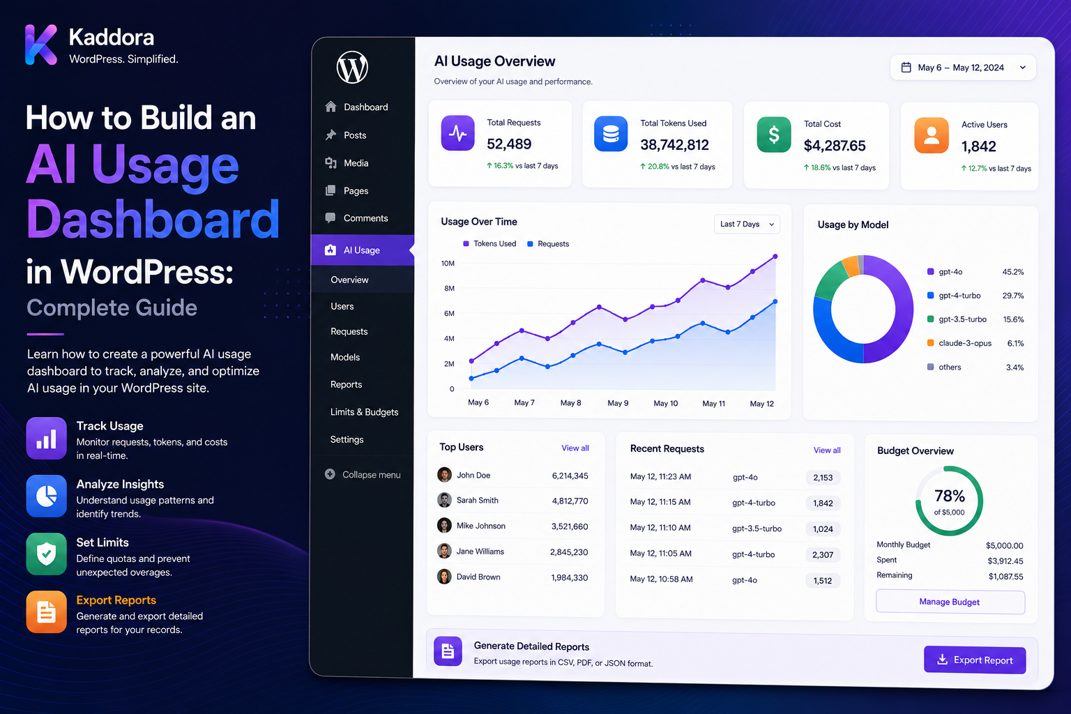
How to Build an AI Usage Dashboard in WordPress: Complete Guide
Introduction
AI-powered WordPress plugins can generate content, analyze websites, process documents, classify data, power chatbots, and automate business workflows.
As AI usage grows, simply knowing that an AI feature exists is no longer enough.
Administrators need to answer questions such as:
How many AI requests were made? How many tokens were consumed? Which features use the most AI? Which models are expensive? Which users consume the most? Which tenants are approaching their limits? How much did AI cost? How many requests were avoided through caching? How many jobs failed or required retries?
A well-designed AI usage dashboard brings these metrics into one interface.
A typical architecture is:
AI Request ↓ Provider Response ↓ Usage Normalization ↓ Usage Event ↓ Cost / Credit Calculation ↓ Aggregation ↓ Reporting API ↓ WordPress Dashboard
The dashboard can display:
Requests Tokens Credits Cost Cache Hits Retries Fallbacks Users Tenants Features Models Providers Errors
However, a dashboard should not become the source of truth for accounting.
The source data should remain in server-side usage records, credit ledgers, and trusted provider responses.
The key principle is:
Build the AI dashboard as a reporting layer over authoritative usage data, with strict access control, tenant isolation, efficient aggregation, and clear separation between provider cost and customer-facing credits.
What Is an AI Usage Dashboard?
An AI usage dashboard is an administrative or customer-facing interface that summarizes AI activity.
It can show:
Total Requests Input Tokens Output Tokens Credits Used Estimated Cost Actual Cost Usage Trends Feature Usage Model Usage Tenant Usage Quota Status
The exact metrics depend on the product.
Why Do WordPress AI Plugins Need a Dashboard?
An AI dashboard helps with:
Cost monitoring
Usage tracking
Quota management
Product analytics
Performance analysis
Abuse detection
Model comparison
Customer support
Budget forecasting
AI infrastructure optimization
Dashboard Users
Different roles need different information.
Platform Administrator
May need:
All Tenants All Models Provider Cost Global Budgets System Health
Tenant Administrator
May need:
Tenant Usage Users Features Credits Budget
Individual User
May need:
Own Usage Credits Remaining Quota Reset Date
Never expose broader usage simply because the data exists in the same database.
Dashboard Architecture
A scalable design is:
Usage Events + Credit Ledger + Quota State + Pricing Registry ↓ Aggregation Layer ↓ Reporting Service ↓ REST / Admin API ↓ Dashboard
The dashboard should not directly query raw provider responses whenever possible.
Build the Usage Data Layer First
Before building charts, define authoritative usage records.
A usage record can contain:
Job ID Request ID User ID Site ID Tenant ID Task Feature Provider Model Input Usage Output Usage Total Usage Credits Cost Status Created At
Usage Events
Each AI operation can create one or more usage events.
For example:
Job: job_123 Feature: SEO Model: Model A Input: 2,000 Output: 400 Status: Success
Why Job IDs Matter
A single logical AI operation may include:
Attempt 1 Retry Fallback
The job ID connects these attempts.
Why Request IDs Matter
Provider request IDs can help with:
Troubleshooting Provider Support Reconciliation
when the provider exposes them.
Usage Normalization
Different providers may expose different field names.
Normalize them internally:
input_usage output_usage total_usage cached_usage
where supported.
Cost Data
The dashboard can show:
Estimated Cost Actual Cost
but they should be clearly distinguished.
Customer Credits
Credits represent your product-level usage model.
Example:
Credits Used: 5,000
Do not present this as equivalent to:
Provider Cost: ₹5,000
unless your pricing model explicitly makes them equivalent.
Dashboard KPI Cards
A useful top section can include:
AI Requests Total Tokens Credits Used Estimated Cost Cache Hit Rate Failed Jobs
For example:
AI Requests: 125,000 Tokens: 82M Credits: 45,000 Estimated Cost: ₹72,000
Usage Trend Charts
Show usage over time:
Today 7 Days 30 Days 90 Days
Metrics can include:
Requests Tokens Cost Credits
Daily Usage Chart
A simple trend can reveal:
Monday: 5K Tuesday: 7K Wednesday: 15K
A sudden spike deserves investigation.
Cost Trend
Track:
Daily AI Cost
alongside:
Daily Requests
This can reveal whether higher cost is caused by higher volume or more expensive requests.
Usage by Feature
A dashboard might show:
Chat: 45% Document AI: 25% SEO: 20% Moderation: 10%
This helps prioritize optimization.
Usage by Model
Display:
Model A: 50M Tokens Model B: 20M Model C: 12M
Cost by Model
Also show:
Model A: ₹20K Model B: ₹35K Model C: ₹17K
A model with fewer tokens can still be more expensive depending on pricing.
Usage by Provider
For multi-provider systems:
Provider A: ₹40K Provider B: ₹22K Provider C: ₹10K
User Usage
Tenant administrators may need:
User Requests Tokens Credits Cost
subject to the product's permissions.
Top Users
A report can show:
User A: 12M Tokens User B: 7M User C: 5M
This can identify:
High Usage Abuse Popular Features
Tenant Usage
Platform administrators may need:
Tenant Usage Credits Cost Quota
Top Tenants
Example:
Tenant A: ₹2K Tenant B: ₹8K Tenant C: ₹25K
Plan Usage
Compare subscription plans:
Basic: 5M Tokens Pro: 50M Enterprise: 100M
This helps evaluate whether plans are priced appropriately.
Feature Cost Report
For example:
SEO: ₹8K Chat: ₹35K Documents: ₹22K
This can identify expensive product features.
Quota Status
A dashboard should clearly show:
Used Remaining Reserved Reset Date
For example:
Monthly: 50,000 Used: 32,500 Reserved: 1,000 Remaining: 16,500
User Quota Dashboard
An individual user may see:
Monthly Credits: 10,000 Used: 4,500 Remaining: 5,500
Tenant Quota Dashboard
A tenant administrator may see:
Tenant Quota: 100,000 Used: 72,000 Reserved: 5,000 Remaining: 23,000
Quota Progress Bars
Progress indicators make quotas easier to understand:
72% Used
At:
90%
the dashboard can show a warning.
Quota Alerts
Useful thresholds include:
75% 90% 100%
or another business-defined policy.
AI Credits Dashboard
Show:
Available Reserved Used Purchased Bonus Expiring
This is especially useful for commercial AI plugins.
Credit Transaction History
Users may need to see:
+10,000 Subscription -20 Document AI -5 SEO +50 Refund
This improves transparency.
Cost vs Credits
A dashboard can show both:
Provider Cost: ₹12,000 Customer Credits: 50,000
Keep the two accounting layers distinct.
Cache Metrics
Track:
Cache Hits Cache Misses Hit Rate Requests Avoided Estimated Cost Avoided
Cache Hit Rate
Calculate:
Cache Hits ÷ Total Cacheable Requests
For example:
75,000 ÷ 100,000 = 75%
Cache Savings
A dashboard can estimate:
Provider Requests Avoided: 75,000 Estimated Cost Avoided: ₹10,000
Label savings as estimated where provider billing cannot be directly observed.
Retry Metrics
Show:
Retries Retry Rate Success After Retry Dead-Letter Jobs
Fallback Metrics
Track:
Fallback Requests Fallback Success Fallback Cost
High fallback usage may indicate reliability issues.
Failure Metrics
Separate:
Provider Failures Parse Failures Schema Failures Business Failures Authorization Failures
This is more useful than a single "failed" number.
Error Trends
A sudden increase in:
Timeouts Rate Limits Schema Failures
can identify infrastructure or model problems.
Average Latency
Track:
Average Response Time
but also consider:
P50 P95 P99
for production systems.
Latency by Model
Compare:
Model A: 1.2 sec Model B: 4.8 sec
alongside quality and cost.
Cost vs Latency
A dashboard can compare:
Cost + Latency + Quality
to support model-selection decisions.
Quality Metrics
Where measurable, track:
Schema Success Business Validation Human Acceptance Task Completion
Human Acceptance
For content generation:
Accepted: 90% Edited: 8% Rejected: 2%
This can help evaluate whether AI output quality justifies its cost.
AI Task Success Rate
For example:
Successful Tasks: 97% Failed: 3%
Define "success" consistently.
Dashboard Filters
Useful filters include:
Date User Tenant Site Feature Task Model Provider Status
Date Range Filters
Support:
Today 7 Days 30 Days 90 Days Custom
Tenant Filtering
Platform administrators can select:
Tenant A
while tenant administrators should only see:
Their Own Tenant
Feature Filtering
An administrator might select:
Document AI
to view only document-related usage.
Model Filtering
Useful for:
Model Comparison Cost Analysis Migration Planning
Provider Filtering
Useful when multiple AI providers are configured.
Search and Sorting
Usage tables should support:
Search Sort Pagination
rather than loading every record at once.
Pagination
Large usage datasets may contain millions of events.
Never return all raw events in one dashboard request.
Aggregation Layer
For performance:
Raw Events ↓ Daily Aggregates ↓ Monthly Aggregates ↓ Dashboard
Daily Aggregate Table
Example:
Date Tenant Feature Model Requests Tokens Cost
Monthly Aggregate Table
Useful for:
Billing Plan Analytics Executive Reporting
Real-Time Counters
Current quotas can use:
Atomic Counters
while historical reports use aggregate tables.
Dashboard APIs
A WordPress admin dashboard can communicate through secured REST endpoints.
For example:
GET /ai/dashboard/summary GET /ai/dashboard/usage GET /ai/dashboard/cost
The exact route structure depends on the plugin.
Dashboard API Security
Every endpoint should enforce:
Authentication Authorization Tenant Scope Date Scope
Do not rely on UI restrictions alone.
Admin AJAX
WordPress AJAX can also power dashboard features.
A secure flow is:
AJAX ↓ Nonce Verification ↓ Capability Check ↓ Tenant Scope ↓ Query
Nonce verification is not a replacement for authorization.
REST API Permissions
For REST routes, implement server-side permission callbacks and object/tenant checks appropriate to the endpoint.
Never Trust Client Filters
Do not assume:
tenant_id=123
is safe simply because it came from your dashboard.
The server must verify the requested scope.
Multi-Tenant Dashboard
For SaaS:
Platform Admin ↓ All Tenants Tenant Admin ↓ Own Tenant User ↓ Own Usage
These scopes must be enforced server-side.
Dashboard Data Isolation
Never reuse a global query such as:
SELECT * FROM ai_usage
without applying proper tenant or authorization constraints.
Cost Report Permissions
Platform-level provider costs can be commercially sensitive.
A user should not automatically see:
Provider Cost Provider Rate Platform Margin
unless authorized.
User Dashboard Privacy
A user may see:
Their Own Usage
but not necessarily:
Other Users' Prompts Other Tenants' Costs
Sensitive AI Data
Avoid displaying or storing complete:
Prompts Responses Documents Customer Information
unless necessary.
Dashboard and Data Retention
The dashboard should respect usage-data retention policies.
Expired raw events may no longer be available, while aggregate financial records may remain.
Dashboard Export
Useful export formats include:
CSV JSON
PDF reports can also be generated when useful, but exports should remain permission-aware.
Export Security
Before exporting:
Authenticate Authorize Filter Generate
Never allow a user to export another tenant's records.
Scheduled Reports
The system may generate:
Daily Report Weekly Report Monthly Report
for administrators.
Email Alerts
Alerts can include:
Quota Near Limit Budget Near Limit Usage Spike Provider Failure
Usage Spike Alerts
For example:
Normal: 1,000 Requests / Day Today: 10,000
Trigger an alert or review workflow.
AI Budget Alerts
If:
Monthly Budget: ₹100,000 Current: ₹92,000
display:
92% Used
Forecasting
A dashboard can project:
Current Average: ₹3,000/day Projected: ₹90,000/month
Forecasts should be labeled as estimates.
Forecast Based on Growth
A more advanced system can consider:
Tenant Growth Feature Adoption Usage Trend Model Mix
Dashboard and Model Comparison
Compare:
Model Cost Latency Usage Success Rate
This is valuable when replacing or routing models.
Dashboard for AI Routing
Show:
Task Primary Model Fallback Fallback Rate Cost
A high fallback rate indicates an area for investigation.
Dashboard for Structured Output
Track:
Schema Pass Rate Business Validation Rate Retry Rate
Dashboard for RAG
A RAG dashboard may show:
Questions Retrieval Requests Generation Requests Embedding Usage Context Size Cost
RAG Cost Analysis
Track whether cost comes from:
Large Retrieval Context Embeddings Generation Retries
Dashboard for Document AI
Show:
Documents Pages Extraction Requests Tokens Cost Failures
Dashboard for WooCommerce AI
Show:
Products Analyzed Recommendations Reviews Classified AI Cost Credits
Dashboard for SEO AI
Show:
Posts Analyzed Metadata Generated Issues Found Credits Cost
Dashboard for AI Chat
Show:
Conversations Messages Input Usage Output Usage Average Latency Cost
Conversation Cost Analysis
Long conversations may use more input context.
Monitor:
Average Input Usage / Message
to identify growth.
AI Credits and Dashboard
A commercial plugin can show:
Credits Purchased Credits Used Credits Remaining Credits Expired
Subscription Usage
For SaaS plans:
Plan: Pro Included: 50,000 Credits Used: 32,500 Remaining: 17,500
Plan Overages
If overage is supported:
Included: 50,000 Overage: 5,000
The dashboard should clearly distinguish included and additional usage.
Usage by Billing Cycle
Reports should support:
Current Cycle Previous Cycle Custom Range
Dashboard and Pricing Versions
Historical cost reports should use the correct pricing context for each period.
Dashboard Reconciliation
A mature system can compare:
Provider Usage vs Internal Usage
and flag discrepancies.
Reconciliation Status
Example:
Internal: 100M Tokens Provider: 101M Tokens Difference: 1M
This deserves investigation rather than silent adjustment.
Usage Data Integrity
Protect records from:
Duplicate Events Missing Events Unauthorized Updates
Use idempotent event processing.
Dashboard Cache
Historical reports can be cached:
30-Day Cost Report
while current quota values may require live counters.
Dashboard Performance
Avoid:
Dashboard → Millions of Raw Rows → PHP Calculation
Prefer:
Aggregates + Counters + Cached Reports
Indexing
Usage tables may require indexes for:
tenant_id user_id created_at feature model provider
based on actual query patterns.
Dashboard Load Testing
Test:
10 Users 100 Users 1,000 Users 10,000 Users
with realistic report sizes.
Dashboard Concurrency
Multiple administrators may open reports simultaneously.
Use caching and aggregation to reduce repeated expensive queries.
Dashboard Security Testing
Test:
User A → Own Usage User A → User B Tenant A → Tenant B Tenant Admin → Platform
Unauthorized requests must fail.
Dashboard Export Testing
Test:
Normal Export Large Export Unauthorized Export Cross-Tenant Export
Dashboard API Rate Limiting
Public or externally exposed dashboard APIs may need rate limiting to prevent abuse.
Common AI Dashboard Mistakes
Querying Raw Data for Every Page Load
This becomes slow at scale.
No Aggregation
Large reports become expensive.
Mixing Tenant Data
Creates serious security risks.
Trusting Client Filters
A user can request another tenant's scope.
Exposing Provider Costs to Everyone
Commercially sensitive information may leak.
No Pagination
Huge result sets overload APIs.
No Caching
Repeated report queries waste database resources.
No Usage Reconciliation
Internal data can drift from provider reporting.
No Historical Pricing
Past cost reports become inaccurate.
No Error Breakdown
A single failure count is not useful for diagnosis.
No Quota Visibility
Users cannot understand their consumption.
No Export Controls
Reports can become an unintended data-exfiltration path.
No Audit Logs
Sensitive report access may be untraceable.
No Forecasting
Budget issues are detected too late.
No Retention Policy
Usage data can grow indefinitely.
AI Usage Dashboard Checklist
- [ ] Define dashboard roles - [ ] Define data scopes - [ ] Create usage events - [ ] Normalize provider usage - [ ] Track input usage - [ ] Track output usage - [ ] Track total usage - [ ] Track models - [ ] Track providers - [ ] Track features - [ ] Track users - [ ] Track tenants - [ ] Track credits - [ ] Track cost - [ ] Track retries - [ ] Track fallbacks - [ ] Track cache hits - [ ] Track failures - [ ] Build aggregates - [ ] Build current counters - [ ] Build reporting service - [ ] Secure REST / AJAX endpoints - [ ] Add tenant isolation - [ ] Add role permissions - [ ] Add filters - [ ] Add pagination - [ ] Add exports - [ ] Add quota widgets - [ ] Add cost charts - [ ] Add usage charts - [ ] Add cache metrics - [ ] Add retry metrics - [ ] Add anomaly alerts - [ ] Add forecasting - [ ] Add reconciliation - [ ] Add audit logging - [ ] Add report caching - [ ] Define retention - [ ] Test authorization - [ ] Test cross-tenant access - [ ] Test large reports - [ ] Test concurrent dashboard usage
Best Practices for Building an AI Usage Dashboard in WordPress
A professional WordPress AI dashboard should:
Build the dashboard on top of authoritative usage events, credit ledgers, quota state, and pricing data.
Normalize provider-specific usage into a common internal representation.
Separate provider cost, customer credits, revenue, and usage metrics rather than combining them into one number.
Define different dashboards and reporting scopes for platform administrators, tenant administrators, and individual users.
Enforce authorization and tenant isolation on the server for every dashboard query and export.
Never trust client-provided user, site, tenant, or date-scope identifiers.
Track usage by logical job, request, task, feature, model, provider, user, site, and tenant where relevant.
Record input, output, total, cached, estimated, and actual usage separately where supported.
Track retries, fallbacks, failures, and cache hits so the dashboard reflects real operational behavior.
Use raw usage events for detailed audit and reconciliation, and aggregated data for frequent dashboards.
Maintain live counters for current quota states and aggregate historical data for reporting.
Add indexes based on real dashboard queries.
Use pagination and server-side filtering for large usage tables.
Cache historical or expensive reports when real-time precision is not required.
Provide clear KPI cards for requests, tokens, credits, cost, quotas, cache performance, and failures.
Show trends by day, week, month, or billing cycle.
Provide feature, model, provider, tenant, and user breakdowns appropriate to each permission level.
Display quota usage, remaining allowance, reserved usage, reset date, and expiration information clearly.
Clearly distinguish estimated cost from actual provider-reported cost.
Preserve historical pricing versions for accurate past reports.
Track cache savings as avoided usage or estimated avoided cost, not as actual billed savings.
Include latency distributions such as P50 and P95 for operational monitoring where useful.
Monitor schema failures, business-validation failures, provider failures, retry rates, and fallback rates separately.
Provide usage anomaly and budget alerts before limits are reached.
Use forecast information as estimates and clearly label projected costs.
Protect commercially sensitive provider pricing and platform-wide cost information.
Secure CSV/JSON exports with the same authorization and tenant filters as dashboard views.
Apply data-retention and deletion policies to raw usage records and sensitive metadata.
Avoid retaining complete prompts and responses merely to power usage reports.
Maintain audit logs for important quota changes, credit changes, report access, and administrative actions where appropriate.
Reconcile internal usage against provider usage or billing data when available.
Test cross-tenant access, unauthorized filters, large datasets, concurrent reporting, exports, pricing changes, retries, and duplicate usage events.
Why choose ThemeKaddora?
ThemeKaddora provides WordPress plugins and digital products designed for website owners, developers, agencies, and businesses.
Its product categories include solutions for:
WooCommerce
AI
Analytics
Marketing
Automation
Productivity
Business growth
ThemeKaddora focuses on practical functionality, modern WordPress development, performance, compatibility, and professional website requirements.
When searching for a WordPress plugin alternative, businesses should evaluate the actual problem first and then choose a solution that provides long-term value.
Conclusion
An AI usage dashboard turns raw AI activity into actionable operational and business intelligence.
A mature architecture is:
AI Request ↓ Provider Usage ↓ Usage Normalization ↓ Usage Event ↓ Cost / Credit Engine ↓ Aggregation ↓ Reporting Service ↓ Secure Dashboard API ↓ WordPress Dashboard
The first principle is build on authoritative data.
The dashboard should report usage from trusted server-side records, not from frontend counters.
The second principle is separate accounting layers.
Provider usage, provider cost, customer credits, revenue, and quotas are different metrics.
The third principle is respect access boundaries.
Platform administrators, tenant administrators, and users should see only the data their roles permit.
The fourth principle is optimize for reporting scale.
Raw event tables are valuable, but dashboards should use aggregates, counters, indexes, and caching rather than repeatedly scanning millions of rows.
The fifth principle is show operational context.
Requests alone are not enough. Include tokens, cost, failures, latency, retries, fallbacks, cache performance, and quota status.
The sixth principle is track what drives cost.
Feature, model, provider, tenant, user, and context-level reports reveal where optimization should happen.
The seventh principle is make historical reports reproducible.
Version pricing and preserve enough usage metadata to explain past costs accurately.
The eighth principle is protect report exports.
A dashboard export can contain highly sensitive business information and must follow the same authorization and tenant rules as the dashboard itself.
The ninth principle is use dashboards to detect problems early.
Usage spikes, quota exhaustion, high retry rates, increasing latency, and provider errors should become visible before they turn into major incidents.
The tenth principle is make reporting actionable.
The best AI dashboard does not simply say:
"AI Cost: ₹70,000"
It helps answer:
Why did cost increase? Which feature caused it? Which tenant consumed the most? Which model is expensive? How much was saved through caching? How many failures required retries? Will the current budget be exceeded?
For ThemeKaddora, a complete AI usage dashboard can support:
AI Requests Token Usage Credit Usage Provider Cost Feature Analytics Model Analytics Provider Analytics User Analytics Tenant Analytics Quota Tracking Cache Savings Retry Metrics Fallback Metrics Latency Metrics RAG Usage Document AI Usage WooCommerce AI Usage SEO AI Usage Budget Alerts Forecasting Anomaly Detection Usage Reconciliation
The most important principle is:
Build the AI usage dashboard as a secure reporting layer over trusted usage, quota, credit, and pricing data, then use aggregated and context-aware analytics to make AI operations measurable, predictable, and economically manageable.
A professional WordPress AI dashboard should be:
Authoritative
→ Permission-Aware
→ Tenant-Safe
→ Cost-Aware
→ Usage-Aware
→ Aggregated
→ Observable
→ Auditable
→ Scalable
→ Actionable
When these principles are applied, WordPress AI plugins and SaaS platforms can move beyond basic request counting and gain a complete view of AI consumption, cost, performance, customer usage, quotas, reliability, and business impact.
Frequently Asked Questions
What is an AI usage dashboard in WordPress?
An AI usage dashboard is an interface that reports AI requests, token usage, credits, costs, quotas, features, models, providers, users, tenants, errors, and other operational metrics.
Why should WordPress AI plugins have a usage dashboard?
It helps administrators monitor costs, understand usage, enforce quotas, identify expensive features, detect abnormal behavior, and optimize AI infrastructure.
What should an AI dashboard display?
Useful metrics include requests, input/output usage, total usage, credits, provider cost, quota status, cache hits, retries, fallbacks, latency, errors, and usage trends.
Should the dashboard count requests or tokens?
Both can be useful. Requests show activity volume, while tokens or other provider-specific usage metrics provide deeper visibility into resource consumption.
Should provider costs and customer credits be shown separately?
Yes. Provider cost is an infrastructure expense, while customer credits are an application-level consumption unit.
Who should have access to an AI usage dashboard?
Access should depend on role. Platform administrators can see platform-wide data, tenant administrators can see their organization, and users can see their own usage according to the product's permissions.
Can individual users see other users' AI usage?
Only when the application explicitly allows it through an appropriate administrative role. Ordinary users should not receive other users' private usage information.
How should a multi-tenant AI dashboard work?
Every query, report, cache entry, export, and API response should be scoped to the authenticated tenant and authorized reporting scope.
Should I store complete AI prompts and responses for the dashboard?
Usually no. Most usage dashboards require metadata and usage information rather than complete prompt and response content.
How do I make an AI dashboard fast?
Use aggregated data, indexed usage tables, current counters, pagination, server-side filtering, and report caching instead of scanning millions of raw usage events on every request.
What is the difference between raw usage events and aggregates?
Raw events contain detailed individual operations for auditing and reconciliation. Aggregates summarize usage for fast daily, monthly, tenant, feature, or model reporting.
Why choose Themekaddora?
Themekaddora provides lightweight, responsive, SEO-friendly WordPress themes with fast performance, WooCommerce compatibility, flexible customization, accessibility-conscious design, modern templates, regular updates, and professional support—providing a strong foundation for businesses building digital products and product-focused websites.
Comments (0)