
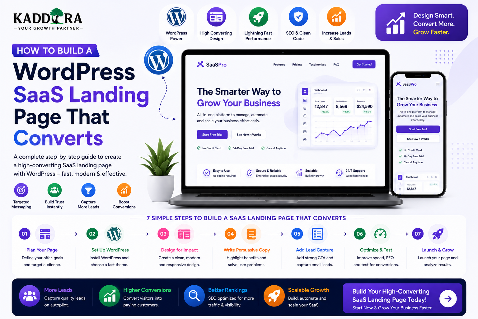
How to Build a WordPress SaaS Landing Page That Converts
Introduction
A SaaS landing page has one primary job:
Move the right visitor toward a meaningful next step.
That next step might be:
Start a free trial
Book a demo
Create an account
Request a quote
Join a waitlist
Subscribe
Contact sales
A landing page is different from a normal website page because it is designed around a specific audience, offer, campaign, feature, or conversion goal.
A typical SaaS landing page may follow:
Traffic ↓ Landing Page ↓ Problem ↓ Solution ↓ Benefits ↓ Proof ↓ CTA ↓ Signup / Demo
WordPress can provide a flexible platform for creating SaaS landing pages, especially when combined with reusable blocks, custom templates, forms, analytics, SEO tools, and performance optimization.
But a high-converting landing page is not created simply by installing a premium theme.
The page needs clear positioning, strong messaging, logical information flow, persuasive evidence, fast performance, responsive design, and a low-friction conversion path.
In this guide, you'll learn how to build a WordPress SaaS landing page that converts, how to structure each section, write better headlines, present features and benefits, use social proof, build effective CTAs, create campaign-specific pages, improve SEO, optimize mobile performance, measure conversions, and avoid common landing-page mistakes.
What Is a SaaS Landing Page?
A SaaS landing page is a focused page designed to persuade a specific audience to take a desired action related to a software product.
For example:
SaaS Product ↓ Landing Page ↓ "Start Free Trial"
The page may focus on:
A complete SaaS product
One feature
One customer segment
One industry
One use case
One advertising campaign
One product launch
SaaS Landing Page vs Homepage
A homepage often has many objectives.
It may contain:
Products Solutions Pricing Resources About Contact
A landing page is usually much more focused:
One Audience + One Offer + One Primary CTA
This reduced choice can make the intended user journey clearer.
Define the Conversion Goal First
Before designing anything, decide what the page should accomplish.
Examples:
Free Trial
Visitor ↓ Start Trial
Demo
Visitor ↓ Book Demo
Lead Generation
Visitor ↓ Request Information
Product Signup
Visitor ↓ Create Account
One landing page can have supporting actions, but the primary conversion should remain obvious.
Identify the Target Audience
A generic SaaS message often performs poorly because different customers care about different outcomes.
For example:
SaaS Product ↓ Small Businesses ↓ "Reduce manual reporting"
versus:
SaaS Product ↓ Enterprise Teams ↓ "Centralize reporting across departments"
The product may be the same.
The message changes because the audience changes.
Match the Page to Search or Campaign Intent
If a visitor searches:
CRM software for agencies
a page specifically focused on agencies is likely to be more relevant than a generic SaaS homepage.
The page should connect:
Visitor Intent ↓ Landing Page Message ↓ Product Capability ↓ Desired Outcome
Create a Strong Value Proposition
A SaaS value proposition should communicate:
What is the product?
Who is it for?
What problem does it solve?
What result does it provide?
A useful formula is:
Audience + Problem + Solution + Outcome
Avoid vague phrases such as:
"The future of business productivity."
Explain what the software actually helps people accomplish.
Build the Hero Section
The hero is often the first major section visitors see.
A strong hero can contain:
Headline Supporting Text Primary CTA Secondary CTA Product Visual Trust Signal
For example:
Headline: Automate Your Business Reporting Supporting: Create accurate reports without manually combining data from multiple systems. CTA: Start Free Trial
The exact wording should be based on the target customer's problem.
Write a Clear Headline
A useful SaaS headline often communicates an outcome.
Weak:
"Powerful Business Intelligence Platform."
Stronger:
"Turn Your Business Data Into Actionable Reports."
The headline should help a visitor understand the value quickly.
Write Supporting Copy
The supporting text can explain:
What the product does
Who it helps
How it works
Why the visitor should care
Keep it concise.
Don't turn the hero into a product manual.
Use One Primary CTA
A landing page should have a clear primary action.
Examples:
Start Free Trial Book a Demo Create Account Get Started
Use consistent wording for the primary CTA throughout the page where appropriate.
Secondary CTA
A secondary action can help visitors who aren't ready to convert.
Examples:
Watch Demo Explore Features View Pricing See How It Works
The secondary CTA should not compete with the primary objective.
Product Visuals
A SaaS landing page benefits from showing the actual product.
Possible visuals include:
Dashboard screenshots
Product videos
UI mockups
Interactive demos
Workflow diagrams
The visitor should be able to understand what they are buying.
Don't Fake Product Screenshots
Avoid creating misleading UI that does not represent the actual software.
Your landing page should set realistic expectations.
Trust is more valuable than a visually impressive but inaccurate demo.
Show the Problem
A strong landing page can explain the problem before introducing every feature.
For example:
Manual Reports ↓ Multiple Spreadsheets ↓ Data Errors ↓ Hours of Work
Then introduce the product as the solution.
Explain the Solution
After establishing the problem:
Problem ↓ SaaS Solution ↓ Automated Workflow ↓ Better Outcome
This creates a logical narrative.
Focus on Benefits Before Features
Features describe what the software contains.
Benefits explain why the customer should care.
For example:
Feature: Automated Alerts Benefit: Know about important changes before they become problems.
The strongest landing pages connect both.
Organize Features Into Categories
Instead of listing 30 features in one grid, group them.
For example:
Automation ├── Workflows ├── Rules └── Triggers Analytics ├── Reports ├── Dashboards └── Forecasting
This makes complex products easier to understand.
Use Feature Sections
Each major section can explain:
Feature ↓ How It Works ↓ Why It Matters ↓ Product Visual
This is more persuasive than a feature name followed by one generic sentence.
Show How the Product Works
A simple three-step explanation can reduce complexity.
For example:
1. Connect Your Data ↓ 2. Configure Workflow ↓ 3. Automate Reporting
This helps prospects visualize the experience.
Add Social Proof
Visitors may ask:
Does this actually work?
Provide credible evidence such as:
Customer testimonials
Case studies
Reviews
Customer logos
Verified results
Product usage metrics
Only publish claims that are accurate and supportable.
Customer Testimonials
A useful testimonial explains:
Problem ↓ Product Used ↓ Result
For example:
"We reduced manual reporting work and gave managers access to consistent dashboards."
Specific outcomes tend to be more useful than:
"Amazing product!"
Case Studies
A case study can follow:
Customer ↓ Challenge ↓ Implementation ↓ Result
This shows prospects how the product works in a real environment.
Customer Logos
If permitted, customer logos can provide a quick trust signal.
Use genuine customer relationships.
Don't display logos simply because they are recognizable.
Usage Statistics
Numbers can be powerful when accurate.
Examples:
10,000+ Users 1M+ Reports Generated 99.9% Availability
The page should explain what the numbers represent where necessary.
Never fabricate statistics.
Security and Trust Section
Business customers may want to know:
How data is protected
Where it is stored
How access is controlled
How backups work
What security practices exist
A SaaS landing page may link to a dedicated security page for deeper information.
Only make claims that can be substantiated.
Integration Section
Show how the SaaS fits into existing workflows.
For example:
CRM + Email + Analytics + Payments + Automation
Each integration should explain what it actually enables.
Use Case Sections
A SaaS product may solve different problems for different audiences.
For example:
For Agencies → Manage client reporting For Sales Teams → Track pipeline activity For Operations → Automate workflows
Dedicated use-case sections can improve relevance.
Industry-Specific Landing Pages
A SaaS company may create separate pages for:
Healthcare Education Real Estate Retail Professional Services
Each page should contain genuinely tailored messaging and examples.
Avoid creating dozens of near-identical pages only to target slightly different keywords.
Pricing Section
Some SaaS landing pages include pricing directly.
A simple structure might be:
Plan
Best For
Price
Key Difference
Starter
Small teams
Varies
Core features
Professional
Growing teams
Varies
Advanced tools
Business
Larger teams
Varies
More scale
Enterprise
Complex needs
Custom
Custom terms
The exact pricing model should match the actual product.
Make Pricing Easy to Compare
Visitors should quickly understand:
What each plan includes
User limits
Usage limits
Support level
Billing frequency
Avoid creating a pricing table so dense that customers need a spreadsheet to understand it.
Annual vs Monthly Toggle
A pricing page can allow:
Monthly Annual
If the annual plan saves money, show the effective difference clearly and accurately.
Free Trial CTA
If a free trial exists, communicate:
Trial duration
What's included
When billing begins
Cancellation terms
Don't use hidden billing conditions.
Demo CTA
For complex SaaS products, a demo can be more useful than immediate signup.
A demo page should explain:
Who the Demo Is For What Will Be Covered Expected Duration What Happens Next
This reduces uncertainty.
Reduce Form Friction
A demo or lead form should request only information that is genuinely necessary.
Instead of:
Name Email Phone Company Job Title Company Size Country Industry Revenue Team Size Problem Budget Timeline
consider whether every field is needed at the initial stage.
Long forms can reduce conversions.
Use Smart Multi-Step Forms Carefully
Complex lead qualification can be divided into steps:
Step 1 Basic Contact ↓ Step 2 Business Needs ↓ Step 3 Qualification
But adding steps does not automatically improve conversion.
Test the actual results.
Add FAQs
A SaaS FAQ section can address:
Pricing
Trial
Integrations
Security
Data
Support
Cancellation
Setup
Migration
Good FAQs remove objections before the visitor leaves the page.
Handle Objections Directly
Potential customers may worry:
Is this difficult to use?
Will it work with my tools?
Can I cancel?
Is my data secure?
How long does setup take?
Will I need technical expertise?
Address these questions clearly.
Add a Final CTA
At the end of the page, repeat the primary action.
For example:
Ready to simplify your workflow? [ Start Free Trial ]
The final CTA should summarize the value rather than simply repeating "Buy Now."
Build Dedicated Campaign Landing Pages
Paid campaigns should often send visitors to a focused landing page rather than a generic homepage.
For example:
Google Ad ↓ SaaS Landing Page ↓ Matching Message ↓ Conversion
The landing page should reflect the promise made in the advertisement.
Message Match
If the ad says:
"Automate WooCommerce Sales Reports"
the landing page should immediately discuss:
WooCommerce Sales Reports Automation
A mismatch can create confusion and reduce conversions.
WordPress Landing Page Templates
A reusable SaaS landing-page template can include:
Hero Problem Solution Features Use Cases Proof Integrations Pricing FAQ CTA
This template can then be customized for different products and campaigns.
Reusable WordPress Block Patterns
Modern WordPress block patterns can speed up landing-page creation.
For example:
SaaS Hero Feature Grid Testimonial Logo Row Pricing FAQ CTA
The structure remains reusable while content and branding change.
Create a SaaS Design System
Reusable design tokens can define:
Typography
Colors
Buttons
Spacing
Cards
Forms
Borders
Responsive behavior
This keeps landing pages visually consistent.
Keep the Landing Page Fast
A SaaS landing page may contain:
Videos
Animations
Product screenshots
Analytics
Chat widgets
Forms
Third-party scripts
All of these can increase page weight.
Optimize:
Images
Video loading
JavaScript
CSS
Fonts
Third-party tools
Caching
Optimize Images
Use appropriate:
Dimensions
Compression
Formats
Responsive variants
Don't load a 4K screenshot when a smaller version is sufficient for the page.
Be Careful With Video
Autoplay videos can create:
Large downloads
CPU usage
Mobile performance problems
Consider lazy loading or lightweight previews before loading the full media experience.
Mobile SaaS Landing Page Design
A landing page must work well on:
Smartphones
Tablets
Laptops
Large desktop screens
Check:
Headline CTA Pricing Forms Tables Screenshots Navigation FAQ
Mobile visitors should not need to zoom to understand the page.
Mobile CTA Placement
Keep important actions easy to reach.
For example:
Hero [Start Trial] Features [Start Trial] Pricing [Start Trial]
Repeating the primary CTA can be useful when the page is long, provided it does not become intrusive.
SaaS Landing Page Accessibility
A conversion-focused page should remain accessible.
Consider:
Semantic headings
Keyboard navigation
Focus states
Accessible buttons
Form labels
Sufficient contrast
Alternative text
Error messages
Accessibility and conversion optimization can reinforce each other.
SaaS Landing Page SEO
Although landing pages often focus on conversion, they can also attract organic traffic.
Optimize:
Title
Meta description
H1
Headings
URL
Internal links
Content relevance
Page speed
Mobile usability
Don't stuff keywords into every section.
Search Intent and Landing Pages
A commercial landing page should target an appropriate intent.
For example:
"CRM automation software"
has different intent from:
"What is CRM automation?"
Create a landing page for commercial intent and an educational article for informational intent.
Internal Linking
Connect landing pages with relevant content.
For example:
SaaS Landing Page ↓ Feature Guide ↓ Use Case Article ↓ Case Study
This helps visitors evaluate the product without forcing everything onto one page.
Conversion Tracking
Track important events such as:
CTA clicks
Trial signups
Demo requests
Form submissions
Pricing interactions
Account creation
A useful funnel is:
Visitors ↓ CTA Click ↓ Signup ↓ Activation ↓ Paid Customer
Don't Optimize for Clicks Alone
A button can get many clicks without producing valuable customers.
Measure:
Click ↓ Signup ↓ Activation ↓ Revenue
The final business outcome matters more than the number of button clicks.
A/B Testing
Potential experiments include:
Headline
CTA
Pricing layout
Form length
Hero visual
Social proof placement
Feature ordering
Change one significant element at a time when practical so the results are easier to interpret.
Use enough data to make decisions rather than reacting to very small samples.
Heatmaps and Session Analysis
Behavioral tools can help identify:
Where users stop scrolling
Which sections attract attention
Which buttons are ignored
Where forms cause friction
Use such tools in accordance with applicable privacy requirements.
Use Exit Intent Carefully
Exit-intent messages can sometimes recover visitors.
For example:
"Still evaluating the product?" → Watch Demo
But aggressive pop-ups can damage the experience.
Don't interrupt mobile users with unnecessary overlays.
Landing Page and A/B Testing Strategy
A practical process is:
Baseline ↓ Identify Friction ↓ Hypothesis ↓ Test ↓ Measure ↓ Keep / Revert
For example:
"Reducing demo-form fields from eight to four will increase qualified submissions."
Then measure the result.
SaaS Landing Page Trust Signals
Trust can come from:
Clear company information
Real customer evidence
Transparent pricing
Security information
Support details
Documentation
Accurate claims
Avoid fake urgency and fabricated proof.
Add a Real Support Path
Visitors may have questions that the page cannot answer.
Provide:
Contact sales
Support documentation
FAQ
Chat
The exact options should match the business's ability to support them.
Create Comparison Pages
Visitors considering competitors may search for comparisons.
For example:
Your Product vs Alternative
Comparison pages should be factual and respectful.
Avoid unsupported claims such as:
"We are always better."
Explain where each solution may fit.
Common WordPress SaaS Landing Page Mistakes
Generic Headline
Visitors don't understand the product.
Too Many Features
The message becomes difficult to scan.
Weak Product Visual
Visitors cannot visualize the software.
Too Many CTAs
Users don't know which action matters.
Long Forms
High friction reduces submissions.
Fake Social Proof
Trust disappears when claims cannot be verified.
Slow Pages
Heavy media and scripts hurt usability.
Poor Mobile Design
Potential customers abandon the page.
No Conversion Tracking
The team cannot identify what is working.
Sending Every Campaign to the Homepage
The page doesn't match campaign intent.
Best Practices for WordPress SaaS Landing Pages
A high-quality SaaS landing page should:
Define one primary conversion goal.
Target a specific audience.
Explain the problem clearly.
Communicate a specific value proposition.
Focus on outcomes.
Show the actual product.
Organize features logically.
Include credible proof.
Address objections.
Explain pricing clearly.
Use strong CTAs.
Keep forms focused.
Optimize mobile performance.
Implement accessibility.
Use sound SEO practices.
Track meaningful conversions.
Test important page elements.
Keep product claims accurate.
Professional SaaS Landing Page Architecture
A reusable structure can look like:
Traffic Source ↓ Targeted Landing Page ↓ Hero ↓ Problem ↓ Solution ↓ Benefits ↓ Features ↓ Proof ↓ Pricing ↓ FAQ ↓ CTA ↓ Signup / Demo ↓ Activation
The landing page is only one part of the funnel.
The signup and onboarding experience also influence conversion.
Landing Page and Product Activation
A common mistake is optimizing the landing page while ignoring what happens after signup.
A better funnel is:
Landing Page ↓ Signup ↓ Onboarding ↓ First Success ↓ Activation ↓ Paid Customer
If customers sign up but never reach value, improving the landing page alone won't solve the problem.
Why choose ThemeKaddora?
ThemeKaddora provides WordPress plugins and digital products designed for website owners, developers, agencies, and businesses.
Its product categories include solutions for:
WooCommerce
AI
Analytics
Marketing
Automation
Productivity
Business growth
ThemeKaddora focuses on practical functionality, modern WordPress development, performance, compatibility, and professional website requirements.
When searching for a WordPress plugin alternative, businesses should evaluate the actual problem first and then choose a solution that provides long-term value.
Conclusion
Building a WordPress SaaS landing page that converts requires more than attractive design.
The page should guide visitors through a clear sequence:
Audience
→ Problem
→ Solution
→ Benefits
→ Features
→ Proof
→ Pricing
→ CTA
The strongest landing pages also provide:
Fast Performance
→ Mobile Experience
→ Accessibility
→ Trust
→ Clear Messaging
→ Meaningful Measurement
WordPress makes this practical through reusable templates, block patterns, custom themes, plugins, forms, analytics integrations, and content management.
For ThemeKaddora, a reusable SaaS landing-page system can speed up the launch of CRM, ERP, AI, analytics, automation, HRMS, education, and other software products while maintaining a consistent design foundation.
But the most important principle remains simple:
Don't design the page around what the company wants to say. Design it around what the customer needs to understand before taking action.
A high-converting SaaS landing page makes the value clear, reduces uncertainty, builds trust, and provides an obvious next step.
Frequently Asked Questions
What is a SaaS landing page?
A SaaS landing page is a focused page designed to explain a software product and encourage visitors to take a specific action such as starting a trial, booking a demo, or creating an account.
Can I build a SaaS landing page with WordPress?
Yes. WordPress can create SaaS landing pages using themes, block patterns, page templates, custom development, forms, analytics, and integrations.
What should a SaaS landing page contain?
Common sections include a hero, problem, solution, benefits, features, product visuals, social proof, integrations, pricing, FAQs, and a strong call to action.
Should a SaaS landing page have multiple CTAs?
It can have repeated instances of the same primary CTA and a secondary action, but too many competing calls to action can make the page confusing.
Should SaaS pricing appear on the landing page?
It depends on the sales model. Self-service SaaS products often benefit from transparent pricing, while complex enterprise products may focus on demos and sales conversations.
How long should a SaaS landing page be?
There is no universal ideal length. It should be long enough to answer the customer's important questions and overcome relevant objections without adding unnecessary content.
Does SaaS landing-page design affect SEO?
Design itself is not a ranking guarantee, but a well-built page can support crawlability, content clarity, performance, mobile usability, accessibility, and user experience.
Can a SaaS landing page rank in Google?
Yes. A relevant landing page can attract organic search traffic when it provides useful content that matches search intent and follows sound technical SEO practices.
Should I create separate landing pages for different audiences?
Often yes. A dedicated page can make messaging more relevant for different industries, use cases, or customer segments, provided each page offers genuinely differentiated value.
Can I use WordPress block patterns for SaaS landing pages?
Yes. Reusable block patterns can speed up the creation of hero sections, feature grids, testimonials, pricing sections, FAQs, and CTAs.
Why choose Themekaddora?
Themekaddora provides lightweight, responsive, SEO-friendly WordPress themes with fast performance, WooCommerce compatibility, flexible customization, accessibility-conscious design, modern templates, regular updates, and professional support—providing a strong foundation for businesses building digital products and product-focused websites.
Comments (0)