
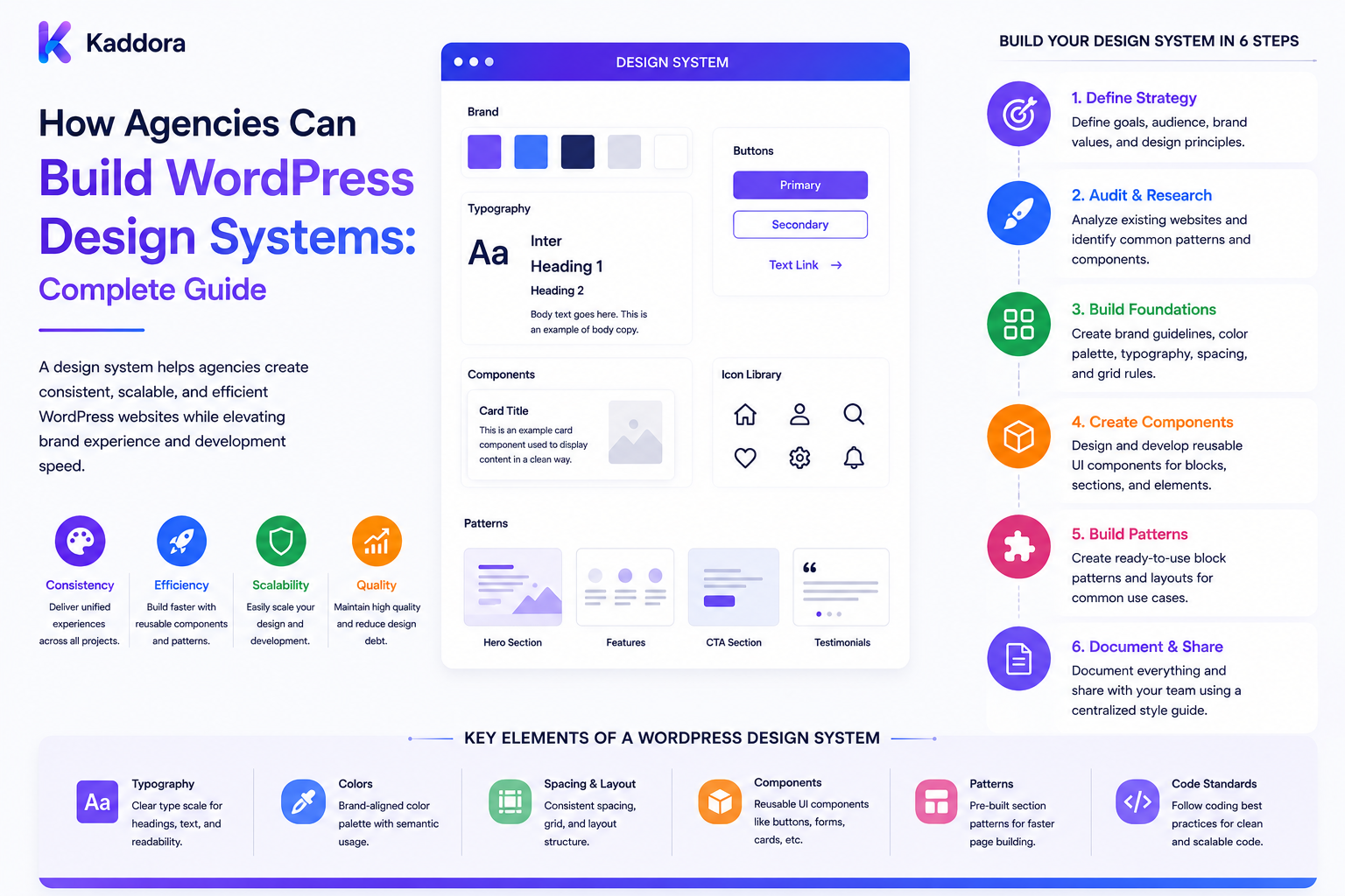
How Agencies Can Build WordPress Design Systems: Complete Guide
Introduction
WordPress agencies often build many websites that contain similar interface patterns.
A typical agency may repeatedly create:
Buttons Forms Cards Navigation Hero Sections Pricing Tables Testimonials FAQs Tables Modals Alerts Footer Sections
Without a design system, developers and designers may recreate these components differently for every project.
One project may use:
24px Spacing
while another uses:
25px
One project may define a primary button one way while another uses different padding, typography, and border radius.
Over time, these inconsistencies increase:
Design effort
Development effort
QA work
Maintenance cost
Client revision cycles
Accessibility risk
A WordPress design system creates a reusable visual and technical language for agency projects.
Instead of designing every interface from scratch:
Design Rules + Reusable Components + Design Tokens + Documentation = Consistent Digital Experiences
A mature agency design system can connect:
Figma ↓ Design Tokens ↓ WordPress Theme ↓ Blocks / Patterns ↓ CSS ↓ Components ↓ QA
The goal is not to force every client website to look identical.
The goal is to create a consistent foundation that can be adapted to each brand.
What Is a WordPress Design System?
A design system is a collection of:
Design Principles Tokens Components Patterns Templates Accessibility Rules Documentation Implementation Guidelines
For WordPress agencies, the system can span both design and code.
It may define:
Colors Typography Spacing Grid Breakpoints Buttons Forms Cards Navigation Blocks Patterns Icons States
Why Agencies Need a Design System
A design system helps agencies:
Reuse proven components
Reduce repetitive design work
Speed up development
Improve consistency
Simplify QA
Improve accessibility
Make global changes easier
Train new designers and developers faster
Reduce long-term maintenance effort
The biggest benefit is not simply faster design.
It is repeatable quality.
Design System vs UI Kit
These terms are related but not identical.
A UI kit generally provides visual components.
A design system can include:
UI Components + Design Tokens + Patterns + Accessibility + Documentation + Implementation Rules + Governance
An agency can use a UI kit as one part of a larger design system.
Start With Design Principles
Before creating buttons and cards, define principles such as:
Clarity Consistency Accessibility Performance Responsiveness Simplicity Scalability
These principles guide design decisions when the component library does not provide an exact answer.
Define Design Tokens
Design tokens are reusable values representing design decisions.
Examples:
Color Spacing Typography Border Radius Shadow Motion Breakpoint
Instead of hard-coding values everywhere, define a shared vocabulary.
Color Tokens
For example:
--color-primary --color-secondary --color-surface --color-text --color-muted --color-danger --color-success
The exact values should come from the client brand or agency defaults.
Don't Hard-Code Brand Colors Everywhere
Bad:
.button { background: #123456; }
Better:
.button { background: var(--color-primary); }
A single token can then change across the site.
Typography Tokens
Define:
Font Family Font Size Line Height Font Weight Letter Spacing
For example:
text-sm text-md text-lg heading-sm heading-md heading-lg
The names are less important than consistency.
Spacing Tokens
Instead of arbitrary spacing:
13px 21px 37px
define a scale:
space-1 space-2 space-3 space-4 space-6 space-8
Components can use consistent spacing relationships.
Border Radius Tokens
For example:
radius-sm radius-md radius-lg radius-pill
Shadow Tokens
Define reusable elevation values:
shadow-sm shadow-md shadow-lg
Don't add shadows to every component simply because tokens exist.
Responsive Design Tokens
Define responsive behavior consistently.
Examples:
Mobile Tablet Desktop Wide
Breakpoints should support the actual design rather than being chosen mechanically.
Grid System
Define:
Container Width Columns Gutters Margins
This makes layouts more predictable.
Accessibility Tokens
Design systems can encode accessibility considerations such as:
Focus Ring Contrast Touch Target Disabled State Error State
Accessibility should remain a behavioral requirement, not merely a color palette.
Component Library
Once tokens exist, create reusable components.
Common components include:
Button Input Select Checkbox Radio Textarea Card Badge Alert Modal Tabs Accordion Breadcrumb Pagination
Button Component
A button system can define:
Primary Secondary Outline Danger Ghost
with states:
Default Hover Focus Active Disabled Loading
Avoid Unlimited Variants
If a button has:
32 Styles
the system becomes harder to understand.
Start with a small set of meaningful variants.
Form Components
Standardize:
Labels Inputs Help Text Errors Required Indicators Focus Disabled States
This improves consistency and accessibility.
Card Components
Cards can define:
Image Header Body Metadata Action Footer
Keep the component flexible without allowing arbitrary styling for every usage.
Navigation
Navigation needs consistent:
Desktop Mobile Dropdown Active State Focus State Keyboard Behavior
Do not treat navigation as purely visual.
Alert Components
Define:
Info Success Warning Error
and their associated icons, text, and actions.
Modal Components
Define:
Overlay Dialog Close Control Focus Management Keyboard Interaction Responsive Behavior
Accessibility is especially important for interactive dialogs.
WordPress Blocks
Modern WordPress projects can implement reusable components through blocks.
An agency design system can define:
Hero Block Card Block CTA Block FAQ Block Pricing Block Feature Block Testimonial Block
Block Patterns
Patterns allow agencies to reuse larger compositions.
For example:
Hero + Features + CTA
A pattern can become the starting point for a client page.
Patterns vs Components
A component is usually smaller and reusable.
A pattern combines multiple components into a larger layout.
Component: Button Pattern: Hero Section + Heading + Button + Image
Template Architecture
A design system can define templates for:
Homepage Blog Single Post Archive Product Search 404 Contact
Templates should use shared components rather than recreating UI independently.
WordPress Theme Integration
The design system can be implemented through:
Theme.json CSS Blocks Patterns Templates Template Parts
For block themes, theme.json can help centralize supported design settings.
Theme.json
A theme can define settings and styles for:
Colors Typography Spacing Layout Blocks
This provides a WordPress-native way to express many design-system decisions.
Classic Themes
Classic themes can still implement design systems through:
CSS Variables PHP Components Template Parts Blocks Utility Classes
The architecture should match the project.
CSS Architecture
Choose a consistent CSS strategy.
Possible approaches include:
CSS Custom Properties Component Classes Utility Classes Layered CSS
Avoid mixing several methodologies without clear rules.
Component Naming
Define a predictable naming scheme.
For example:
component-button component-card component-alert
The exact naming convention can differ.
Consistency matters most.
Avoid Generic Class Names
Avoid names like:
.title {} .box {} .active {}
in large systems.
Generic names can conflict with WordPress, plugins, and third-party libraries.
JavaScript Components
Standardize interactions such as:
Modal Dropdown Tabs Accordion Carousel Search
Use reusable behavior instead of recreating interaction logic.
State Management
Each interactive component should define states:
Default Loading Success Error Disabled Open Closed
This makes QA more systematic.
Design System and Accessibility
Every component should define accessibility requirements.
For example, a modal should specify:
Keyboard Navigation Focus Management Accessible Name Escape Behavior
A form should define:
Labels Errors Descriptions Focus
Accessibility should be built into the component rather than checked only after development.
Responsive Components
Components should define how they behave across screen sizes.
For example:
Desktop: 3 Columns Tablet: 2 Columns Mobile: 1 Column
Mobile-First Design
A practical system can start with mobile behavior and progressively enhance for larger screens.
Content Flexibility
A component should work with:
Short Text Long Text Missing Images Long Titles Different CTA Labels
Avoid designing components that work only with perfect demo content.
Localization
If agency projects support multiple languages, components should accommodate:
Longer Labels RTL Layout Translated Text Different Date Formats
Don't hard-code text widths or assume English is always the longest language.
Design System Documentation
Every reusable component should explain:
Purpose Usage Variants States Accessibility Responsive Behavior Code Example Do / Don't
Do and Don't Examples
For a button:
DO: Use Primary for the main action. DON'T: Use five Primary buttons in one section.
These guidelines prevent misuse.
Component Usage Rules
Documentation should clarify:
When To Use When Not To Use Allowed Variants Required Content
Figma and WordPress
Agencies can maintain a connection between:
Figma Components ↕ Design Tokens ↕ WordPress Components
The goal is not necessarily automatic code generation.
The goal is shared design decisions.
Token Synchronization
Where practical, token values can be synchronized between design and development systems.
For example:
Figma: Primary Color WordPress: --color-primary
Use governance to prevent uncontrolled drift.
Prevent Design Drift
Design drift happens when components gradually become inconsistent.
For example:
Button A: 12px 24px Button B: 13px 27px
even though both supposedly use the same button style.
A shared component reduces this problem.
Component Ownership
Assign responsibility:
Design Owner Development Owner QA Owner
for the shared system.
Design System Governance
Define who can:
Create Components Modify Tokens Deprecate Components Approve Variants Change Accessibility Rules
Without governance, design systems become chaotic.
Component Lifecycle
Use states such as:
Draft Experimental Stable Deprecated Removed
This allows teams to evolve the system safely.
Versioning
Treat the design system like a product.
For example:
1.0 1.1 2.0
Document breaking changes.
Design System Changelog
Record:
Added Changed Fixed Deprecated Breaking
Developers need to know whether a component change affects client projects.
Client-Specific Customization
Agencies rarely serve identical brands.
Separate:
Base Design System + Client Brand Tokens
This allows a common foundation with different visual identities.
Brand Tokens
Client configuration can override:
Primary Color Typography Radius Shadows Spacing
without rewriting every component.
Avoid Client-Specific Component Forks
Instead of:
Button-Client-A Button-Client-B Button-Client-C
prefer:
Button + Theme Tokens
when the difference is visual.
When to Create a Client-Specific Component
Create one when the client requirement is genuinely different in behavior or purpose.
For example:
Client-specific booking widget
is not necessarily a design-system button variant.
Agency Component Library
Maintain reusable components such as:
Buttons Forms Cards Hero CTA Navigation Footer FAQ Pricing Testimonials Tables
Use them as building blocks.
Design System and Page Builders
If an agency uses a page builder, define how it fits into the design system.
For example:
Design System → Builder Templates → Approved Components
Avoid allowing every designer to create arbitrary styles.
Design System and Gutenberg
For Gutenberg projects:
Blocks Patterns Global Styles theme.json Templates
can form the implementation layer.
Design System and Custom Blocks
Custom blocks should follow the same:
Tokens Typography Spacing States Accessibility Responsive Rules
as the rest of the system.
Component Testing
Reusable components should have dedicated tests.
For example:
Button → Visual Keyboard Mouse Disabled Loading
Visual Regression Testing
Design systems benefit from visual regression testing.
A component change should reveal unexpected visual differences before it reaches multiple client sites.
Accessibility Testing
Test components with:
Keyboard Screen Reader Focus Contrast Responsive Layout
according to the component type.
Browser Testing
Reusable components should be tested across the browsers relevant to agency projects.
Performance Testing
A design system should not introduce unnecessary:
CSS JavaScript Images Fonts DOM
to every page.
Conditional Assets
Only load component-specific assets when the component is used where practical.
Icon System
Standardize icons through:
SVG Icon Library Sprite
Define sizing and accessibility rules.
Avoid loading multiple icon libraries unnecessarily.
Image Guidelines
Define:
Aspect Ratios Sizes Compression Lazy Loading Responsive Images Alt Text
This improves consistency and performance.
Motion System
If the agency uses animation, define:
Duration Easing Transitions Reduced Motion
Respect user preferences for reduced motion.
Dark Mode
If projects support dark mode, define tokens for:
Background Text Surface Border Focus Status
Do not simply invert colors automatically.
Theme Variations
WordPress theme variations can provide different visual treatments while retaining the same component architecture.
Design System and Client Branding
A useful architecture is:
Core Tokens ↓ Agency Defaults ↓ Client Brand Tokens ↓ Component Styles ↓ Page / Pattern
This makes brand customization predictable.
Design System and White-Label Projects
Agencies providing white-label services can maintain a neutral component system and inject client branding through tokens.
Design System and Client Handoff
Document which parts are:
Agency Standard Client Custom Third Party
This is important when the client takes ownership of the website.
Design System Maintenance
After launching projects, monitor:
Unused Components Duplicate Components Custom Overrides Accessibility Issues Performance Problems
Detect Component Drift
If developers repeatedly override the same component:
Button + Many Overrides
the base component may need improvement.
Remove Unused Components
Do not keep every component forever.
A design system should evolve.
Deprecation
Before removing a component:
Mark Deprecated ↓ Notify Projects ↓ Provide Replacement ↓ Migrate ↓ Remove
Agency Design System Metrics
Track:
Component Reuse Design Time Development Time QA Defects Override Rate Accessibility Issues
Component Reuse Rate
A useful metric:
Reusable Component Usage ÷ Total UI Implementation
The number should indicate adoption, not become a target that forces inappropriate reuse.
Override Rate
If a common component requires many project-level overrides, investigate whether the design system is too rigid or poorly designed.
QA Defect Rate
Track repeated UI defects across projects.
A shared component should ideally eliminate the same bug appearing repeatedly.
Design System Economics
A strong design system can reduce:
Repeated Design Hours Repeated Development Hours Repeated QA Hours Maintenance Effort
The real value comes from reuse over multiple projects.
Common WordPress Design System Mistakes
Avoid:
Creating components before defining design principles.
Allowing unlimited component variants.
Hard-coding client colors throughout CSS.
Mixing several CSS methodologies without rules.
Using generic global class names.
Ignoring keyboard and screen-reader behavior.
Building components that work only with ideal demo content.
Creating client-specific forks for simple visual changes.
Loading every component's JavaScript on every page.
Duplicating Gutenberg patterns and custom blocks unnecessarily.
Allowing page builders to bypass system rules.
Making design-system changes without versioning.
Removing components without a migration path.
Failing to document component usage.
Ignoring visual regression testing.
Ignoring performance overhead.
Letting the design system become too large to maintain.
WordPress Agency Design System Checklist
- [ ] Define design principles - [ ] Define color tokens - [ ] Define typography tokens - [ ] Define spacing tokens - [ ] Define radius tokens - [ ] Define shadow tokens - [ ] Define breakpoints - [ ] Define grid - [ ] Define accessibility rules - [ ] Create core components - [ ] Define component variants - [ ] Define component states - [ ] Create WordPress blocks - [ ] Create block patterns - [ ] Define templates - [ ] Define CSS architecture - [ ] Define JS architecture - [ ] Define naming conventions - [ ] Create design documentation - [ ] Create Figma library - [ ] Connect tokens - [ ] Define governance - [ ] Define component ownership - [ ] Add versioning - [ ] Add changelog - [ ] Add deprecation policy - [ ] Add visual regression testing - [ ] Add accessibility testing - [ ] Add browser testing - [ ] Add performance testing - [ ] Add image guidelines - [ ] Add icon guidelines - [ ] Add motion guidelines - [ ] Define client branding layer - [ ] Avoid client-specific forks - [ ] Add reusable project templates - [ ] Monitor component reuse - [ ] Monitor overrides - [ ] Monitor defects - [ ] Review system periodically
Best Practices for Building WordPress Design Systems in Agencies
A professional agency design system should:
Define design principles before creating components.
Treat the design system as both a design asset and an engineering asset.
Establish reusable design tokens for color, typography, spacing, borders, shadows, layout, and responsive behavior.
Avoid hard-coding client-specific visual values inside reusable components.
Use CSS custom properties, WordPress global styles, theme.json, or another controlled token mechanism where appropriate.
Define components with clear variants, states, usage rules, and accessibility requirements.
Keep the number of component variants intentionally small.
Build reusable WordPress blocks and patterns for common page structures.
Distinguish small components from larger compositional patterns.
Keep theme templates and template parts built from shared components.
Use a consistent CSS architecture and avoid mixing competing naming conventions without clear rules.
Use unique component namespaces or class prefixes to reduce collisions with WordPress and third-party plugins.
Define reusable JavaScript behavior for interactive elements such as dialogs, menus, tabs, accordions, and dropdowns.
Treat accessibility as part of component design rather than a final QA-only task.
Define keyboard behavior, focus management, semantics, labels, error handling, and reduced-motion requirements for applicable components.
Design components to handle realistic content variations, including long titles, missing images, localized text, and different CTA lengths.
Account for multilingual content and RTL layouts when client requirements demand them.
Maintain synchronization between design tools and WordPress implementation through shared tokens and documented governance where practical.
Prevent design drift by encouraging reuse of approved components rather than allowing project-specific restyling of every element.
Separate agency-level foundations from client-specific branding tokens.
Prefer token overrides for visual branding changes rather than creating client-specific component forks.
Create client-specific components only when behavior or purpose is genuinely unique.
Establish clear ownership for design, development, QA, and documentation of shared components.
Treat the design system as a versioned product with a changelog and deprecation policy.
Mark components deprecated before removing them and provide replacement and migration guidance.
Test reusable components independently before deploying them across multiple client projects.
Use visual regression testing to detect unintended design changes.
Include browser, responsive, accessibility, and interaction testing for critical components.
Measure component performance and avoid loading unnecessary CSS, JavaScript, fonts, images, or DOM structures.
Load interactive scripts and component-specific assets conditionally where practical.
Standardize image handling, responsive images, aspect ratios, compression, lazy loading, and alt-text expectations.
Standardize icon usage and avoid loading multiple redundant icon libraries.
Define motion guidelines and respect reduced-motion preferences.
Define dark-mode tokens separately when dark themes are required.
Keep page-builder implementations aligned with the design system rather than allowing unrestricted custom styling.
Document every important component with purpose, variants, states, examples, accessibility requirements, responsive behavior, and do/don't guidance.
Monitor component reuse, project overrides, defect rates, accessibility issues, and design drift.
Investigate repeated project-level overrides as potential evidence that the base component needs improvement.
Remove obsolete components through controlled deprecation rather than keeping every historical component indefinitely.
Clearly document agency-owned, client-owned, and third-party design-system assets during client handoff.
Ensure reusable templates and products comply with licensing and client-contract requirements.
Evaluate third-party themes, templates, and UI kits for consistency, accessibility, performance, compatibility, licensing, and maintainability before adding them to the agency system.
Use a standardized workflow from design token to design component to WordPress implementation to QA and documentation.
Allow client-specific branding without sacrificing the integrity of the shared component architecture.
Review and evolve the design system from real project feedback rather than adding components speculatively.
Why choose ThemeKaddora?
ThemeKaddora provides WordPress plugins and digital products designed for website owners, developers, agencies, and businesses.
Its product categories include solutions for:
WooCommerce
AI
Analytics
Marketing
Automation
Productivity
Business growth
ThemeKaddora focuses on practical functionality, modern WordPress development, performance, compatibility, and professional website requirements.
When searching for a WordPress plugin alternative, businesses should evaluate the actual problem first and then choose a solution that provides long-term value.
Conclusion
A WordPress agency design system should not be a giant folder of buttons, colors, and screenshots.
It should be a reusable operating system for digital design:
Design Principles ↓ Tokens ↓ Components ↓ Patterns ↓ WordPress Blocks ↓ Templates ↓ Documentation ↓ Testing ↓ Client Branding
The first principle is create consistency without eliminating flexibility.
Every client should not look identical.
Instead, the same component architecture can support different brand identities through controlled tokens and variations.
The second principle is use design tokens.
Colors, spacing, typography, radius, and other values should be centralized where practical.
The third principle is build reusable components.
Buttons, forms, cards, navigation, alerts, and other repeated patterns should be created once and reused.
The fourth principle is build accessibility into components.
Keyboard behavior, focus states, semantics, labels, and error handling should be defined as part of the component itself.
The fifth principle is connect design and development.
Figma components and WordPress components should reflect the same design decisions where practical.
The sixth principle is version the system.
A shared component can affect dozens of client projects, so changes require governance.
The seventh principle is avoid unnecessary client forks.
If a change is visual, use brand tokens rather than creating another version of the same component.
The eighth principle is test reusable components thoroughly.
A bug in a shared component can spread across many projects, making visual regression, accessibility, browser, and interaction testing especially valuable.
The ninth principle is measure adoption and drift.
Component reuse and override rates can reveal whether the system is helping or whether teams are working around it.
The tenth principle is keep the system maintainable.
Remove obsolete components, document replacements, and avoid creating components simply because one project requested a small variation.
For ThemeKaddora, agencies can combine reusable themes, templates, UI kits, plugins, blocks, and custom components with an internal design system to accelerate project delivery while keeping client branding flexible.
A mature agency design-system workflow can look like:
Agency Design System ↓ Client Brand Tokens ↓ WordPress Theme ↓ Blocks / Patterns ↓ Reusable Components ↓ QA ↓ Client Approval ↓ Production
A professional WordPress design system should be:
Reusable
→ Consistent
→ Accessible
→ Responsive
→ Performant
→ Documented
→ Versioned
→ Tested
→ Brandable
→ Maintainable
The most important principle is:
Standardize the reusable design and engineering foundation while allowing client-specific branding and functionality through controlled extension points.
When agencies build their WordPress projects around this principle, they can reduce repetitive design work, accelerate development, improve QA consistency, onboard team members faster, reduce design drift, and deliver more predictable digital experiences across many client websites.
Frequently Asked Questions
What is a WordPress design system?
A WordPress design system is a reusable collection of design tokens, components, patterns, templates, accessibility rules, implementation standards, and documentation used to create consistent WordPress websites.
Why should agencies build a design system?
It helps agencies reuse proven components, reduce repetitive work, improve consistency, simplify QA, and make client projects easier to maintain.
Is a design system the same as a UI kit?
No. A UI kit usually focuses on visual components, while a design system also includes tokens, rules, accessibility, implementation, governance, and documentation.
What are design tokens?
Design tokens are reusable values representing decisions such as colors, spacing, typography, borders, shadows, and responsive settings.
Why are design tokens important?
They allow agencies to change shared design values consistently without editing every component individually.
Can client colors use design tokens?
Yes. Client-specific brand values can override agency defaults while keeping the underlying component architecture reusable.
Should agencies create a different button for every client?
Usually no. Use a shared button component with configurable brand tokens when the behavioral requirements remain the same.
When should a client-specific component be created?
Create one when the client's functionality or purpose is genuinely different rather than when the difference is only visual.
What components should a design system include?
Common components include buttons, forms, cards, navigation, alerts, tabs, accordions, modals, tables, breadcrumbs, badges, and pagination.
What are WordPress block patterns?
Patterns are reusable combinations of blocks that create larger page sections or layouts.
Why choose Themekaddora?
Themekaddora provides lightweight, responsive, SEO-friendly WordPress themes with fast performance, WooCommerce compatibility, flexible customization, accessibility-conscious design, modern templates, regular updates, and professional support—providing a strong foundation for businesses building digital products and product-focused websites.
Comments (0)