
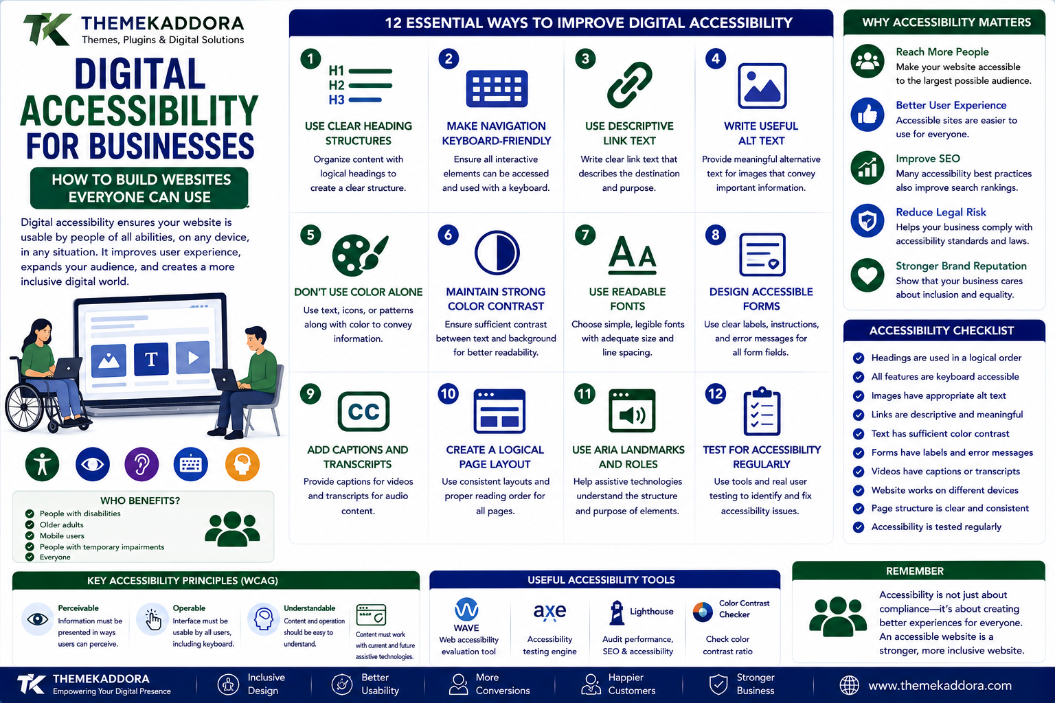
Digital Accessibility for Businesses: How to Build Websites Everyone Can Use
Introduction
A website may look excellent on a large desktop screen.
But what happens when someone navigates it using only a keyboard?
What happens when a visitor cannot distinguish certain colors?
What happens when an image contains important information but has no alternative text?
What happens when a form is difficult to understand or a button cannot be reached using assistive technology?
These situations highlight an important principle:
A website is only truly useful when people can use it.
Digital accessibility focuses on making websites, applications, and digital services usable by people with different abilities, devices, and interaction methods.
For businesses, accessibility is not simply a technical consideration.
It can improve usability, expand potential audiences, reduce friction, and create a better digital experience for everyone.
What Is Digital Accessibility?
Digital accessibility is the practice of designing and developing digital experiences so that people with disabilities can perceive, navigate, understand, and interact with them.
Accessibility can apply to:
Websites
Mobile applications
Forms
Documents
Videos
Digital services
Customer portals
A more accessible website can accommodate different ways of interacting with digital content.
Why Digital Accessibility Matters
Accessibility benefits both users and businesses.
It can help:
More people access your website
Improve overall usability
Reduce navigation problems
Make content easier to understand
Support keyboard users
Improve mobile experiences
Strengthen digital inclusion
Many accessibility improvements also improve the experience for people without disabilities.
For example, clear headings help screen-reader users—but they also help anyone scanning a long article.
Accessibility Is More Than a Compliance Exercise
Businesses sometimes approach accessibility as a checklist.
That can be useful, but accessibility should be viewed more broadly.
The real question is:
Can customers successfully complete the tasks they came to the website to perform?
Those tasks might include:
Finding information
Buying a product
Filling out a form
Reading an article
Booking a service
Contacting support
Downloading a document
Accessibility should support these real-world outcomes.
Design With Different Users in Mind
People interact with websites differently.
Some users may:
Use keyboards instead of a mouse
Use screen readers
Magnify content
Depend on captions
Have difficulty distinguishing colors
Experience motor limitations
Prefer simpler interfaces
Designing for these different needs creates a more flexible website.
Use Clear Heading Structures
Headings create structure.
For example:
Main Topic
Major Section
Subsection
A logical heading hierarchy helps users understand the page.
Avoid choosing heading levels simply because a particular size looks attractive.
Use headings according to their structural meaning.
Make Navigation Keyboard-Friendly
Not everyone uses a mouse.
A keyboard user should be able to:
Move through links
Access menus
Complete forms
Operate buttons
Close dialogs
Submit information
Focus indicators should also remain visible.
If an interactive element cannot be reached or operated using a keyboard, it can create a significant accessibility barrier.
Use Descriptive Link Text
Avoid vague links such as:
"Click here."
Instead, make the destination clear.
For example:
"Read our WordPress performance guide."
Descriptive links provide more context and can be particularly useful when users navigate links independently from surrounding content.
Write Useful Alternative Text
Images that communicate meaningful information should have appropriate alternative text.
For example, instead of:
"image123.jpg"
describe the meaningful information represented by the image.
However, not every decorative image needs a lengthy description.
The purpose of alternative text is to communicate relevant information—not describe every visual detail unnecessarily.
Don't Use Color Alone to Communicate Information
Imagine a form that says:
Green = successful
Red = error
Someone who cannot distinguish those colors may miss the difference.
Use additional indicators such as:
Text
Icons
Labels
Patterns
Clear messages
Color can support meaning but should not be the only method of communication.
Maintain Strong Color Contrast
Text needs sufficient contrast against its background.
Low-contrast text can be difficult to read for many users.
Review:
Body text
Buttons
Navigation
Form labels
Placeholder text
Important interface elements
Readable design benefits almost everyone.
Make Text Easy to Read
Accessibility is also influenced by typography.
Consider:
Font size
Line height
Paragraph length
Letter spacing
Text alignment
Content density
Avoid creating large blocks of tightly packed text.
Good visual hierarchy makes content easier to scan.
Make Forms Accessible
Forms are often critical conversion points.
A form should provide:
Clear labels
Logical field order
Useful instructions
Understandable error messages
Visible focus states
Clear success feedback
For example, instead of:
"Invalid input."
provide a useful explanation of what needs to be corrected.
Design Better Error Messages
Errors should help users recover.
A good error message answers:
What went wrong?
Where did it happen?
How can I fix it?
For example:
Instead of:
"Error 104."
Use:
"Enter a valid email address, such as name@example.com."
Clear error messages reduce frustration.
Make Interactive Elements Understandable
Buttons and controls should communicate what they do.
Examples:
Download Report
Add to Cart
Submit Application
Start Free Trial
are more useful than ambiguous labels such as:
Go
Next
More
when context is unclear.
Avoid Excessive Motion
Animations can enhance a website.
But excessive movement may create problems for some users.
Consider:
Large animations
Auto-playing effects
Rapid transitions
Parallax effects
Moving backgrounds
Give users appropriate control over motion where necessary.
Make Videos Accessible
Videos can contain valuable information.
Consider providing:
Captions
Transcripts
Clear audio
Accessible controls
Captions can also help people watching videos in environments where audio cannot be used.
Don't Rely on Audio Alone
Important information should not be communicated exclusively through sound.
For example:
A website should not rely only on an audio alert to indicate that a payment failed.
Provide a visible message as well.
Create Accessible PDFs and Documents
Accessibility should extend beyond webpages.
Businesses may publish:
PDFs
Reports
Brochures
Product documentation
Forms
These materials should also be considered when developing an accessibility strategy.
Think About Mobile Accessibility
Accessibility applies to mobile devices too.
Review:
Touch target size
Text readability
Navigation
Form usability
Screen orientation
Zoom behavior
Small interactive controls can be particularly difficult to use on touchscreens.
Improve Website Search
Search is an important accessibility feature for large websites.
Make sure users can:
Find the search box
Understand how to use it
Recognize results
Recover from zero-result searches
Useful search can reduce the effort required to navigate complex websites.
Make Content Easy to Understand
Accessibility also involves communication.
Use:
Clear language
Shorter paragraphs
Descriptive headings
Lists
Familiar terminology
Consistent wording
Complex information can still be presented clearly.
Accessibility and SEO
Accessibility and SEO are not the same thing.
However, some practices support both.
Examples include:
Descriptive headings
Meaningful link text
Good page structure
Alternative text
Clear content
Mobile-friendly design
Accessibility should not be treated merely as an SEO technique.
Its primary purpose is to make digital experiences more usable.
Accessibility and Conversion Rates
Accessibility can reduce unnecessary barriers during important customer actions.
For example:
A more accessible checkout can make purchasing easier.
A clearer form can improve completion.
Better navigation can help users reach products or services.
The result is a better experience for a broader audience.
Test With Real Users
Automated tools can identify certain accessibility problems.
But they cannot detect everything.
Combine:
Automated testing
Manual testing
Keyboard testing
Screen-reader testing
Usability testing
Feedback from users
Real-world testing can reveal issues that automated checks miss.
Accessibility Should Be Continuous
Accessibility is not something you fix once.
Websites change.
New pages are published.
New plugins are installed.
Designs are updated.
New functionality is introduced.
Each change can create new accessibility problems.
Include accessibility in:
Design reviews
Development
Content publishing
Testing
Website audits
Maintenance
WordPress and Accessibility
WordPress can support accessible websites when themes, plugins, content, and customizations are implemented thoughtfully.
Businesses should evaluate:
Theme structure
Navigation
Forms
Plugin interfaces
Page builders
Content templates
Custom components
Installing an accessibility-focused theme does not automatically make every part of a website accessible.
The entire experience matters.
Common Digital Accessibility Mistakes
Avoid:
Using color as the only indicator
Removing visible focus states
Creating vague link text
Uploading images without useful alternative text
Using inaccessible forms
Ignoring keyboard navigation
Adding excessive animations
Using low-contrast text
Assuming automated tools detect every problem
Treating accessibility as a one-time project
How to Improve Website Accessibility
Step 1: Audit the Website
Identify major accessibility barriers.
Step 2: Test Keyboard Navigation
Navigate important pages without a mouse.
Step 3: Review Content
Check headings, links, images, forms, and language.
Step 4: Check Visual Design
Review contrast, typography, spacing, and interactive states.
Step 5: Test Forms
Make sure users can understand, complete, and recover from errors.
Step 6: Review Multimedia
Check captions, transcripts, controls, and alternative formats.
Step 7: Test With Assistive Technologies
Where possible, include screen-reader and other assistive-technology testing.
Step 8: Fix High-Impact Problems
Prioritize barriers that prevent users from completing important tasks.
Step 9: Add Accessibility to Workflows
Include accessibility in future design and development processes.
Step 10: Review Regularly
Continue testing as the website evolves.
Digital Accessibility Checklist
Logical heading structure
Keyboard-accessible navigation
Visible focus indicators
Descriptive links
Useful alternative text
Adequate color contrast
Accessible forms
Clear error messages
Readable typography
Captions for important videos
Accessible mobile experience
Limited unnecessary motion
Regular accessibility testing
Why Choose Themekaddora?
The foundation of a business website can influence how easily accessibility best practices are implemented.
Themekaddora WordPress themes provide:
Lightweight architecture
Responsive layouts
Fast loading performance
SEO-friendly code
WooCommerce compatibility
Flexible customization
Modern business templates
Accessibility-conscious design
Clean HTML5 and CSS3 standards
Regular updates
Professional support
A thoughtful WordPress theme can provide a strong foundation, while businesses can further improve accessibility through content, plugins, custom development, testing, and ongoing maintenance.
Conclusion
Digital accessibility is ultimately about removing unnecessary barriers.
A visitor should not struggle to navigate a website simply because they use a keyboard.
A customer should not miss important information because color is the only indicator.
A user should not abandon a form because its error messages are confusing.
Accessible websites focus on making digital experiences understandable, navigable, and usable for a wider range of people.
The best accessibility strategy is not to create a separate version of the website for different users.
It is to build the primary experience so that more people can use it successfully from the beginning.
For businesses, that can mean a more inclusive audience, better usability, stronger customer experiences, and a more resilient digital presence.
Frequently Asked Questions (FAQs)
What is digital accessibility?
Digital accessibility is the practice of making websites, applications, documents, and digital services usable by people with different abilities and interaction methods.
Why is website accessibility important for businesses?
Accessibility can help businesses reach broader audiences, reduce usability barriers, improve customer experiences, and make important digital tasks easier to complete.
How can I make my WordPress website more accessible?
Start with keyboard navigation, clear headings, readable typography, sufficient contrast, descriptive links, useful alternative text, accessible forms, and regular testing.
Does accessibility improve SEO?
Some accessibility practices overlap with good SEO and website structure, but accessibility should primarily be implemented to make digital experiences more usable and inclusive.
Can automated tools test accessibility?
Automated tools can identify many common issues, but they cannot detect every accessibility problem. Manual testing and real-user feedback remain important.
Is accessibility only important for people with disabilities?
No. Accessible design can also benefit users on mobile devices, people with temporary limitations, users in difficult environments, older users, and anyone who prefers clearer digital experiences.
Why choose Themekaddora?
Themekaddora provides lightweight, responsive, SEO-friendly WordPress themes with accessibility-conscious design, fast performance, WooCommerce compatibility, flexible customization, modern templates, regular updates, and professional support—providing a strong foundation for businesses building more accessible websites.
Comments (0)