Dark Patterns in Web Design: 20 Manipulative UX Tactics That Damage Trust and Conversions
Introduction
A website can be beautiful, fast, and technically impressive—and still create a terrible experience.
Sometimes the problem is accidental. Confusing navigation, unclear buttons, or poor mobile layouts may result from weak design decisions.
But sometimes friction is intentional.
A website may make it easy to subscribe but difficult to cancel. A checkout page may quietly add an optional product. A button may use confusing language to push visitors toward a choice they did not intend to make.
These practices are often called dark patterns or deceptive design patterns.
Dark patterns use interface design, wording, visual hierarchy, or interaction flows to influence users in ways that may conflict with their real intentions.
While these tactics may appear to improve short-term metrics, they can create serious long-term problems:
Customer frustration
Higher refund requests
Support complaints
Negative reviews
Reduced trust
Brand damage
Lower customer loyalty
In this guide, you'll learn about 20 common dark patterns, why businesses use them, how they affect user experience, and how to design more transparent WordPress website.
What Are Dark Patterns in Web Design?
Dark patterns are interface choices that steer, pressure, confuse, or manipulate users into actions they may not otherwise choose.
These actions may include:
Making an unintended purchase
Sharing more data than expected
Subscribing to unwanted communication
Accepting unnecessary settings
Struggling to cancel a service
Paying unexpected fees
The key issue is misalignment between the user's intention and the interface's design.
Dark Patterns vs Persuasive Design
Not every persuasive technique is a dark pattern.
Good websites naturally encourage action.
Examples of legitimate persuasive design include:
Clear CTAs
Honest testimonials
Useful product recommendations
Transparent pricing
Genuine limited availability
Clear benefit explanations
The difference is transparency.
Persuasive design helps people make informed decisions.
Dark patterns interfere with informed decisions.
Why Businesses Use Dark Patterns
Businesses may use manipulative UX because they want to increase:
Signups
Purchases
Data collection
Subscription retention
Email opt-ins
Average order value
The problem is that short-term metrics may hide long-term damage.
A forced signup can increase registrations while reducing customer satisfaction.
A difficult cancellation flow can reduce cancellations temporarily while increasing complaints and negative sentiment.
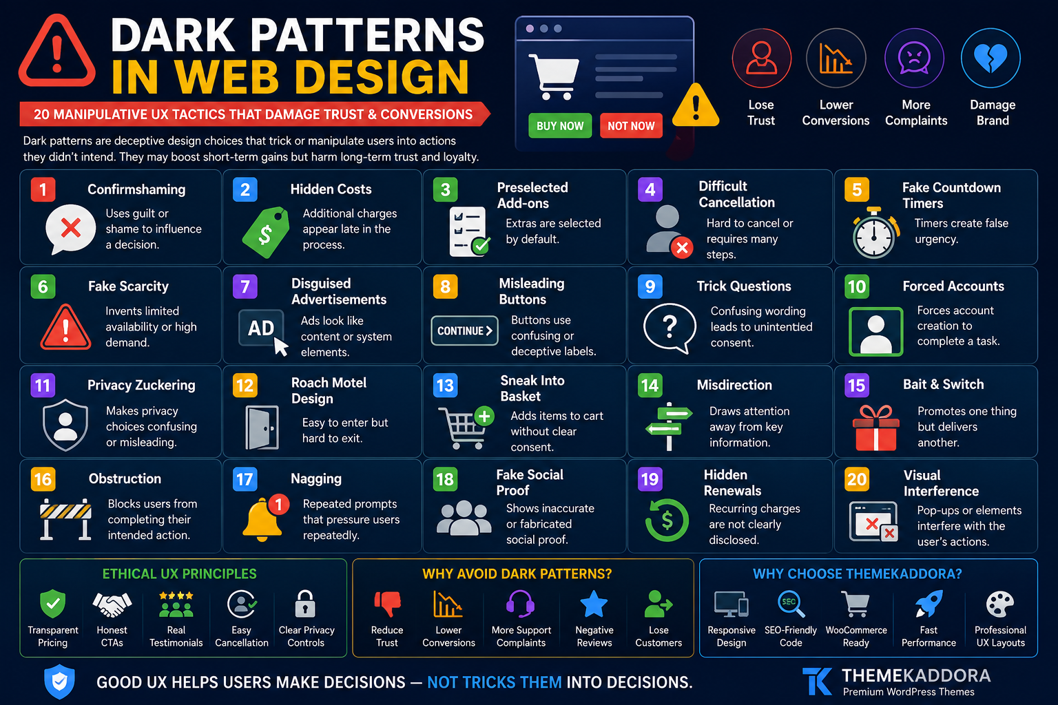
1. Confirmshaming
Confirmshaming uses guilt or embarrassment to influence a choice.
Example:
Yes, I Want to Save Money
versus
No Thanks, I Prefer Paying More
The negative option attempts to shame the visitor.
Better Approach
Use neutral language:
Yes, Send Me Updates
No Thanks
Respect the decision.
2. Hidden Costs
A visitor sees one price initially but discovers additional charges later.
Examples:
Service fees
Processing charges
Mandatory add-ons
Unexpected shipping
Better Approach
Communicate relevant costs as early as practical.
Transparency reduces checkout surprises.
3. Preselected Add-Ons
Optional extras are automatically selected.
Examples:
Insurance
Premium support
Donations
Additional products
Users may purchase something unintentionally.
Better Approach
Let customers actively choose optional extras.
4. Difficult Cancellation
Signing up takes seconds.
Cancelling requires:
Multiple pages
Phone calls
Hidden settings
Repeated confirmation steps
This imbalance creates frustration.
Better Approach
Make cancellation reasonably easy to find and complete.
5. Fake Countdown Timers
A timer claims:
Offer Ends in 10 Minutes
but resets when the visitor returns.
This creates false urgency.
Better Approach
Use countdown timers only for genuine deadlines.
6. Fake Scarcity
Examples include:
Only 1 left!
Almost sold out!
50 people viewing now!
when the information is fabricated.
Better Approach
Use scarcity only when based on accurate information.
7. Disguised Advertisements
An advertisement is designed to look like:
Navigation
A download button
System notification
Content link
Users may click unintentionally.
Better Approach
Clearly distinguish promotional content.
8. Misleading Button Hierarchy
One option is large, colorful, and prominent.
The alternative is:
Tiny
Low contrast
Difficult to locate
Visual hierarchy can become manipulative when it hides meaningful choices.
Better Approach
You can emphasize a preferred action without making alternatives inaccessible.
9. Trick Questions
Confusing wording makes it difficult to understand what selecting a checkbox means.
Example:
Uncheck this box if you don't want to stop receiving updates.
Double negatives create confusion.
Better Approach
Use simple language:
Send me promotional emails.
10. Forced Account Creation
A visitor must create an account for an action that may not genuinely require one.
This commonly appears during checkout.
Better Approach
Consider guest checkout where appropriate.
Explain the benefits of account creation rather than forcing it unnecessarily.
11. Privacy Zuckering
The interface encourages users to share more personal information than they realize or intend.
This may happen through:
Confusing settings
Broad defaults
Unclear permissions
Better Approach
Use understandable privacy controls and collect only necessary information.
12. Roach Motel Design
It is easy to enter a situation but difficult to leave.
Examples:
Easy subscription
Difficult cancellation
Easy notification activation
Hidden deactivation
Better Approach
Keep entry and exit processes reasonably balanced.
13. Sneak Into Basket
An additional product appears in the cart without clear user intent.
Better Approach
Use optional recommendations that require active selection.
14. Misdirection
Visual design intentionally draws attention away from important information.
Examples:
Highlighting a discount while hiding renewal terms
Emphasizing a CTA while minimizing fees
Better Approach
Important decision information should remain visible.
15. Bait and Switch
A user takes an action expecting one result but receives another.
Example:
A button appears to close a popup but instead opens another page.
Better Approach
Interface controls should behave as expected.
16. Obstruction
The interface creates unnecessary difficulty around an action.
Examples:
Complex refund requests
Excessive cancellation steps
Hidden account deletion
Better Approach
Reduce unnecessary friction.
17. Nagging
Repeated interruptions pressure visitors.
Examples:
Constant app prompts
Repeated newsletter popups
Continuous notification requests
Better Approach
Respect previous choices.
18. Fake Social Proof
A website displays fabricated:
Reviews
Testimonials
Purchase notifications
Customer numbers
Fake proof can seriously damage credibility.
Better Approach
Use genuine, verifiable customer feedback.
19. Hidden Renewal Terms
A promotional price is highly visible while renewal pricing is difficult to find.
Better Approach
Clearly communicate:
Introductory price
Renewal price
Billing frequency
Customers should understand ongoing costs.
20. Visual Interference
Important information is intentionally made difficult to notice through:
Low contrast
Tiny text
Poor placement
Overwhelming design
Better Approach
Design important information for readability.
Dark Patterns in eCommerce
Online stores should pay special attention to:
Cart additions
Shipping costs
Discounts
Product availability
Checkout options
Returns
Transparent experiences support repeat business.
Dark Patterns in Subscription Websites
Subscription businesses should clearly explain:
Billing frequency
Trial duration
Renewal terms
Cancellation
Refund policies
Recurring payments require strong transparency.
Dark Patterns in Cookie Consent
Cookie interfaces may become manipulative when:
Accept is highly visible
Reject is hidden
Settings are unnecessarily complex
Language is confusing
Design consent experiences around clarity and applicable requirements.
Dark Patterns in Mobile Apps and Responsive Websites
Smaller screens can amplify manipulation.
Watch for:
Hidden close buttons
Accidental taps
Full-screen interruptions
Tiny alternatives
Difficult scrolling
Mobile users deserve the same transparency as desktop users.
The Business Cost of Manipulative UX
Dark patterns can contribute to:
Refund requests
Chargebacks
Support tickets
Negative reviews
Customer churn
Reduced loyalty
Brand damage
Short-term conversion gains may not reflect long-term customer value.
Ethical Conversion Rate Optimization
CRO does not require manipulation.
Ethical optimization focuses on:
Clear value propositions
Faster pages
Better forms
Stronger CTAs
Useful social proof
Transparent pricing
Reduced friction
Better mobile experiences
The goal is to help the right visitor make the right decision.
Ethical UX Checklist for WordPress Websites
Before publishing, confirm:
✅ Prices are clear
✅ Optional extras require active choice
✅ Cancellation is understandable
✅ CTAs are honest
✅ Reviews are genuine
✅ Deadlines are real
✅ Forms use clear language
✅ Privacy settings are understandable
✅ Mobile interactions are usable
✅ Important terms are visible
How to Audit Your Website for Dark Patterns
Review these areas:
Homepage
Are claims accurate?
Popups
Can visitors close them easily?
Forms
Are choices understandable?
Pricing Page
Are fees and billing periods clear?
Checkout
Are optional extras transparent?
Account Area
Can users manage subscriptions?
Mobile Website
Are controls accessible?
Why Your WordPress Theme Matters
Your theme influences:
Navigation
Forms
Buttons
Pricing tables
Mobile layouts
Visual hierarchy
Checkout presentation
A flexible, well-designed theme makes transparent UX easier to implement.
Why Choose Themekaddora for Trust-Focused WordPress Websites?
Themekaddora WordPress themes are designed to provide a modern foundation for professional websites.
Key benefits include:
Lightweight architecture
Responsive layouts
SEO-friendly code
WooCommerce compatibility
Fast loading performance
Flexible customization
Clean HTML5 and CSS3 standards
Cross-browser compatibility
Regular updates
Professional support
These features help businesses create clear, usable, and professional digital experiences.
A Better UX Framework
Use this framework:
Clarify
Make choices understandable.
Inform
Provide relevant information before decisions.
Respect
Honor user preferences.
Simplify
Remove unnecessary friction.
Verify
Test whether users understand the interface.
Improve
Use feedback to make experiences better.
Conclusion
Dark patterns may increase certain short-term metrics, but they can damage the relationship between a business and its customers.
The strongest websites do not rely on confusion, hidden costs, fake urgency, or difficult cancellation flows.
They compete through:
Better products
Clearer communication
Stronger user experience
Transparent pricing
Genuine trust
For WordPress websites, ethical UX begins with a flexible and reliable technical foundation.
Themekaddora themes combine responsive design, lightweight architecture, SEO-friendly code, WooCommerce compatibility, and flexible customization to help businesses create modern websites built around usability and trust.
Good design should help users make decisions.
Not trick them into decisions.
Frequently Asked Questions (FAQs)
What are dark patterns in web design?
Dark patterns are interface techniques that confuse, pressure, or manipulate users into actions they may not otherwise choose.
Are all persuasive design techniques dark patterns?
No. Ethical persuasive design clearly communicates value and allows users to make informed decisions.
What is confirmshaming?
Confirmshaming uses guilt-based wording to pressure users into accepting an offer or option.
Why are fake countdown timers problematic?
They create artificial urgency and can damage trust when visitors discover that the deadline is not genuine.
Can dark patterns increase conversions?
Some tactics may improve short-term metrics, but they can also increase complaints, refunds, churn, and long-term brand damage.
How can WordPress websites avoid dark patterns?
Use clear language, transparent pricing, honest CTAs, accessible alternatives, genuine social proof, and straightforward account controls.
Why choose Themekaddora WordPress themes?
Themekaddora themes provide responsive layouts, lightweight architecture, SEO-friendly code, WooCommerce compatibility, fast performance, and flexible customization, supporting professional and user-friendly WordPress websites.
Comments (0)