CSS Grid Layout Explained: Build Powerful Two-Dimensional Responsive Layouts
Introduction
Creating complex website layouts once required floats, positioning hacks, or deeply nested HTML structures. As websites became more sophisticated, developers needed a layout system that could handle both rows and columns with ease.
CSS Grid Layout was introduced to solve this challenge. It is a powerful two-dimensional layout system that allows developers to design flexible, responsive, and visually organized web pages with less code and greater control.
Whether you're building dashboards, landing pages, eCommerce websites, blogs, or portfolio sites, CSS Grid makes it easier to create professional layouts that adapt beautifully to different screen sizes.
In this guide, you'll learn how CSS Grid works, its key concepts, practical applications, and best practices.
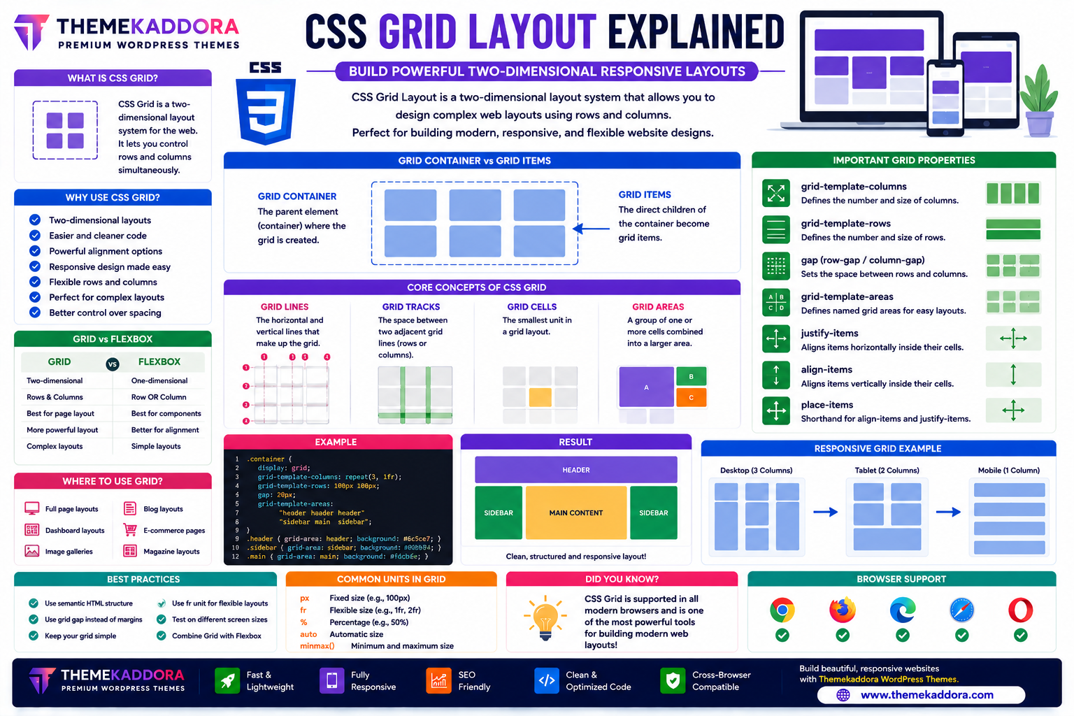
What is CSS Grid Layout?
CSS Grid Layout is a two-dimensional layout system that enables developers to arrange content using rows and columns simultaneously.
Unlike Flexbox, which works primarily in one direction (row or column), Grid manages both dimensions together, making it ideal for full-page layouts and complex designs.
Why Use CSS Grid?
CSS Grid offers many advantages:
Two-dimensional layouts
Cleaner HTML
Responsive design
Flexible page structure
Easy alignment
Reduced CSS complexity
Better maintainability
Modern browser support
It simplifies layouts that previously required multiple techniques.
Grid Container and Grid Items
Grid Container
A grid container is the parent element that establishes a grid formatting context.
It defines:
Columns
Rows
Gaps
Alignment
Overall layout
Grid Items
The direct child elements of the grid container become grid items.
Each item can occupy one or more rows and columns.
Core Grid Concepts
Grid Lines
Grid lines are the horizontal and vertical dividing lines that separate rows and columns.
They help position grid items precisely.
Grid Tracks
A grid track is the space between two adjacent grid lines.
Tracks can represent either:
Rows
Columns
Grid Cells
A grid cell is the smallest individual unit within the grid.
It is created by the intersection of one row and one column.
Grid Areas
A grid area is a group of one or more grid cells combined into a larger section.
Grid areas simplify the creation of complex page layouts.
Important CSS Grid Properties
Grid Template Columns
Defines the number and size of columns within the grid.
Developers can create:
Equal-width columns
Mixed-width columns
Flexible layouts
Grid Template Rows
Controls the size and number of rows.
Rows can have fixed, automatic, or flexible heights.
Grid Gap
Creates spacing between rows and columns.
Using gaps helps maintain clean, organized layouts without relying on margins.
Grid Template Areas
Allows developers to assign names to different layout regions.
This creates highly readable and maintainable CSS.
Justify Items
Controls horizontal alignment inside each grid cell.
Align Items
Controls vertical alignment inside grid cells.
Place Items
A shorthand property for aligning items both horizontally and vertically.
Responsive CSS Grid
Grid makes responsive design much easier.
Responsive layouts can include:
Auto-adjusting columns
Flexible content blocks
Adaptive galleries
Responsive product listings
Dynamic dashboards
Grid reduces the need for complicated media query layouts in many scenarios.
Common CSS Grid Use Cases
CSS Grid is perfect for building:
Homepage layouts
Dashboards
Product grids
Portfolio galleries
Blog layouts
Pricing tables
Magazine websites
Landing pages
Admin panels
News websites
Its flexibility makes it suitable for nearly every type of website.
CSS Grid vs Flexbox
Feature
CSS Grid
Flexbox
Layout Type
Two-dimensional
One-dimensional
Best For
Full-page layouts
UI components
Rows & Columns
Yes
Limited
Alignment
Excellent
Excellent
Complex Layouts
Ideal
Moderate
Responsive Design
Excellent
Excellent
Many modern websites use both Grid and Flexbox together, selecting the most appropriate tool for each part of the layout.
Best Practices for CSS Grid
To build effective layouts:
Use Grid for page-level layouts.
Combine Grid with Flexbox where appropriate.
Keep layouts simple and organized.
Name grid areas clearly.
Test layouts across different screen sizes.
Use semantic HTML structure.
A thoughtful layout improves both usability and maintainability.
Common CSS Grid Mistakes
Avoid:
Overcomplicating grid structures
Creating unnecessary nested grids
Ignoring responsive testing
Using Grid where Flexbox is more appropriate
Forgetting spacing between items
Building layouts without semantic HTML
Choosing the right layout system for each task leads to cleaner code.
CSS Grid in Responsive Web Design
Grid is widely used to build responsive:
Hero sections
Product catalogs
Image galleries
Blog archives
Content cards
Landing pages
Dashboard widgets
Its ability to manage rows and columns simultaneously makes responsive design more intuitive.
Why CSS Grid Matters for WordPress Themes
Professional WordPress themes—including Themekaddora themes—use CSS Grid to create modern, responsive layouts.
Benefits include:
Flexible page structures
Responsive WooCommerce layouts
Organized content sections
Faster customization
Clean CSS architecture
Better scalability
Excellent user experience
Grid enables themes to deliver visually balanced designs across all devices.
CSS Grid Checklist
Before building a layout, remember to:
✅ Create a grid container
✅ Define rows and columns
✅ Use consistent spacing
✅ Name grid areas logically
✅ Test on multiple screen sizes
✅ Keep HTML semantic
✅ Combine Grid with Flexbox when appropriate
✅ Optimize for mobile users
Conclusion
CSS Grid Layout has revolutionized modern web design by providing a simple yet powerful way to build complex, responsive layouts.
Its two-dimensional capabilities make it ideal for page layouts, galleries, dashboards, and many other design patterns that were once difficult to implement.
When combined with Flexbox and responsive WordPress themes from Themekaddora, CSS Grid helps developers create clean, scalable, and professional websites that perform beautifully on every device.
Frequently Asked Questions (FAQs)
What is CSS Grid Layout?
CSS Grid Layout is a two-dimensional CSS layout system that allows developers to organize webpage content using rows and columns.
What is the difference between CSS Grid and Flexbox?
CSS Grid is best for two-dimensional layouts involving rows and columns, while Flexbox is designed for one-dimensional layouts along a single row or column.
Is CSS Grid responsive?
Yes. CSS Grid is designed to create flexible, responsive layouts that adapt to different screen sizes.
Should I use CSS Grid or Flexbox?
Use CSS Grid for full-page and complex layouts, and Flexbox for smaller interface components. Many websites use both together.
Why do Themekaddora WordPress themes use CSS Grid?
Themekaddora themes use CSS Grid to build responsive layouts, WooCommerce pages, organized content sections, and scalable designs that deliver an excellent user experience across all devices.
Comments (0)