CSS Flexbox Explained: Build Modern Responsive Layouts with Ease
Introduction
Creating responsive website layouts was once one of the biggest challenges in web development. Developers often relied on tables, floats, and complex positioning techniques to align content, making layouts difficult to build and maintain.
CSS Flexbox (Flexible Box Layout) changed that by introducing a simpler and more powerful way to arrange elements. With Flexbox, you can easily align items, distribute space, reorder content, and build responsive layouts with less code.
Today, Flexbox is one of the most widely used CSS layout systems and an essential skill for every web developer.
In this guide, you'll learn how Flexbox works, its core properties, practical use cases, and best practices for building responsive websites.
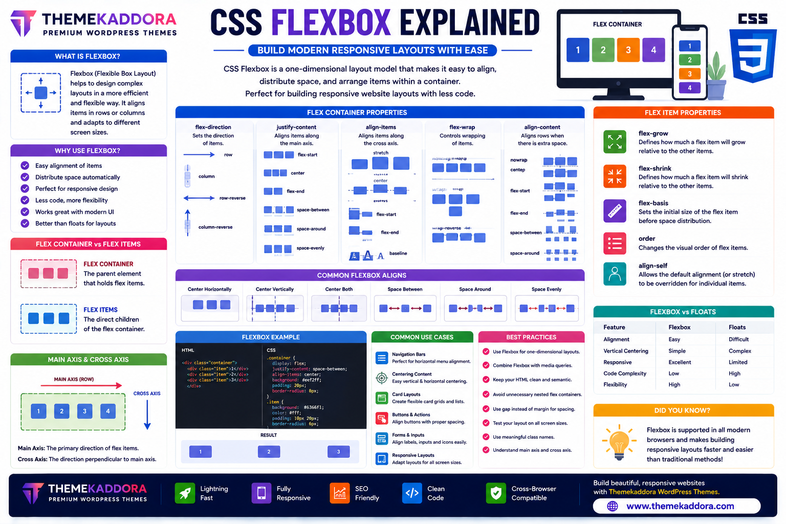
What is CSS Flexbox?
CSS Flexbox is a one-dimensional layout model that allows developers to arrange elements efficiently along a row or a column.
It helps control:
Alignment
Spacing
Item order
Flexible sizing
Responsive layouts
Flexbox is especially useful for user interface components and smaller layout sections.
Why Use Flexbox?
Flexbox offers several advantages:
Simplifies layouts
Reduces CSS complexity
Supports responsive design
Aligns elements easily
Distributes space automatically
Reduces dependence on floats
Works well with modern browsers
Improves code readability
These benefits make Flexbox an essential tool for modern web development.
Flex Container vs Flex Items
A Flexbox layout consists of two main parts:
Flex Container
The parent element becomes a flex container when Flexbox is enabled.
It controls how child elements are arranged.
Flex Items
The direct children of the flex container become flex items.
The container manages their size, alignment, spacing, and position.
Main Axis and Cross Axis
Understanding Flexbox begins with two important concepts:
Main Axis
The primary direction in which flex items are arranged.
It can be horizontal or vertical depending on the layout.
Cross Axis
The direction perpendicular to the main axis.
Flexbox uses the cross axis for vertical or horizontal alignment depending on the layout direction.
Important Flex Container Properties
Flex Direction
Controls the direction of flex items.
Common layouts include:
Horizontal rows
Vertical columns
Reverse order arrangements
Justify Content
Controls how items are distributed along the main axis.
Common alignment options include:
Start
Center
End
Space between items
Space around items
Even spacing
Align Items
Controls alignment along the cross axis.
Useful for vertically centering content or aligning items consistently.
Flex Wrap
Determines whether items remain on one line or wrap onto multiple lines when space is limited.
Wrapping is especially helpful for responsive layouts.
Align Content
Controls spacing between multiple rows or columns when wrapping occurs.
Important Flex Item Properties
Flex Grow
Determines how much available space an item can occupy relative to other items.
Flex Shrink
Controls how items shrink when there is limited space.
Flex Basis
Defines the initial size of a flex item before extra space is distributed.
Order
Changes the visual order of flex items without modifying the HTML structure.
Align Self
Allows an individual item to override the alignment set by the container.
Common Flexbox Use Cases
Flexbox is ideal for building:
Navigation bars
Hero sections
Card layouts
Pricing tables
Feature sections
Image galleries
Forms
Buttons
Toolbars
Mobile menus
It excels at arranging related interface components.
Flexbox vs Traditional Layout Methods
Feature
Floats
Flexbox
Responsive Layouts
Difficult
Easy
Vertical Alignment
Limited
Built-in
Equal Height Items
Complex
Simple
Code Complexity
Higher
Lower
Layout Flexibility
Limited
Excellent
Flexbox simplifies many layout tasks that previously required complicated CSS.
Best Practices for Flexbox
To build efficient layouts:
Use Flexbox for one-dimensional layouts.
Combine Flexbox with responsive design principles.
Keep nesting to a minimum.
Test layouts on different screen sizes.
Use meaningful HTML structure.
Avoid unnecessary overrides.
A clean layout improves maintainability.
Common Flexbox Mistakes
Avoid:
Using Flexbox for every layout
Ignoring wrapping behavior
Overcomplicating nested flex containers
Forgetting responsive testing
Using fixed widths unnecessarily
Misunderstanding axis directions
Choosing the right layout technique improves results.
Flexbox in Responsive Web Design
Flexbox works exceptionally well for responsive websites because it automatically adapts to available space.
Developers commonly use Flexbox for:
Mobile navigation
Responsive cards
Content alignment
Flexible buttons
Header layouts
Footer sections
Its adaptability makes it ideal for modern interfaces.
Why Flexbox Matters for WordPress Themes
Professional WordPress themes—including Themekaddora themes—use CSS Flexbox extensively to build responsive and maintainable layouts.
Benefits include:
Flexible page layouts
Mobile-friendly components
Faster customization
Cleaner CSS
WooCommerce compatibility
Responsive navigation
Improved user experience
Flexbox helps themes adapt smoothly across different devices.
CSS Flexbox Checklist
Before building a layout, remember to:
✅ Create a flex container
✅ Understand the main and cross axes
✅ Use appropriate alignment properties
✅ Enable wrapping when needed
✅ Test on mobile devices
✅ Keep layouts simple
✅ Combine with responsive design techniques
✅ Maintain semantic HTML structure
Conclusion
CSS Flexbox has transformed the way developers create layouts. Its intuitive alignment system, flexible sizing, and responsive capabilities make it one of the most valuable tools in modern CSS.
Whether you're designing navigation menus, landing pages, dashboards, or WooCommerce stores, Flexbox helps you build clean, responsive, and maintainable layouts with less effort.
Combined with responsive WordPress themes from Themekaddora, Flexbox enables developers to create professional websites that perform beautifully across all screen sizes.
Frequently Asked Questions (FAQs)
What is CSS Flexbox?
CSS Flexbox is a one-dimensional layout system used to arrange and align elements efficiently within rows or columns.
Is Flexbox good for responsive websites?
Yes. Flexbox is designed to adapt to different screen sizes, making it an excellent choice for responsive web design.
What is the difference between Flexbox and CSS Grid?
Flexbox is best for one-dimensional layouts (rows or columns), while CSS Grid is designed for two-dimensional layouts involving both rows and columns.
Can Flexbox replace floats?
For many layout tasks, yes. Flexbox provides a simpler and more flexible alternative to traditional float-based layouts.
Why do Themekaddora WordPress themes use CSS Flexbox?
Themekaddora themes use Flexbox to create responsive layouts, mobile-friendly navigation, clean code, WooCommerce compatibility, and modern user interfaces that perform well on every device.
Comments (0)